Max Services
2015-2021
Can-do capability
Defining the value in the business and seizing the opportunity to reshape an industry through brand.

National Foundation for Australian Women
Brand identity / Information design
2015
The influence of women
Symbolic language and archetypal form repositions a powerful national voice.
Rebranding for The National Foundation for Australian Women, a non-profit organisation that is responsible for high level policy development, representing women at a Federal Government level.
NFAW is an organisation formed in the second wave of feminism of the 1980’s with the shared goal of ensuring the gains of the past 20 years were not lost. Its board members, comprised of leading women from diverse demographics, have all played a significant role in historic policy development and other initiatives all working largely behind the scenes for the better representation of women nationally.
When initially approached we felt obliged to discreetly question the merits of engaging an all male design team for the project but were assured we had the full support of the group. To develop a thorough design brief and ensure we fully grasped the issues and goals of this national organisation we devised and ran an intensive one day strategy working session for the board. The session comprehensively addressed a broad range of historic and contemporary factors influencing women and successfully defined a contemporary position and direction for the organisation.
A range of archetypal and stereotypical design directions were all explored, proposed, discussed and debated at length. The resultant mark was supported unanimously by the group despite it being the most visually risky – its minimal form and corporate language represents a significant departure from the past visual identity. The symbol is a bold statement of clarity and draws from the theory and analysis of the way gender influences the definition and construction of space. The circular mark is an inherently nurturing form and the openings top and bottom feminine in nature in that it allows movement through and around. This is reminiscent of the forms of medieval earth shelters and of town squares in contrast with the more masculine marking of space with monumental forms such as obelisks and towers.
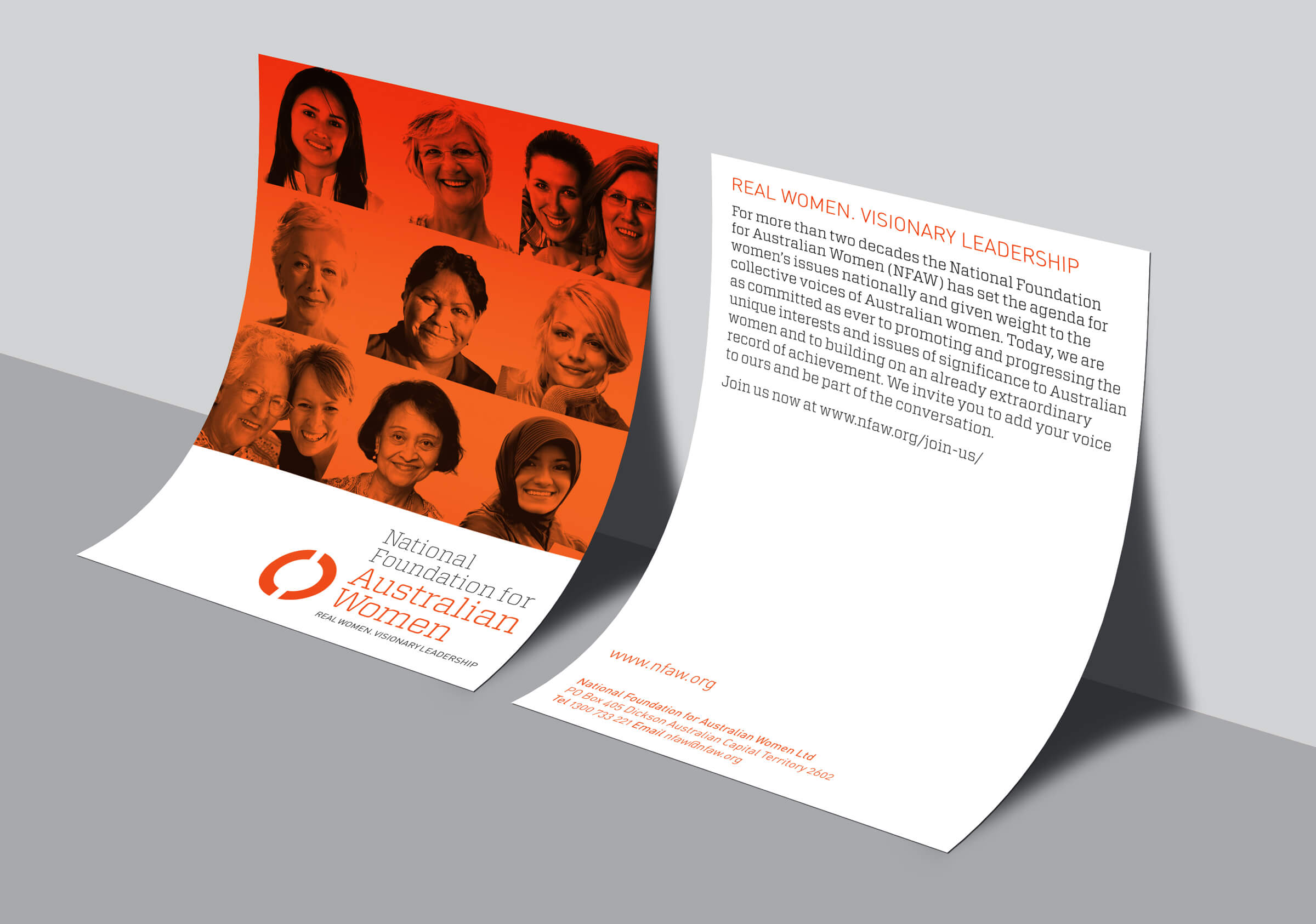
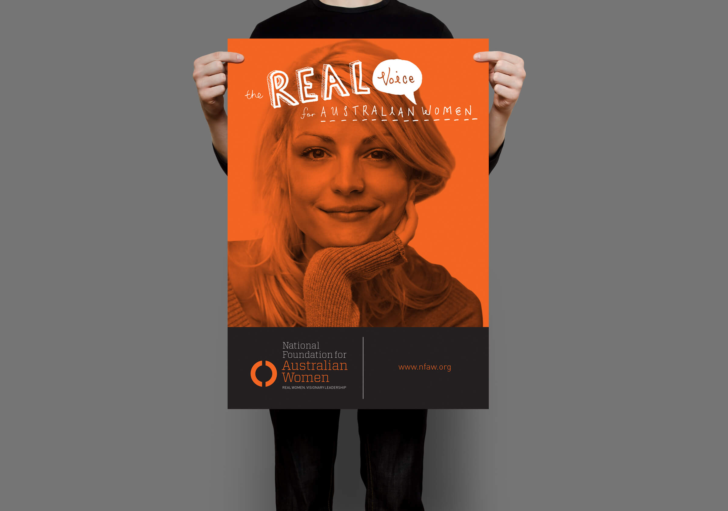
The new visual identity has been instrumental in refocusing the goals and values of a significant group of women and provides a contemporary face to an organisation existing comfortably behind the scenes at the very highest levels of power. The tagline Real Women. Visionary Leadership affirms a clear path for the future and reflects the practical determination of its members to effect real and lasting change.


