Well Made
Brand identity / Information design
2015
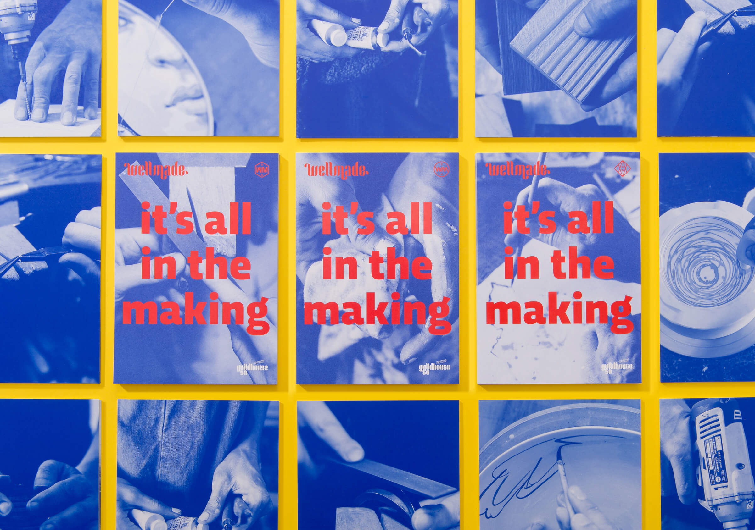
It’s all in the making
Defining the language of craft, connecting makers to their market.
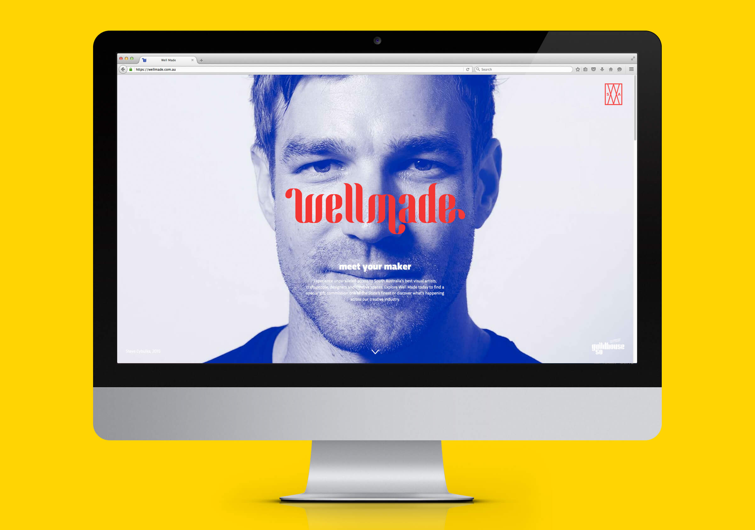
Program brand identity, website design and collateral for Well Made – an initiative of Guildhouse that aims to provide a platform for high level South Australian creative practitioners.
Our work with Guildhouse for the Well Made program began in 2012 with a focused, co-operative working session with web and brand with the aim to define audiences in South Australia and investigate the best means of delivering value for the program and creating a positive online experience.
With funding assured at the beginning of 2016 Working Images picked up development and initiated the project with a Well Made and Guildhouse team working session. Our aim was to better understand how the audience had shifted; defining the needs and desires of all stakeholders including practitioners across multiple disciplines and national audiences.
In the short space of time since we had begun development the number of online platforms profiling the work of creative practitioners and makers grew significantly – five launched locally and nationally within a space of about 6 months. Within this now competitive online market we began development of a brand identity for the program. The majority of other programs comprised young makers communicating with young audiences and Guildhouse in contrast aimed to provide an inclusive platform for a wide demographic.
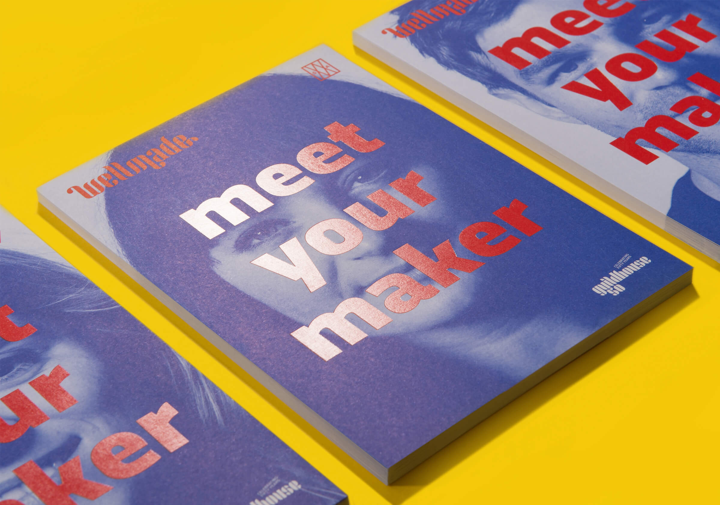
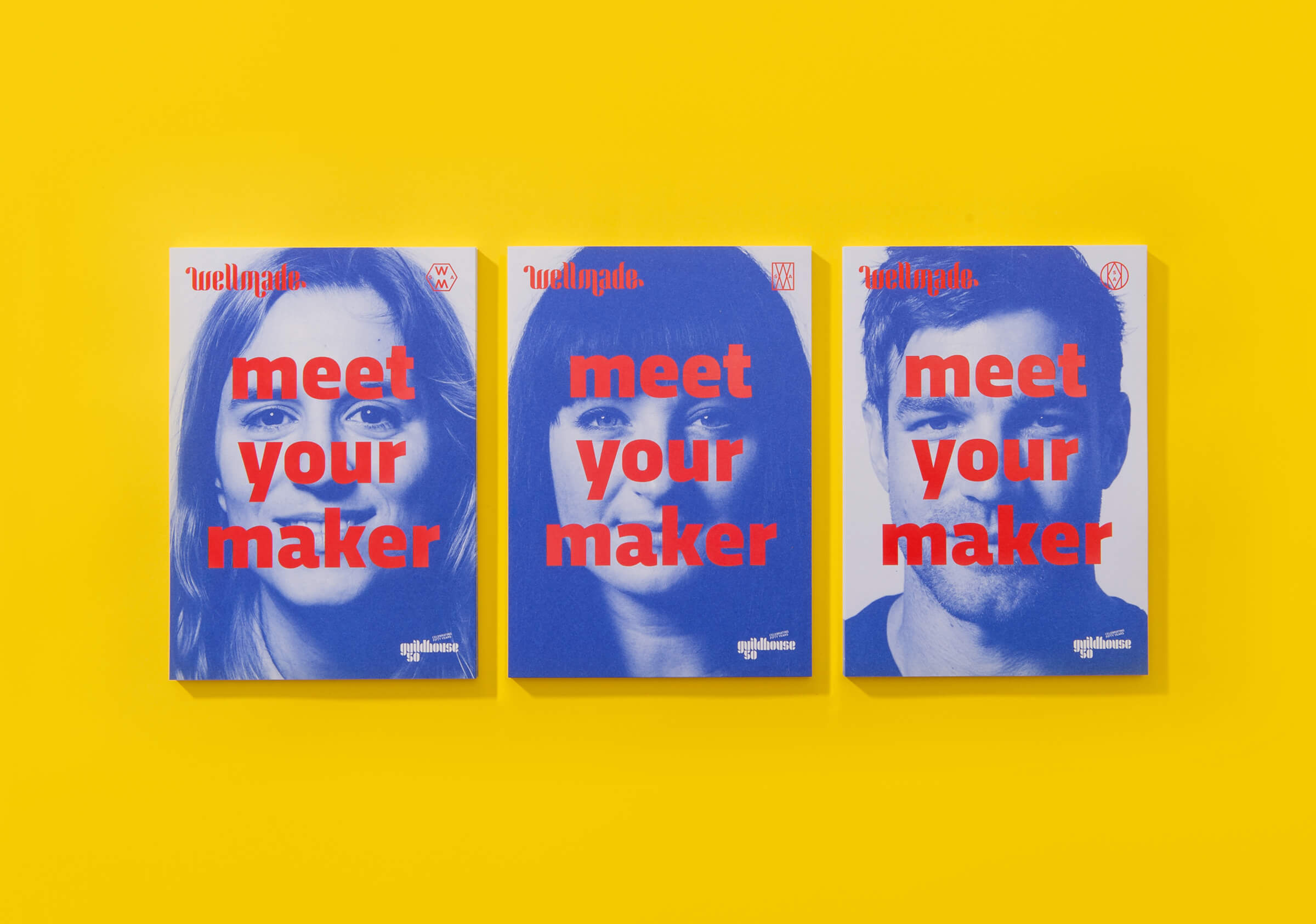
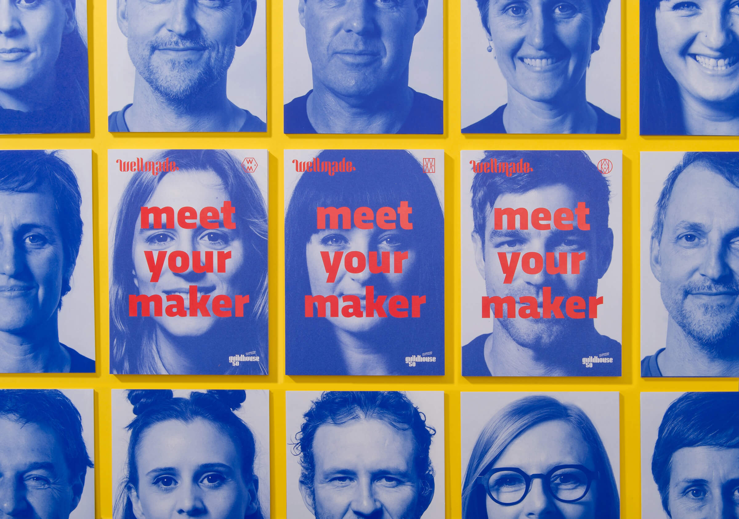
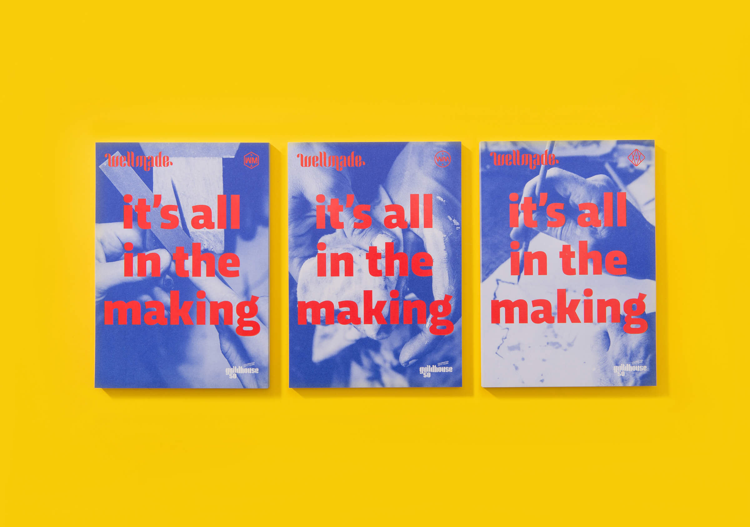
Our research also clearly showed that the work of South Australian creative practitioners, especially makers, is held in high regard with the work sitting very comfortably on a world stage. With this in mind we aimed specifically for the visual language of the brand identity to avoid the fashionable conventions being adopted by others and aimed instead to reflect the confidence, authenticity and originality of the wider body of South Australian practitioners.
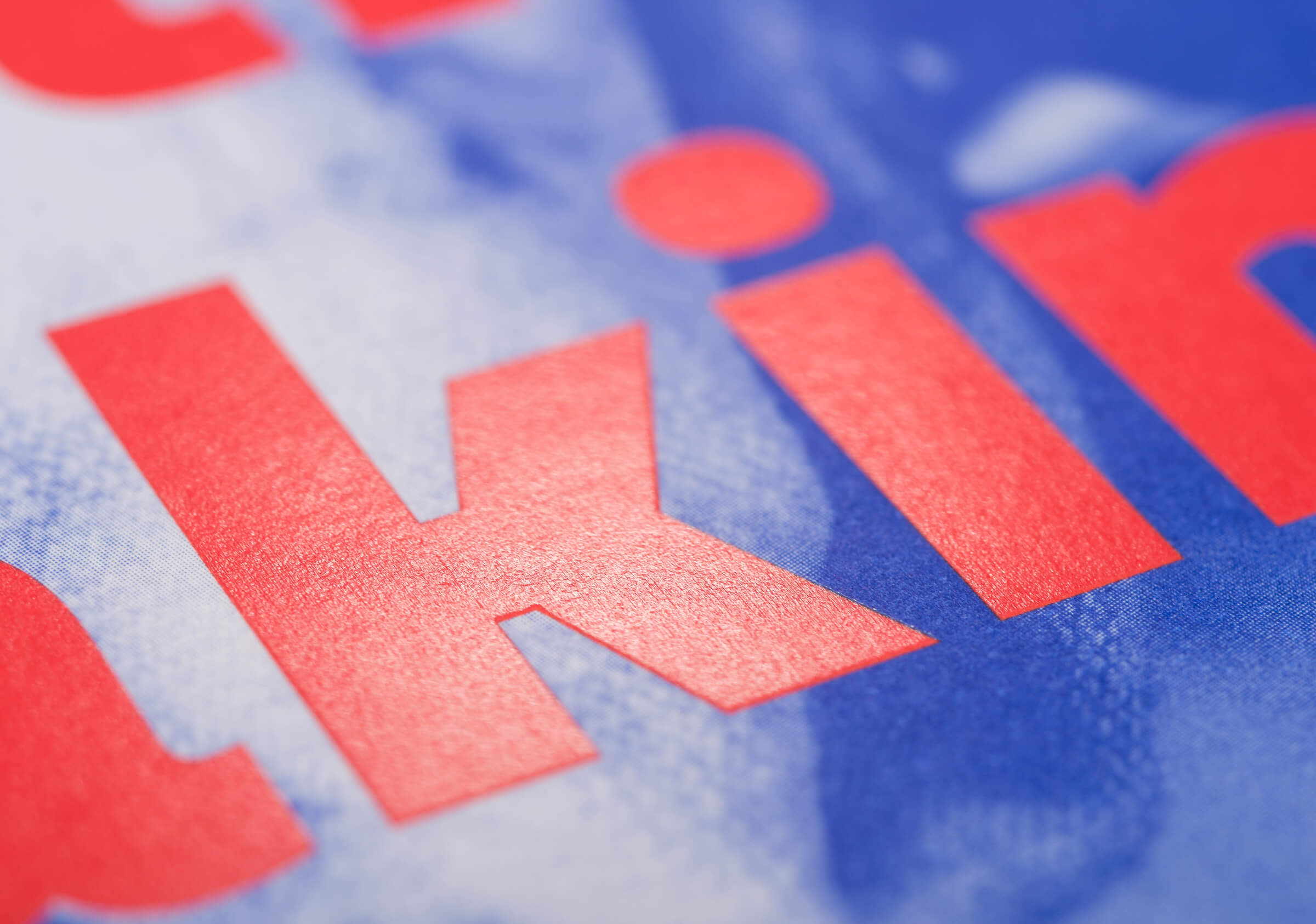
The idiosyncratic, handcrafted logotype speaks with confidence and the verticality of its visual form referencing the parent brand of Guildhouse. In the process of brand development a line of inquiry opened up exploring the artisanal marks of early makers in Australia and Europe. The value in these marks and their necessarily simplistic visual forms were considered an important element of the maker’s language. Whilst they couldn’t be justified as a brand identity we found they worked well in an adjunct role providing a rich embellishment of the brand story.
The value in the program had always been centred on providing a direct connection to the maker or practitioner. In line with this we developed a series of promotional cards to launch the program and brand that featured artist faces and hands. Working with copy writer Hayley Green two key campaign messages were devised that artfully reflected this connection: Meet Your Maker and It’s all in the making.