SKEIN
Brand identity / Information design
2016
A new perspective
Projecting an image of the future for a bespoke South Australian architectural practice driven by craft.
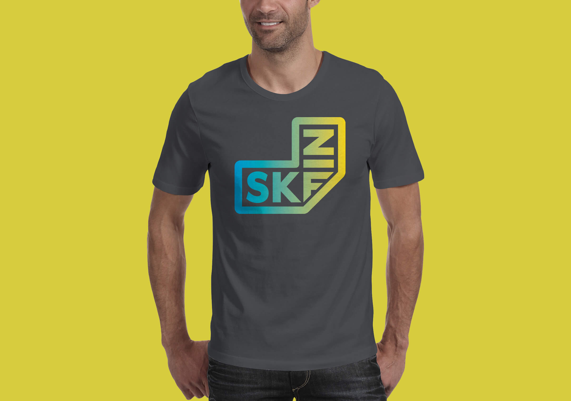
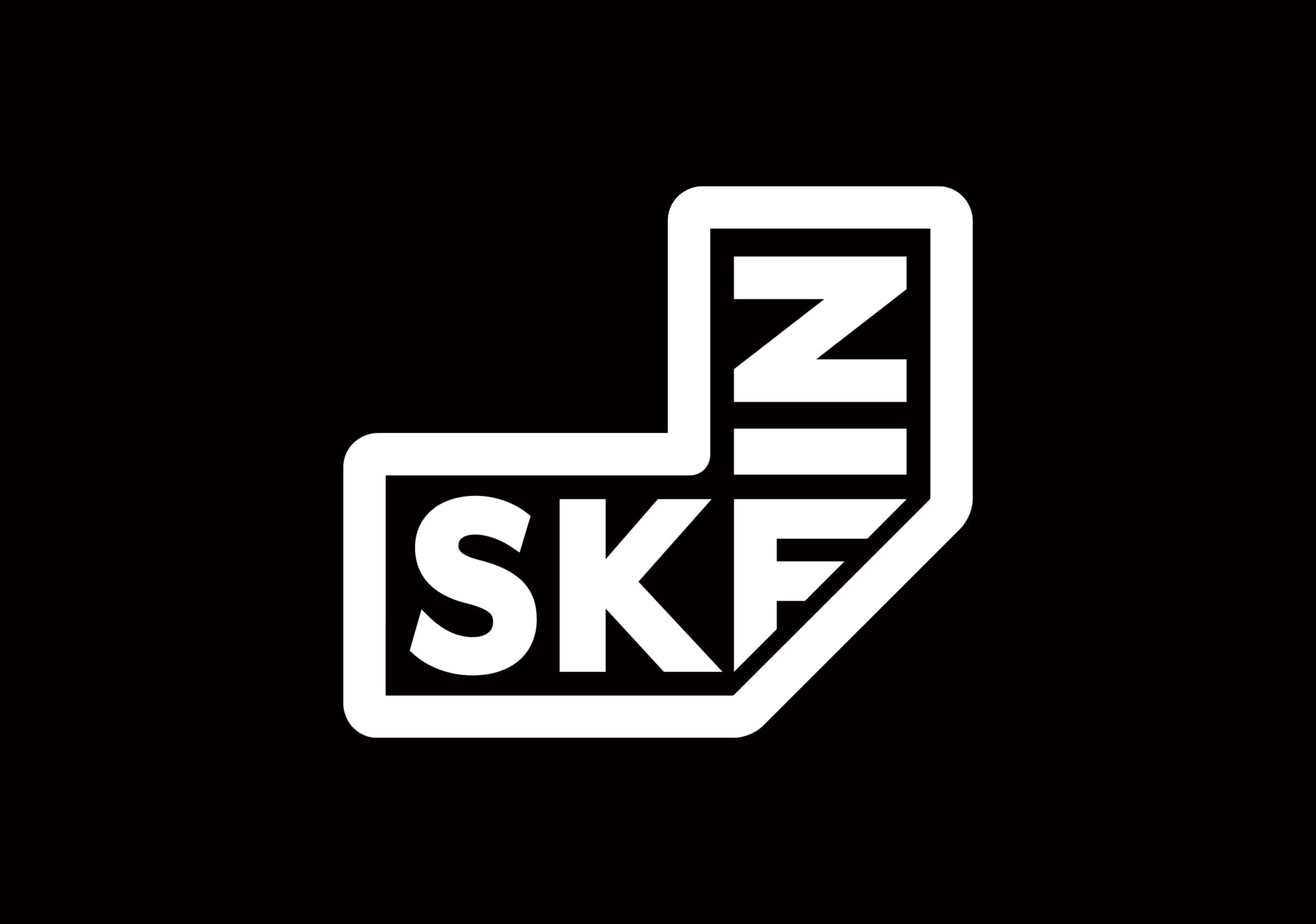
Brand identity and collateral for Skein: architecture / objects / installations.
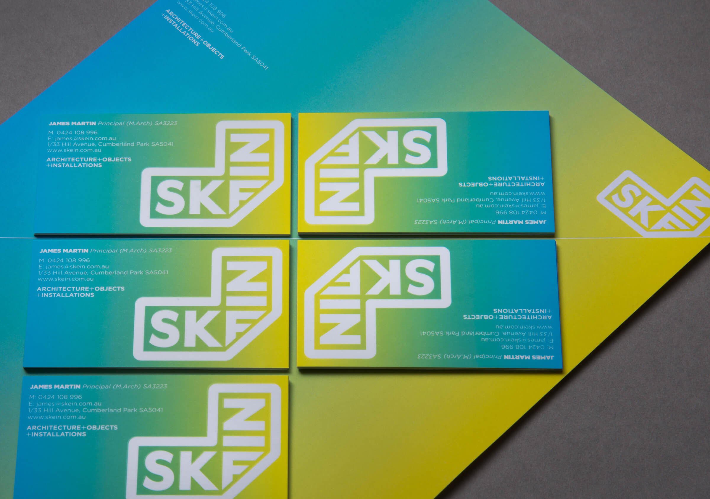
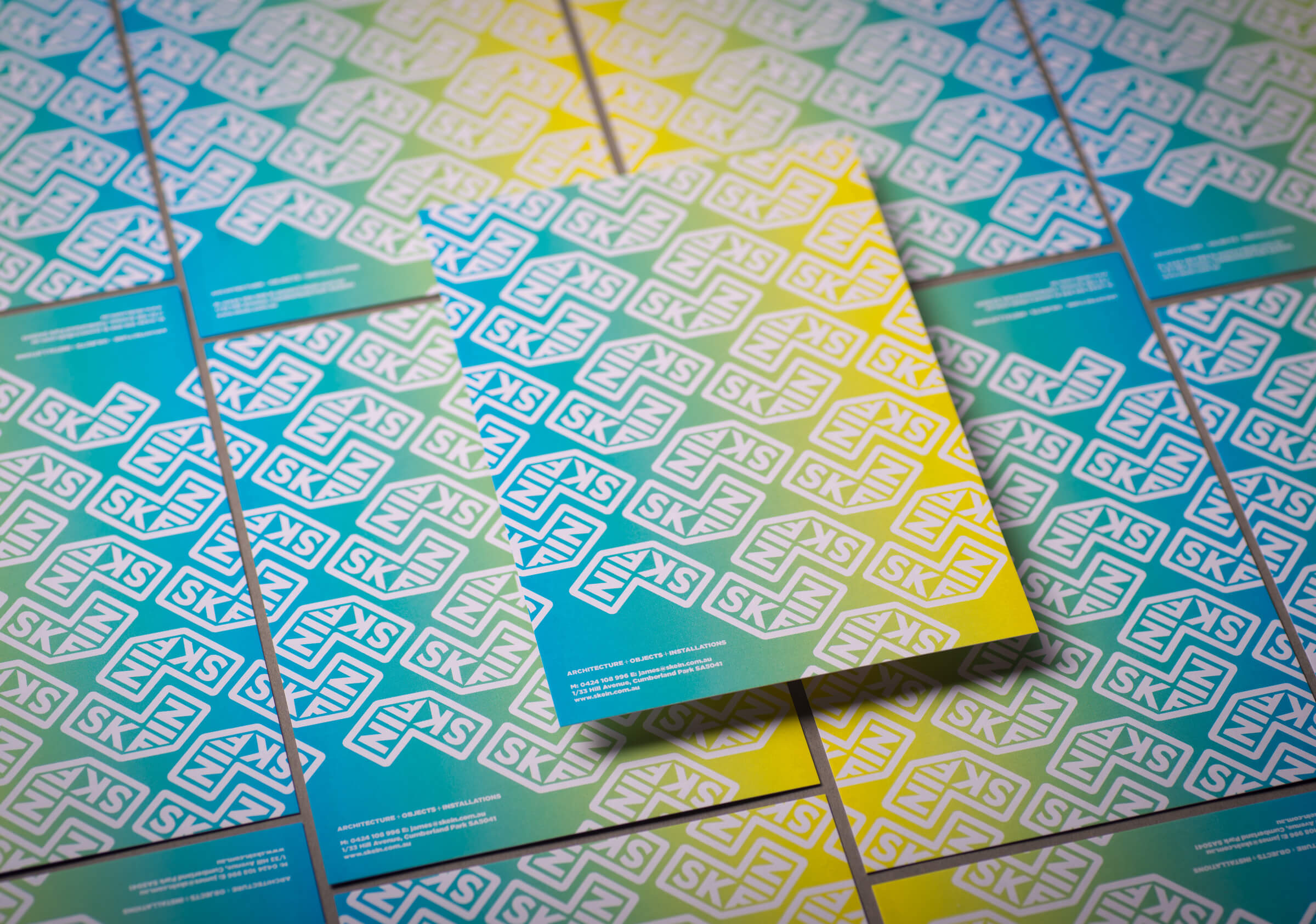
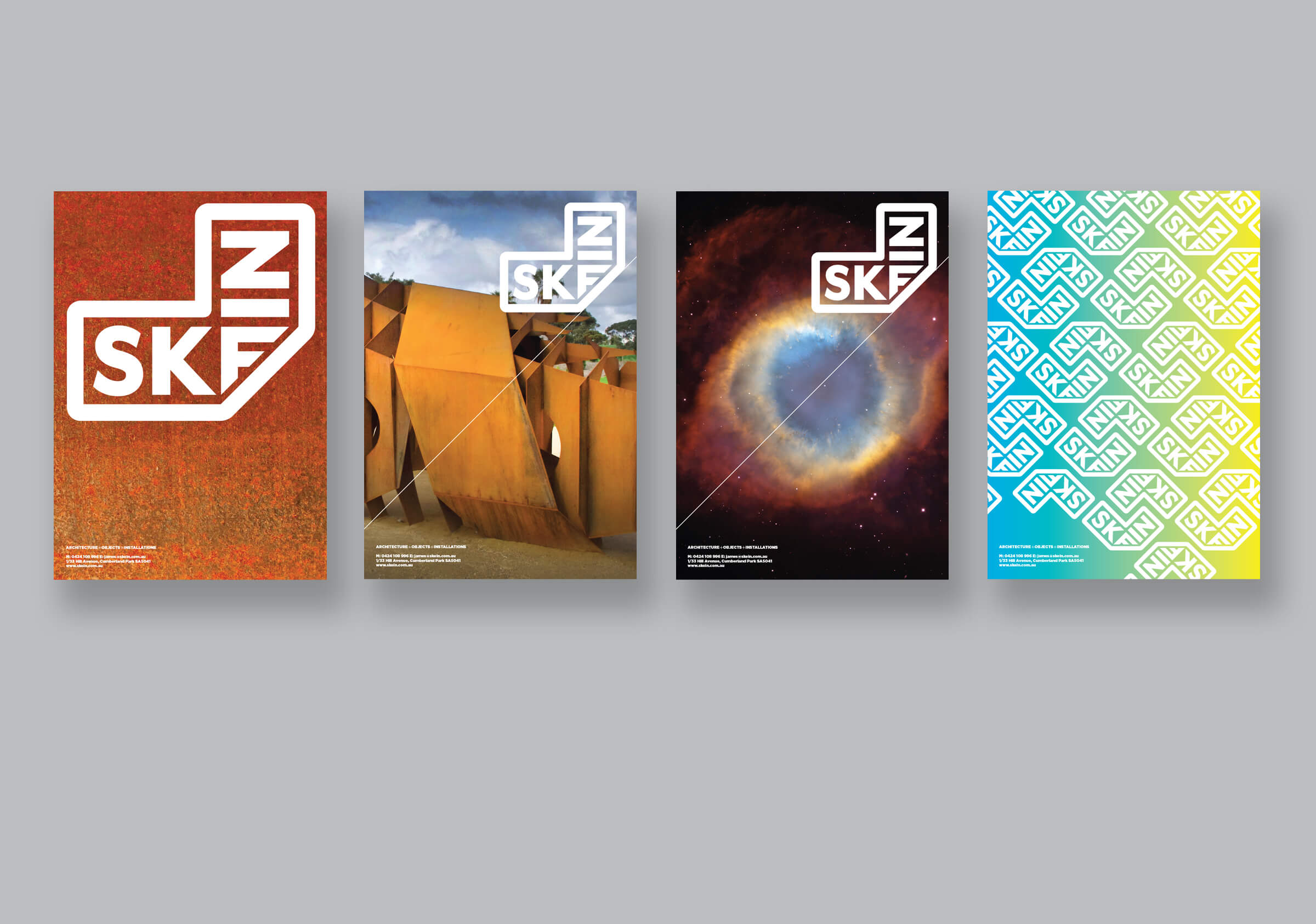
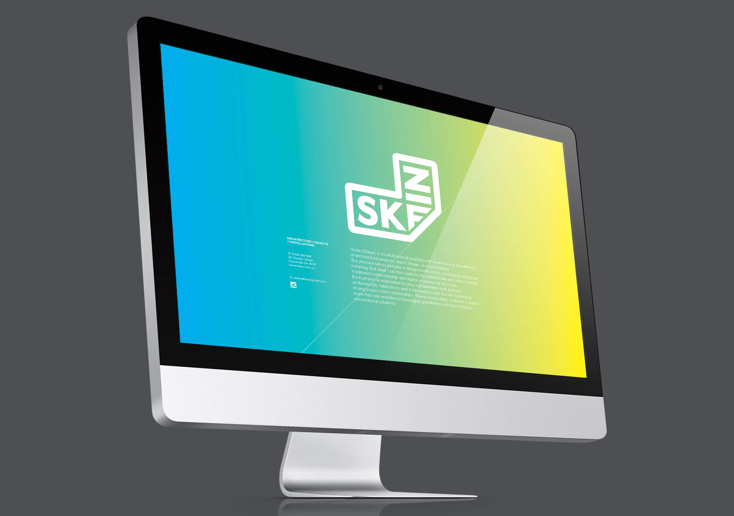
In the development of the brand identity we were guided primarily by the strong materiality and distinctive, sculptural characteristics of Skein’s works. In particular we aimed to capture the folded thematic elements evident in the public space commissions. The word skein refers specifically to the V-formation of a flight of geese and we were inspired with the correlation between this and the folded forms of the architectural works. The visual identity has its origin in a simple folded plane.
The typographic brand element, originally distorted and unnecessarily overt, has been reinstated to read right way round. The incidental visual reference to the identity for band Nine Inch Nails was a curiosity.
The brand aimed to position this practice confidently and clearly in a saturated market in a challenging economic climate. It speaks easily of the innovation and clarity of thinking evident in their works.