Ashley Halliday
Brand identity / Information design
2016
Defining an international architecture brand
A projection of capability reflected through materiality, detail and process.
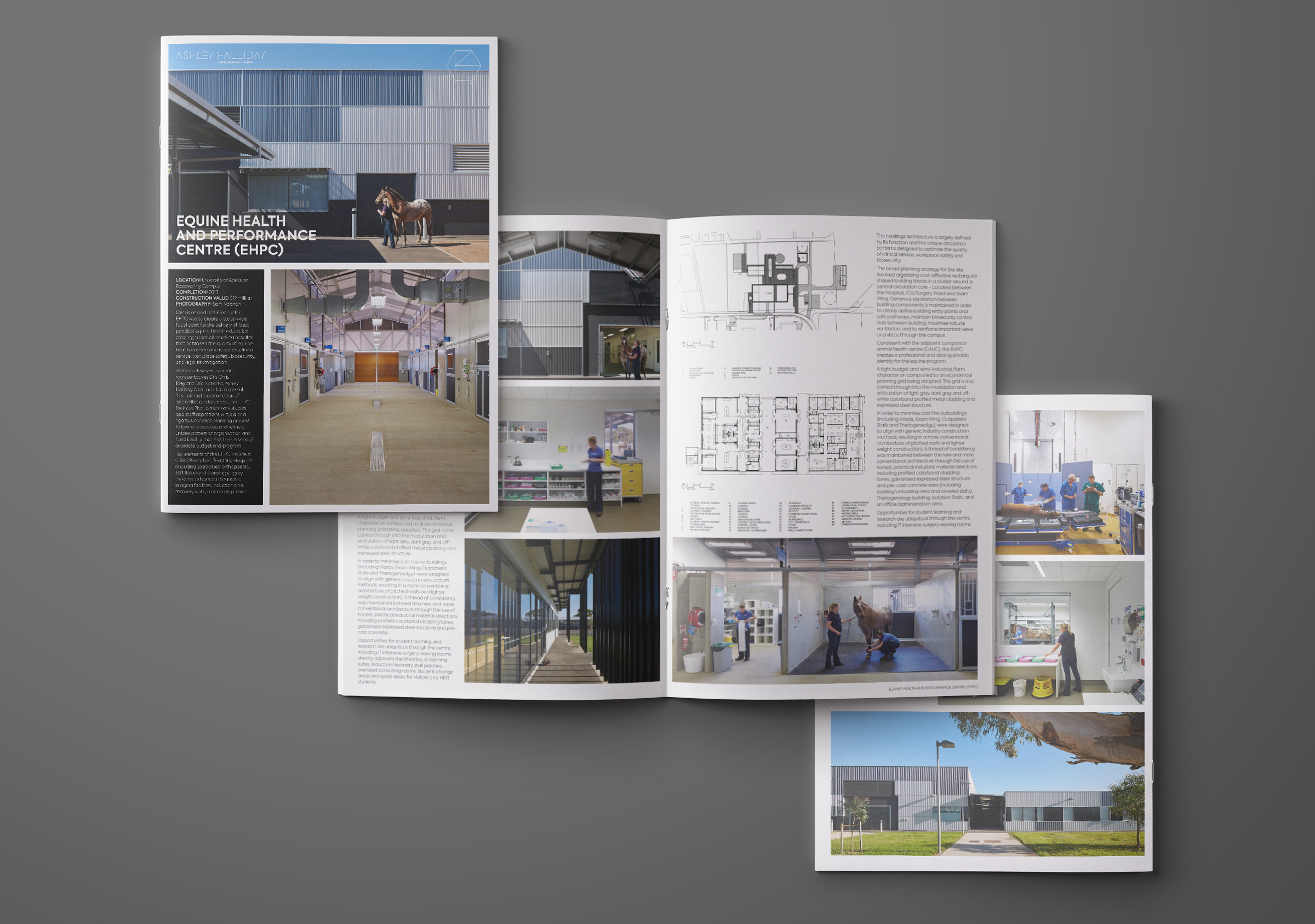
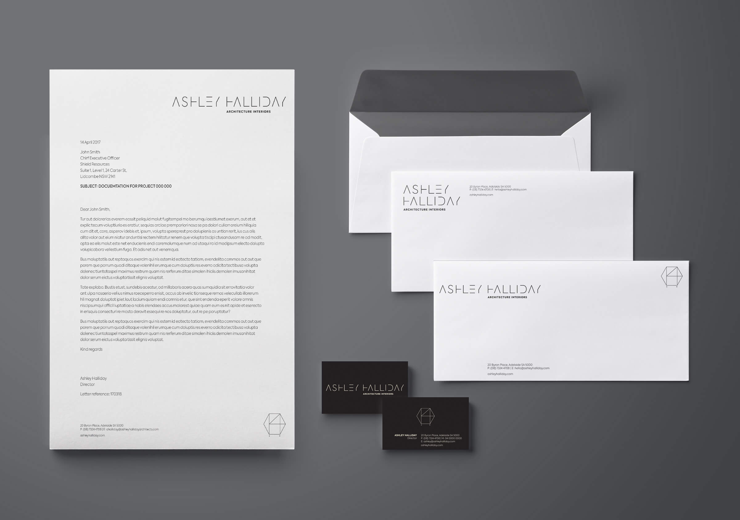
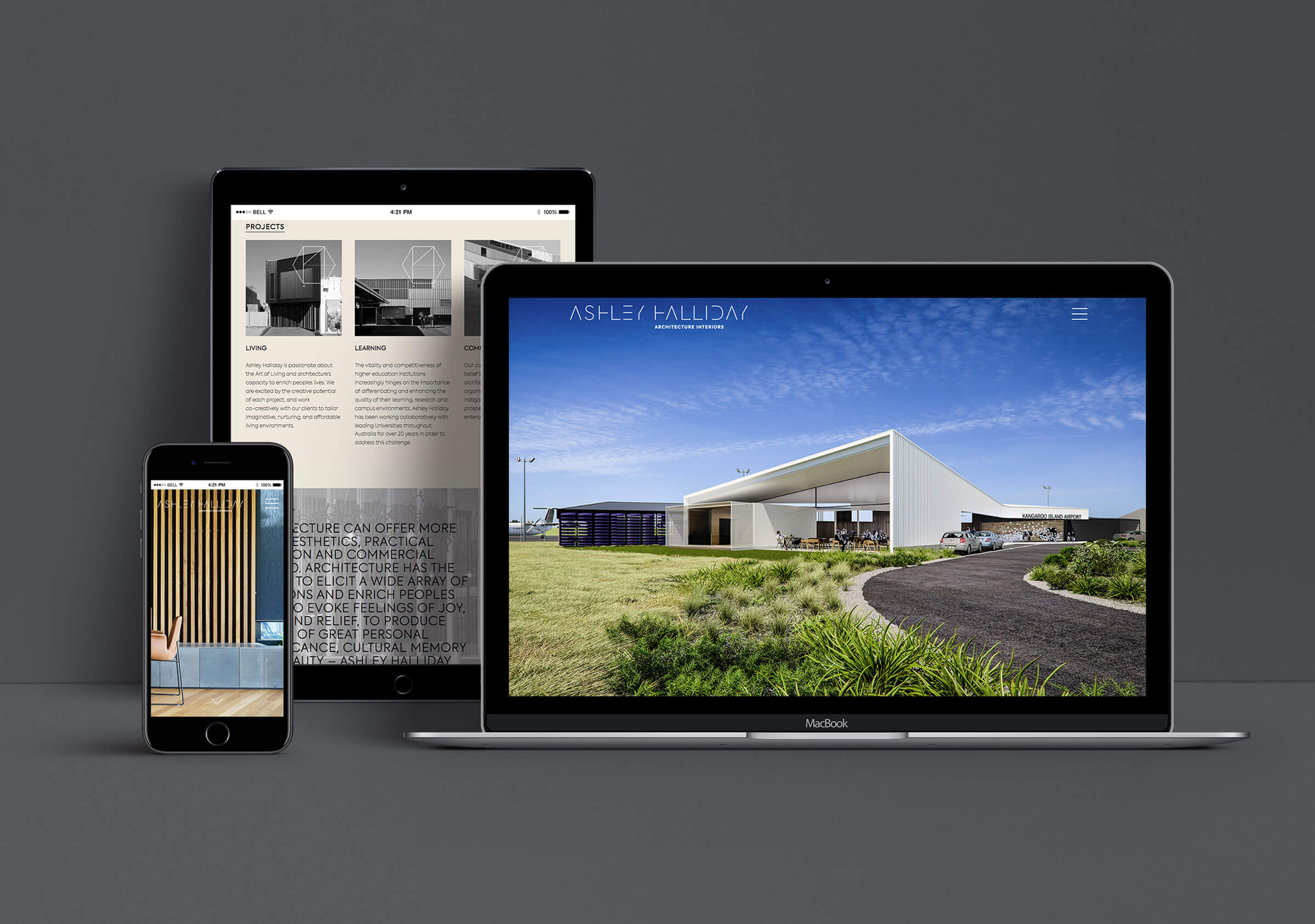
Brand identity, naming strategy, website design and communication collateral for Ashley Halliday Architects.
Our work before brand with this South Australian practice began with a detailed review of the company’s engagement methodology. Through this we were able to gain insight into the architectural commissioning process, the specific client segments and demographic and get a nuanced understanding of the key value indicators leading to commissions. Through this we were able to confidently steer a course away from some well worn design and communication conventions proliferated through magazine culture and which proved not to be useful in this business scenario. The focus on relationships and reputation being the primary intent.
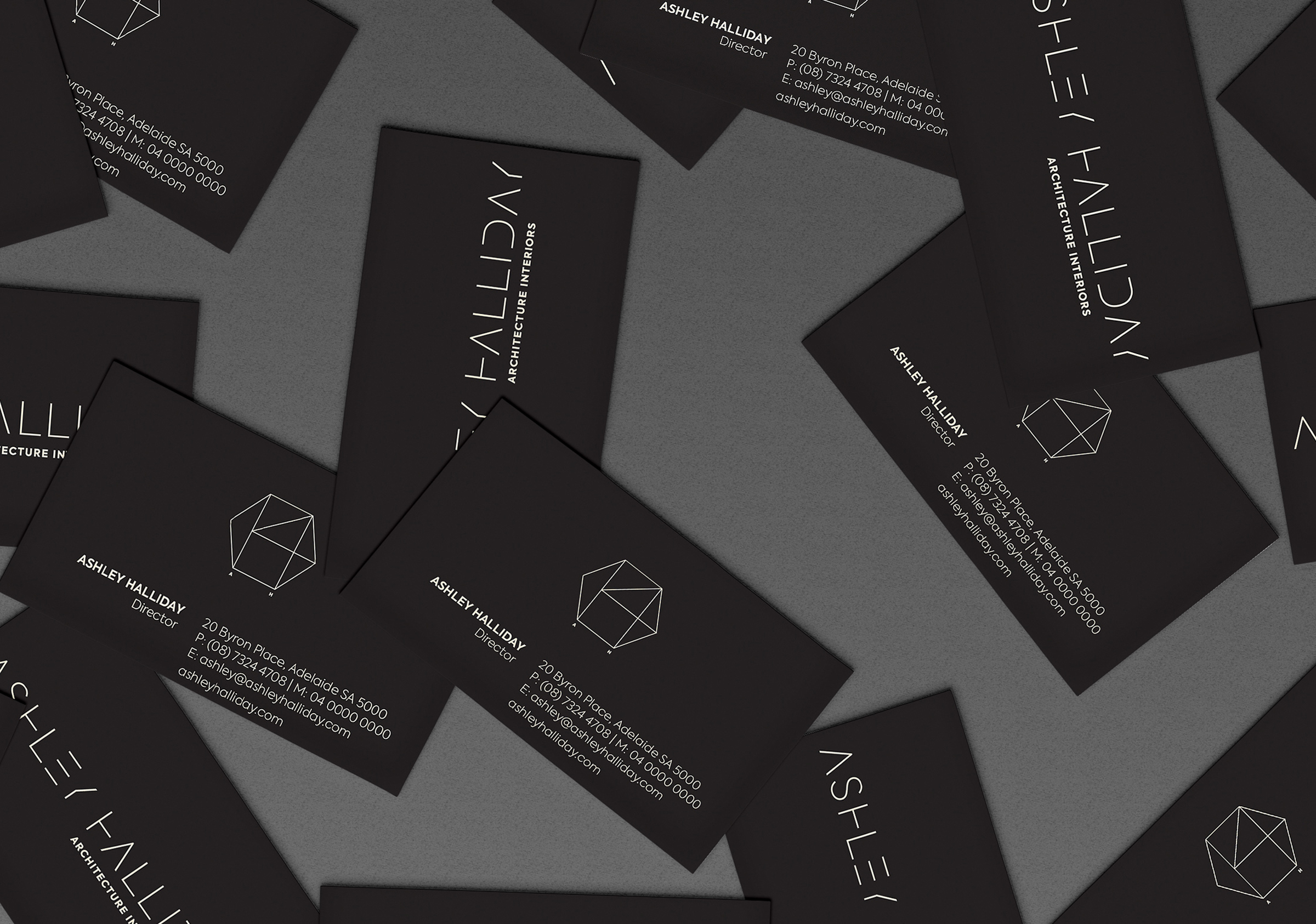
Brand is often just about capturing and communicating the value in the business. With this practice their very considered methodology, the depth of engagement with clients and their detailed aesthetic led us to the crafting of a mark and logotype that embodied and communicated these characteristics.
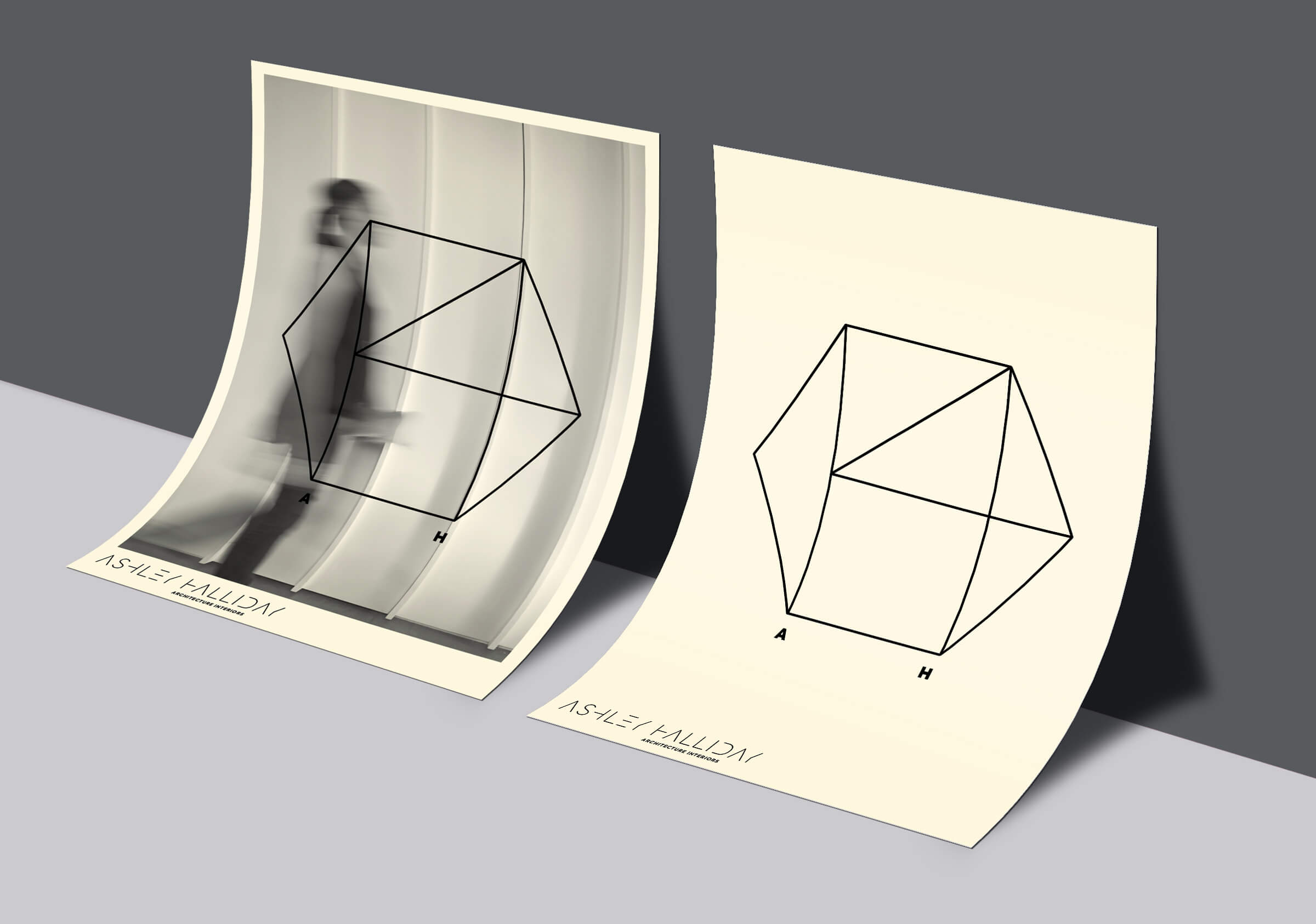
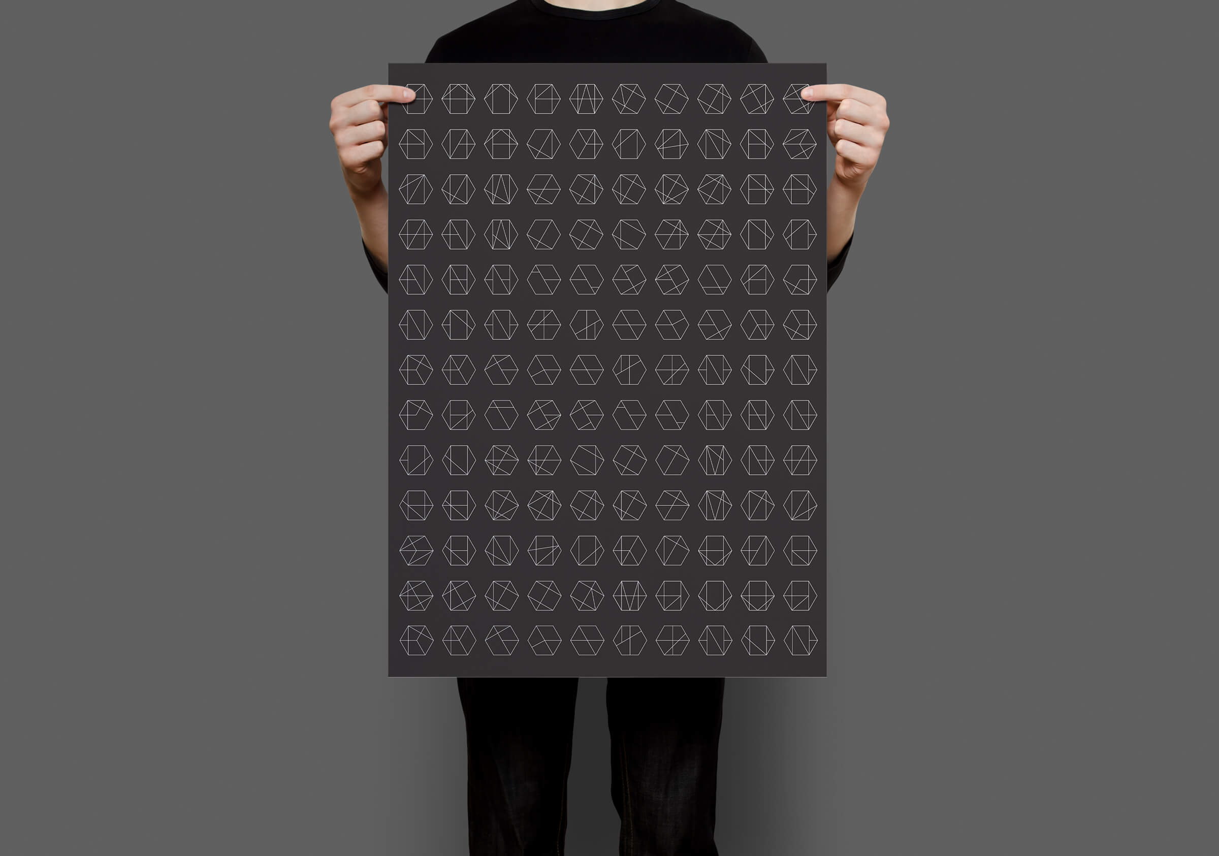
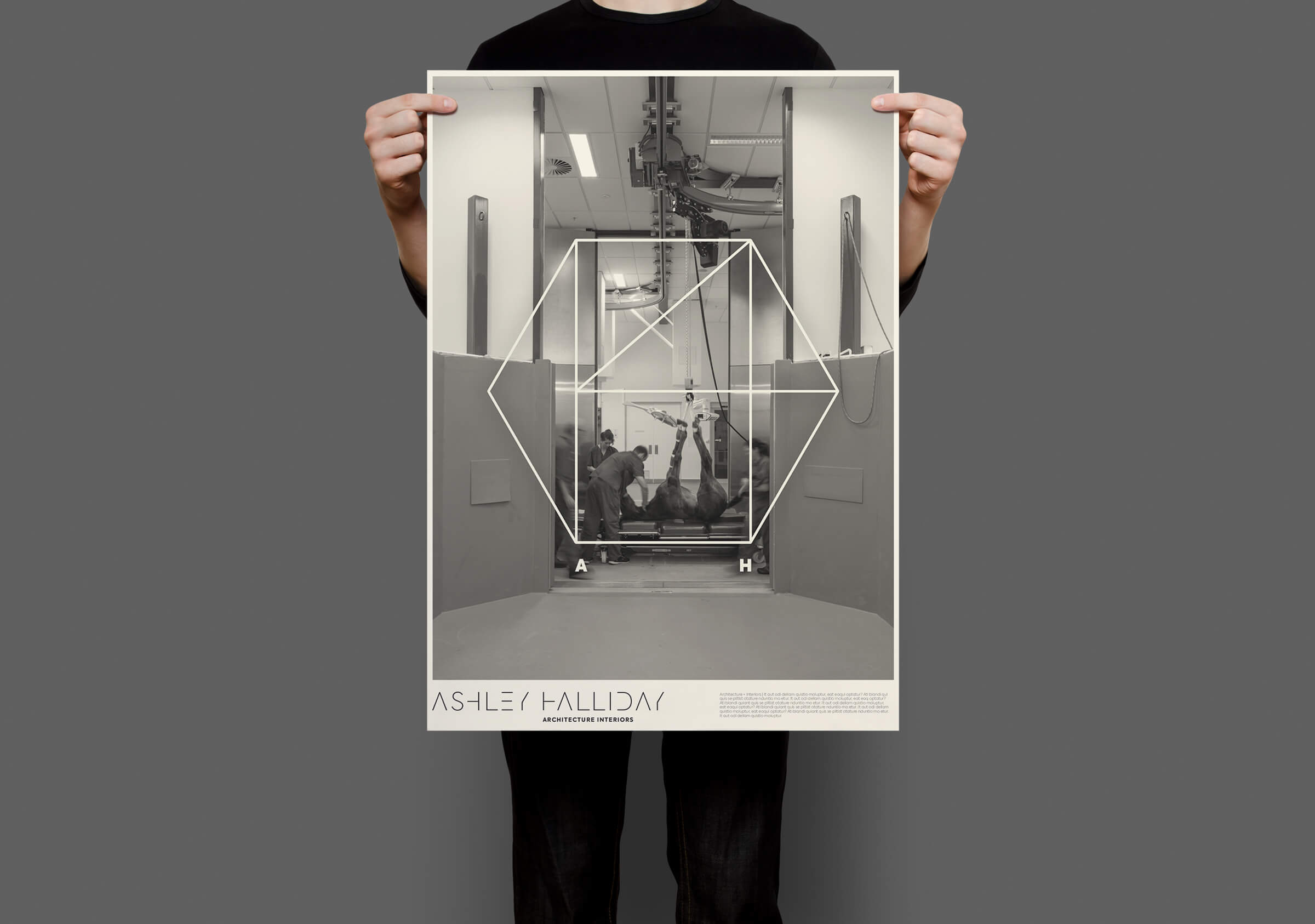
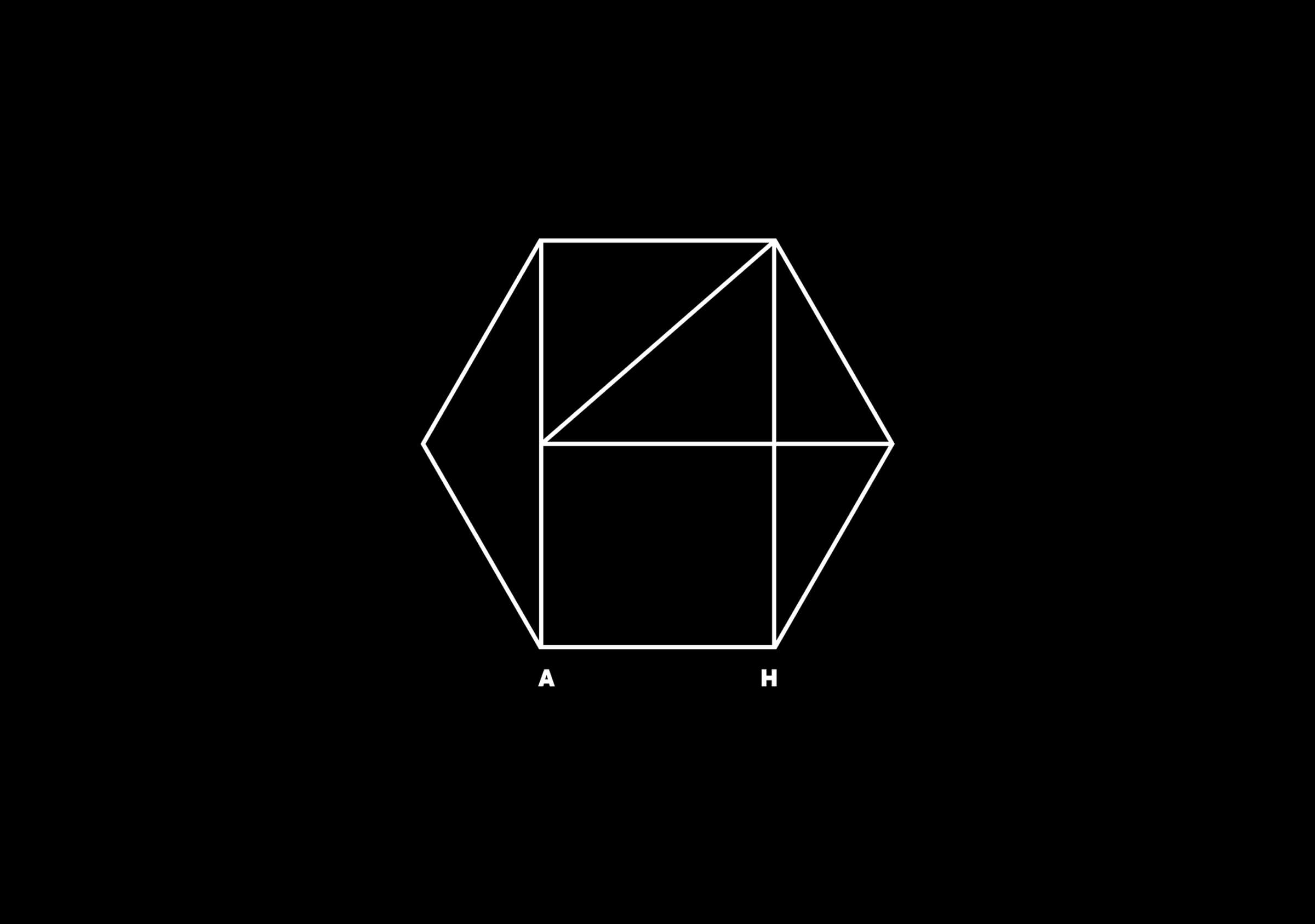
With this aesthetic in mind and drawing on the vertical, horizontal and angled lines in the business name we devised an octagonal mark comprised of a set of variable, internal lines. Through experimentation and a process of recombination we generated a vast suite of 64 closely related symbols – one of which was elevated for use in the brand identity. This process and outcome was then used to guide the development of a unique namestyle for the business building a coherent and shared aesthetic. The resultant visual language was then used in the creation of a website and collateral for the business.
The value in this work is in its ability to project an awareness of the depth of consideration taken by the practice in the development of award winning architectural responses. For a practice that has built a reputation on rigorous thinking and a vigorous and minimalist design approach, a potent and gestural brand identity was imperative.