Karatta Wines
Brand identity
2016
K-Range branding
Progressive design for a entry level wine brand profiling stories from the Woods’ family and Robe farm.
Entry level range brand for Karatta Wines.
A premium brand will set the benchmark but an entry level range brand unequivocally has to do the heavy lifting. Has to get out there, establish sales volume, reach a wider audience, make them feel at home with the wine, the business and the people behind it. It has to deliver value on a budget.
With this clear mandate in mind we set about working through a clever approach to deliver a second stunning range on a budget. Emerging from our work before brand with the client and team we had been privileged to gain insight into the family history and the operation of the farm. It’s often the case that it requires someone from the outside to recognise something that we see every day and take for granted and just can’t see the merit within. An so it was with the Woods’ family history. We presented a case to open the lid on their archives and stories they thought to be everyday but came to see how it created a compelling portrait of the brand. This is brand and meaning making at the heart. It was clear we had an opportunity to generate a forum with the labels to share a range of stories. Drafting a wide range of anecdotes and historical snapshots we refined these into a series of compressed narratives each capturing and conveying some fantastic perspective on Karatta – their farming and viticulture operations and their long association with the region.
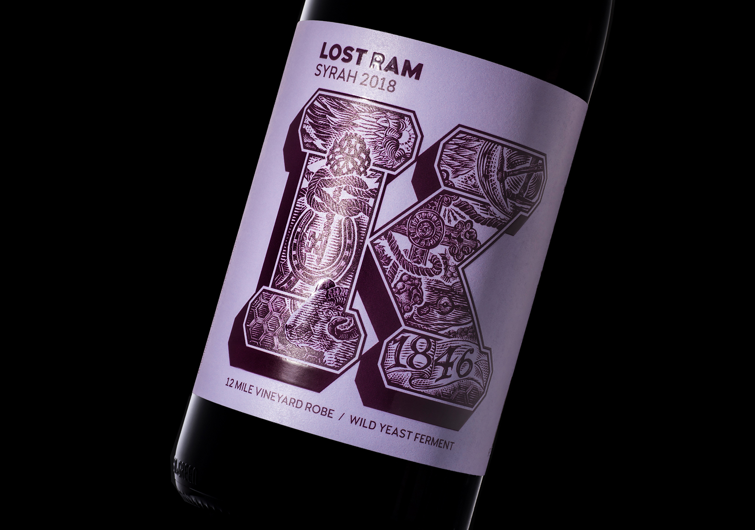
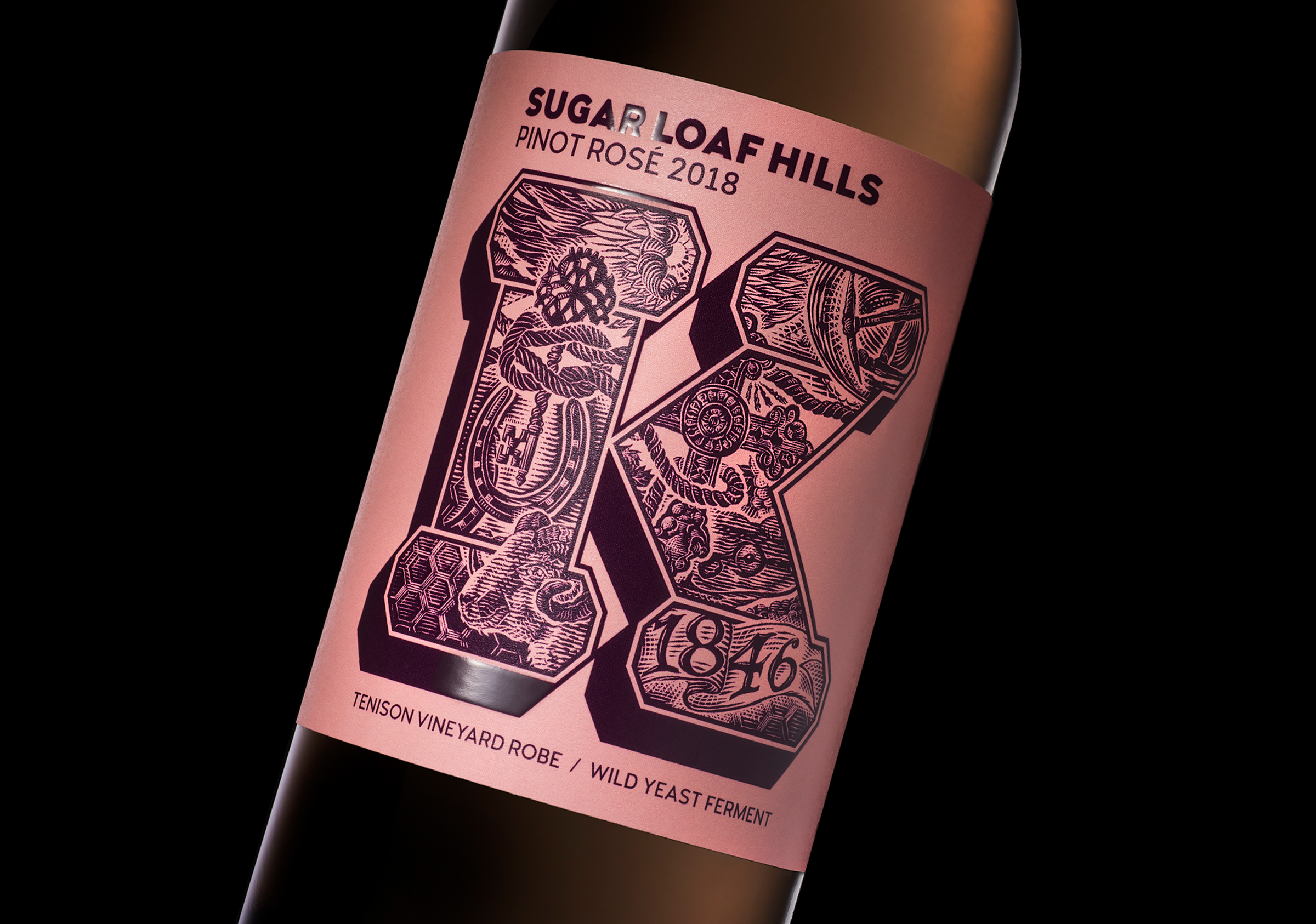
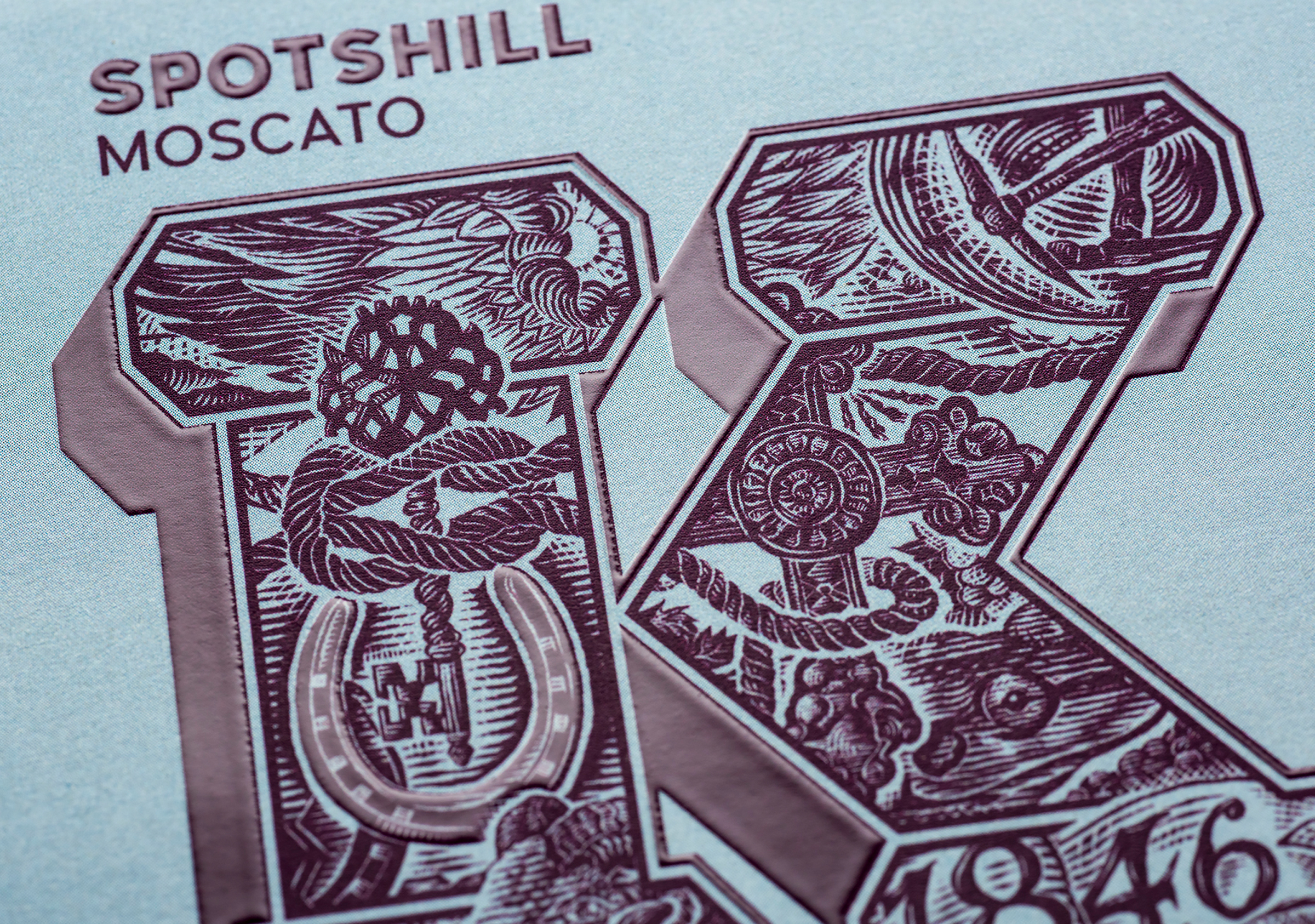
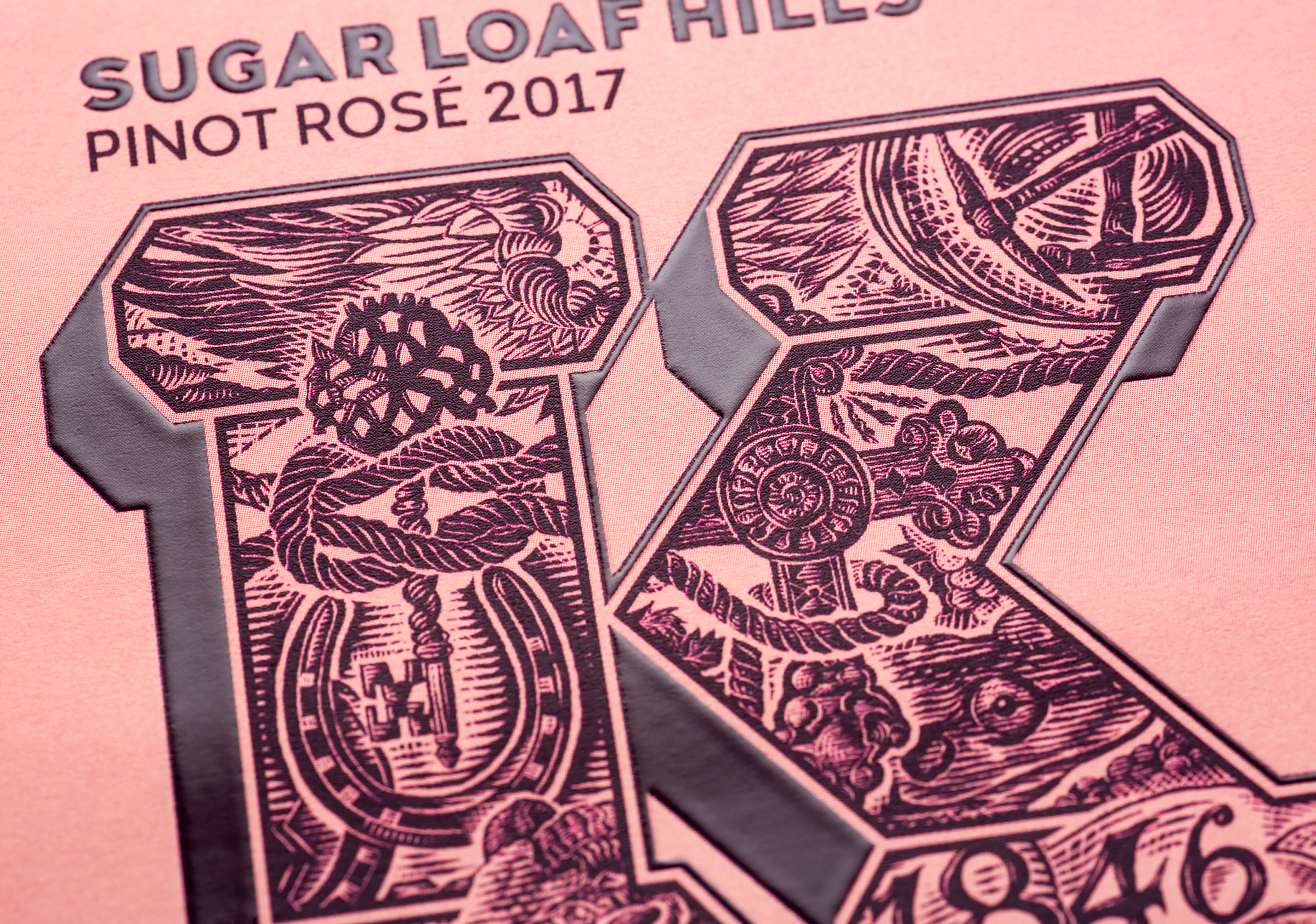
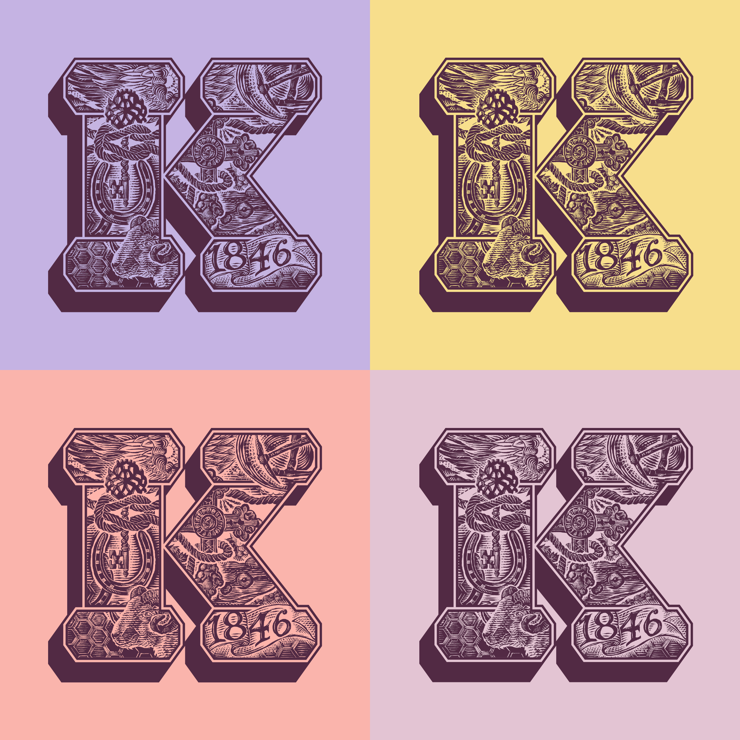
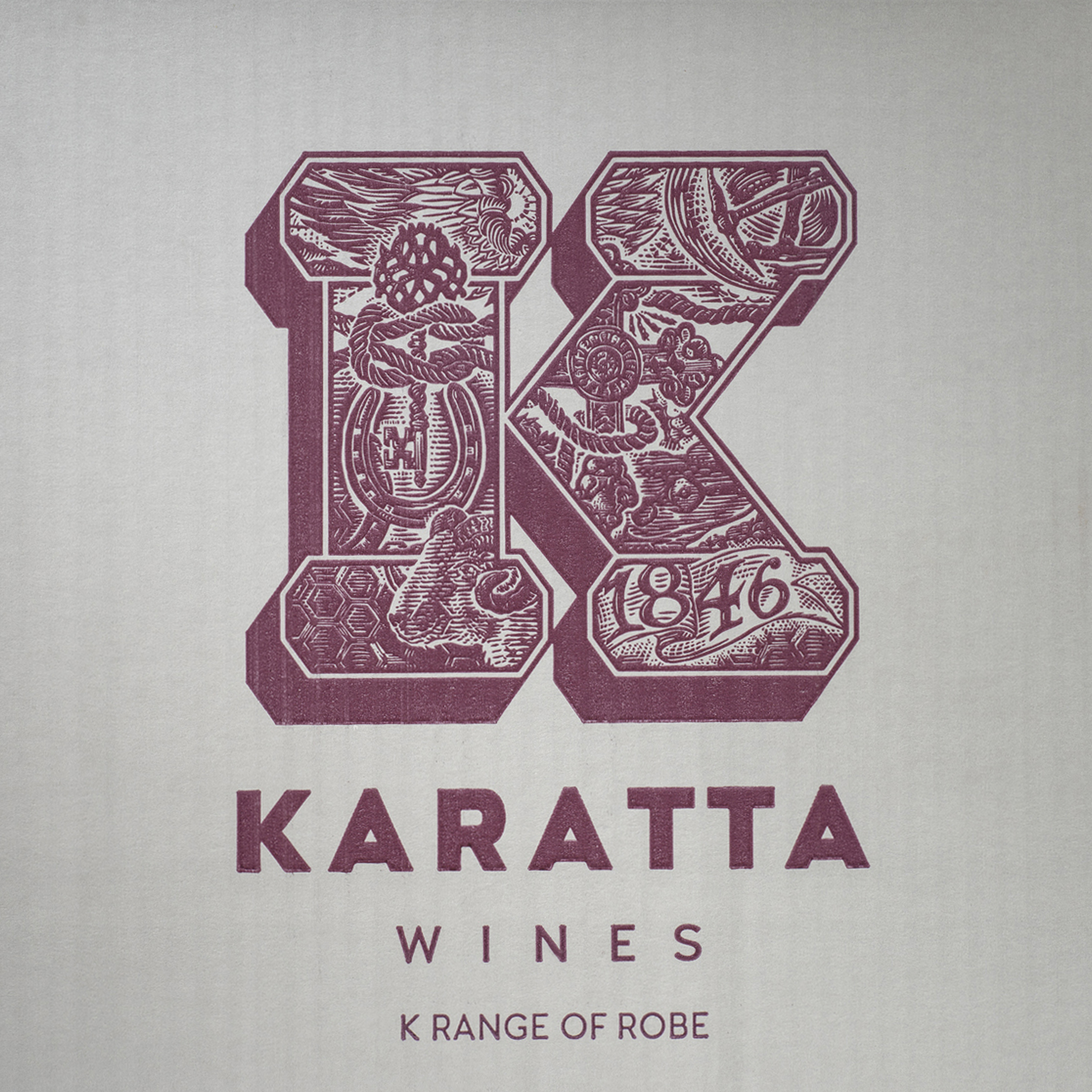
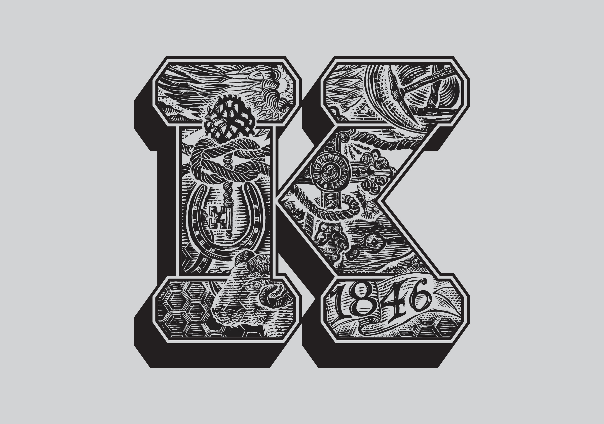
Talented illustrator Anthony Chiappin having just completed the Wildflower illustrations was engaged again to bring to life through authentic scraperboard a part of the region. Our strategy to deliver this range on budget was to develop one master image that linked to a range of narratives through a series of symbols, glyphs and imagery all contained within the one label. Each label was to have its own colour, name and story. The bright, gelati inspired colour scheme evolved through much debate and was intended to bring a vibrancy and confidence to its shelf presence. It achieves this in a way that maintains accessibility but retains a sophistication true to the product and parent brand.
The result of these labels is a product range that brings lightness, colour and life to the Karatta brand. True to the aspirations of an entry level brand it delivers quality whilst contributing new dimensions to the brand story for Karatta. Each label both a testament and window to another part of the colourful Karatta story.