Don’t forget the wine
Brand identity
2016
Modernising an existing mark
Expanding a brand story through a whimsical gesture.
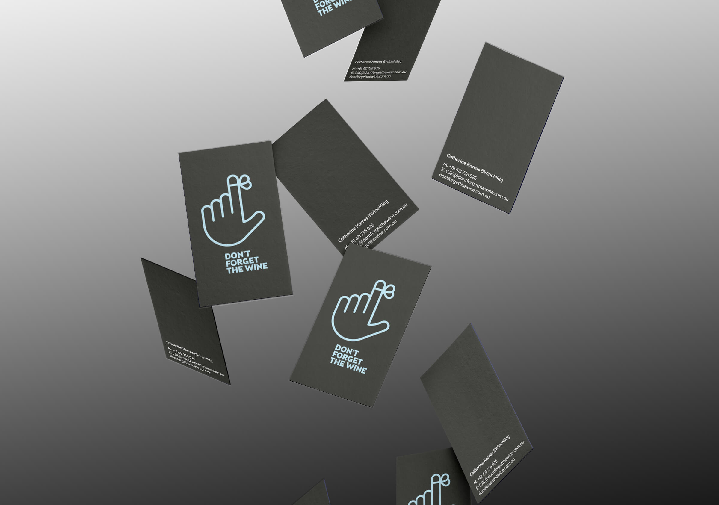
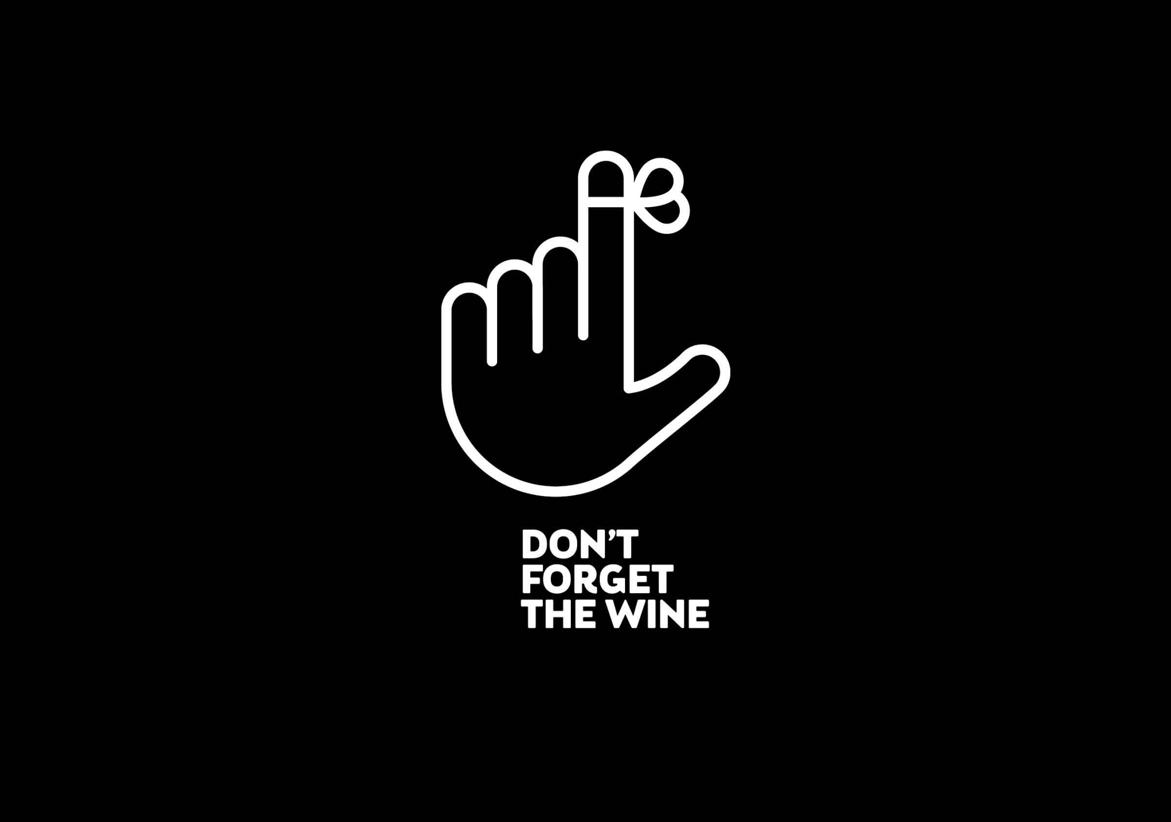
Brand identity for, hmm who was that? Oh yes Don’t Forget The Wine.
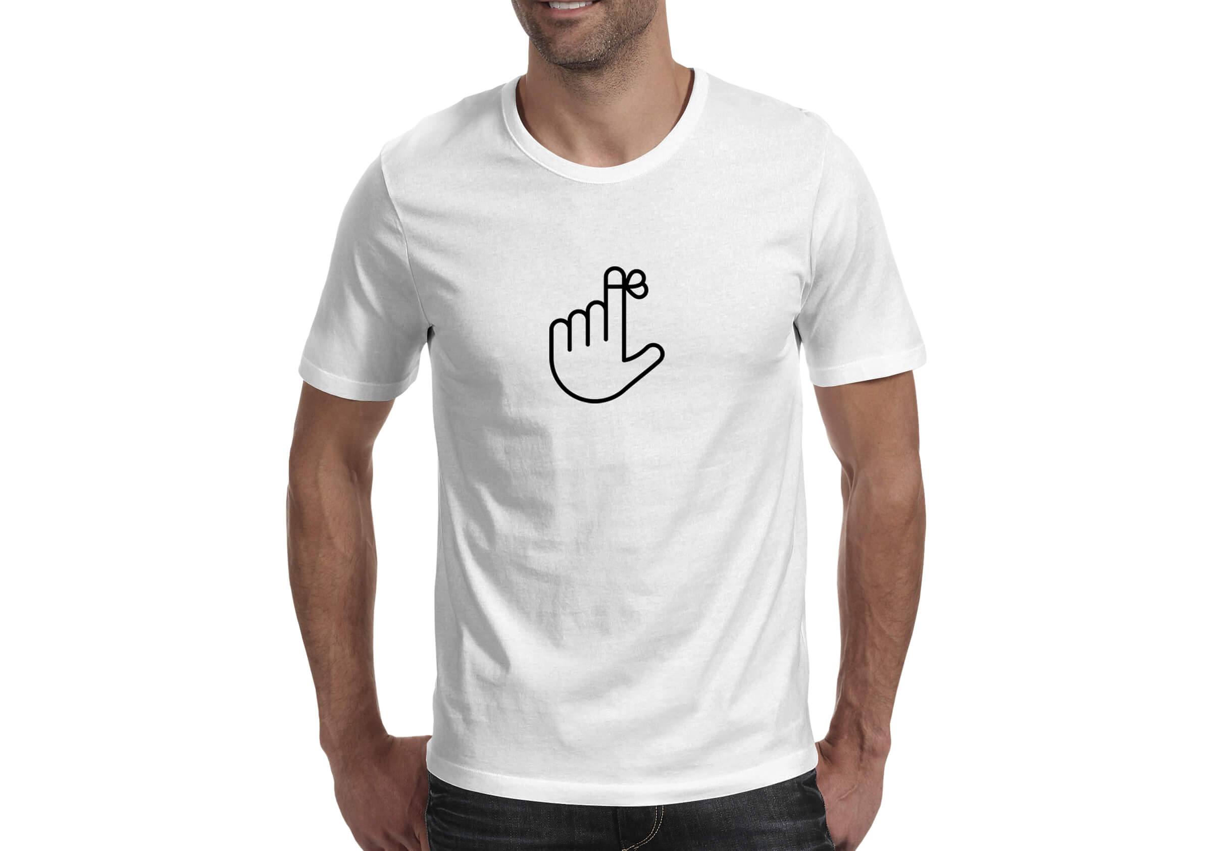
This bespoke identity for international wine marketing consultant Catherine Karras modernises an existing mark conceived of by the owner. The string tied to the finger draws on a well known mnemonic device used as a memory trigger. We expanded the brand narrative to include a suite of 9 marks in total. Each of the additional 8 marks in the suite infers a new audience and new conversation by co-opting a familiar hand and finger-based gesture (not all of them polite).
Each gesture is idiosyncratic, invokes a particular character or set of circumstances and suggests in their own way that they too will not forget the wine.
The restrained and modern line aesthetic draws on a design style familiar to contemporary audiences and utilises a strategy familiar to arts based organisations – prioritising the presentation of the artist by relegating the brand to a secondary function. In this case the wine is foregrounded and the intended hero of all communication. All hail the wine.