Max Services
2015-2021
Can-do capability
Defining the value in the business and seizing the opportunity to reshape an industry through brand.

Golding Wines
Brand identity
2001-2020
Straight from the market
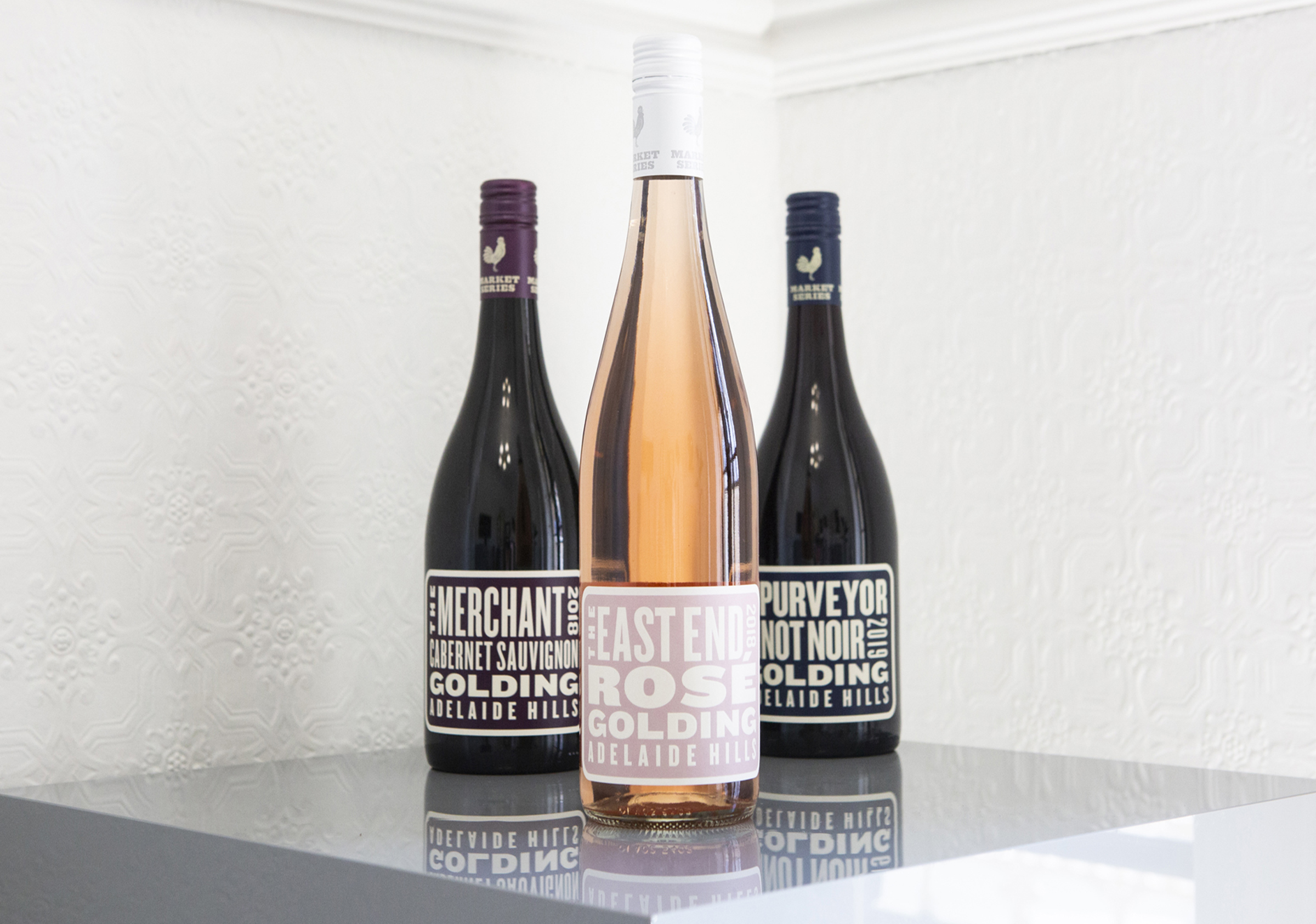
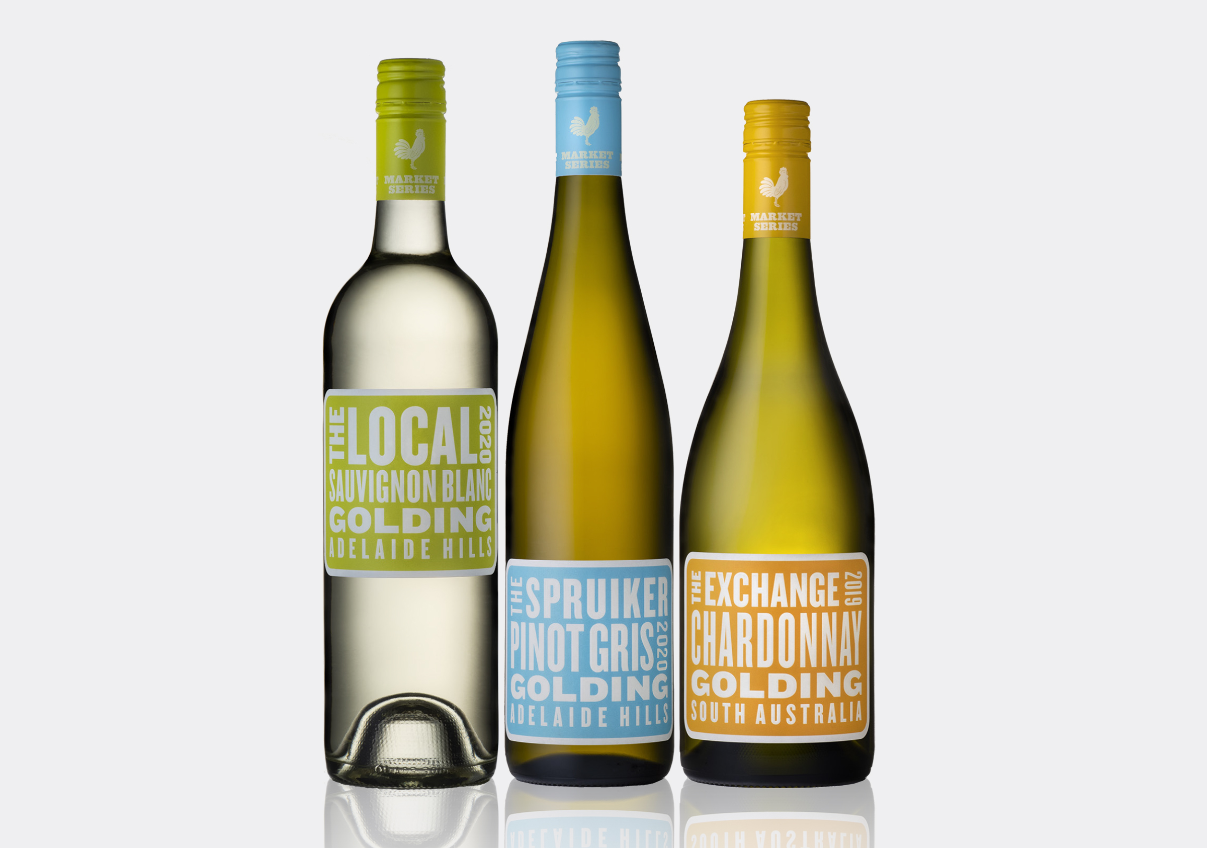
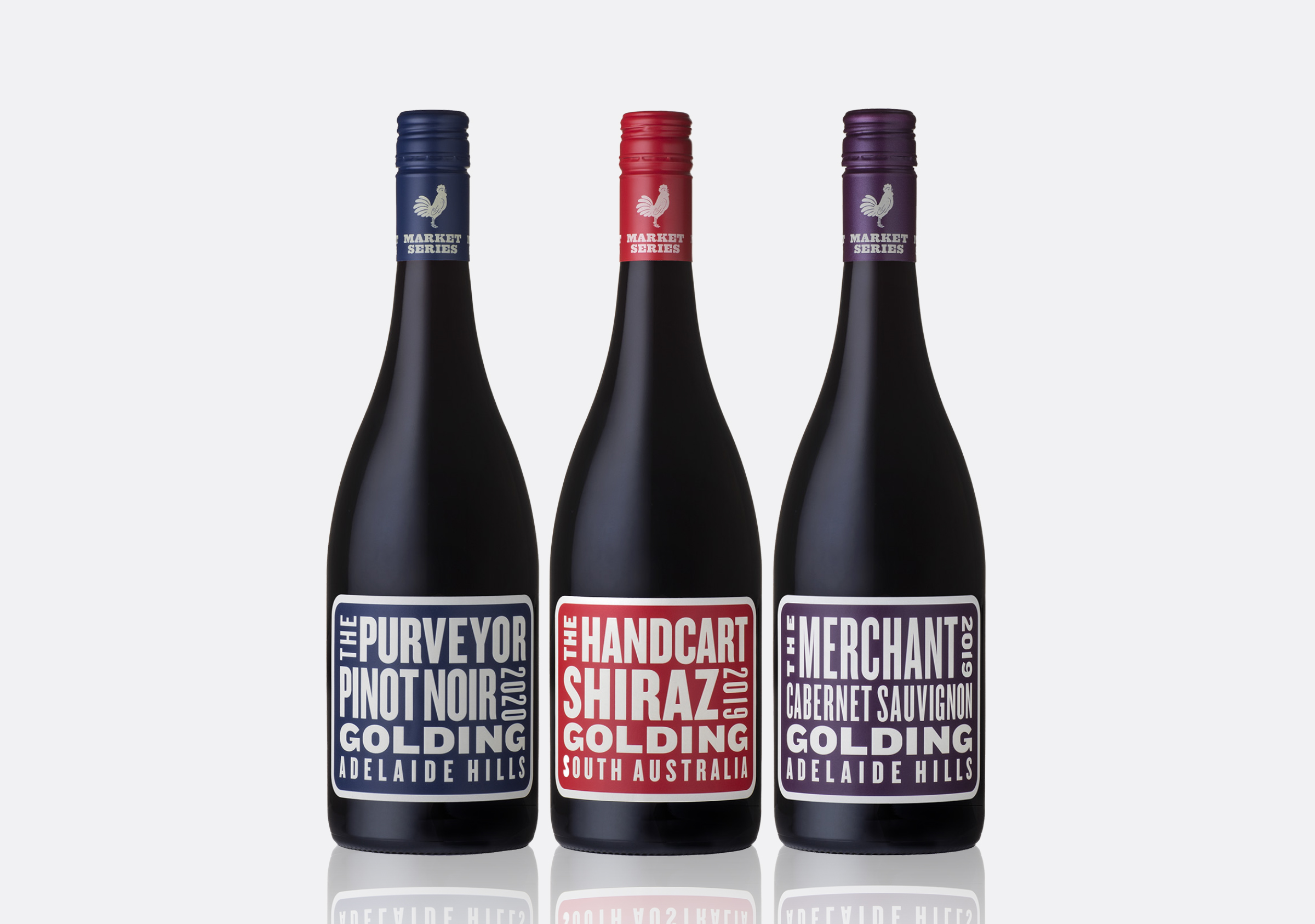
The Market Series range branding celebrates the early market trading of the Golding family.
Product branding for the quirky end of Golding’s single vineyard varietals.
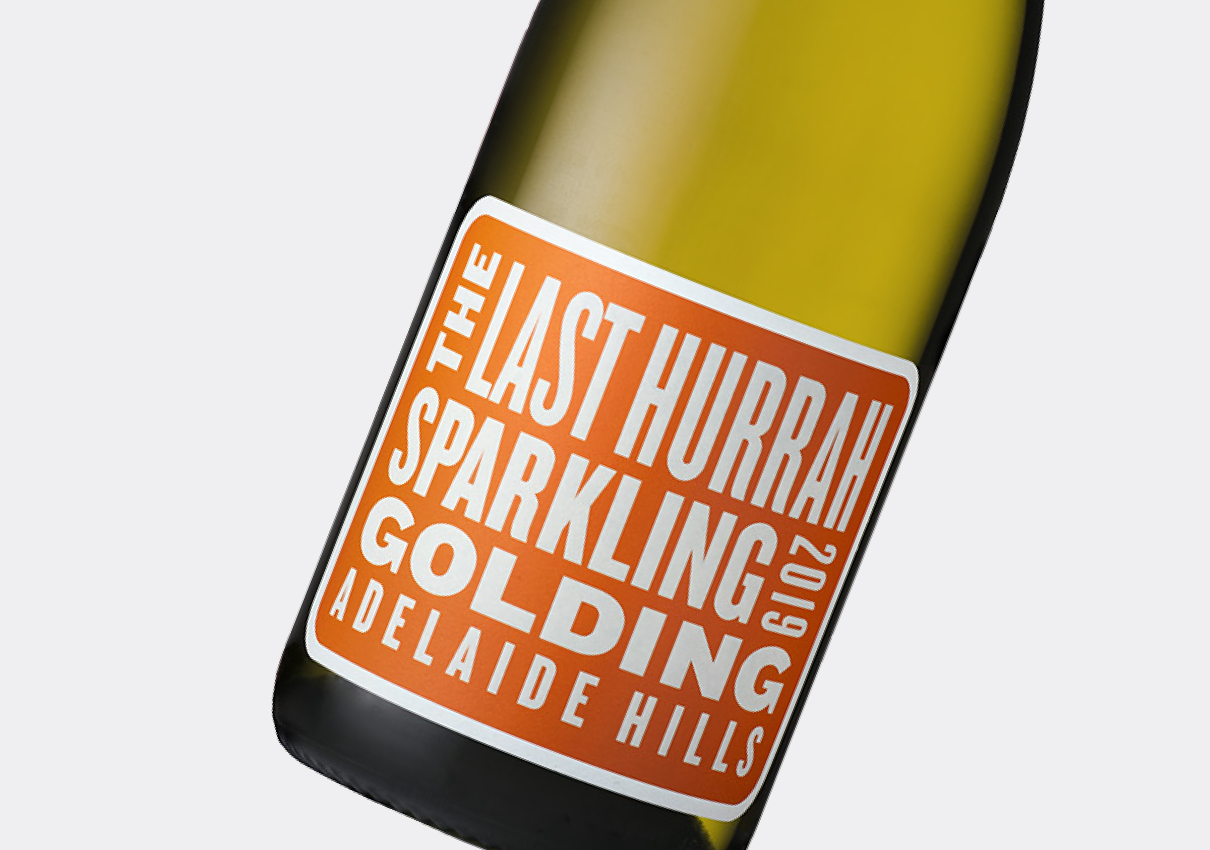
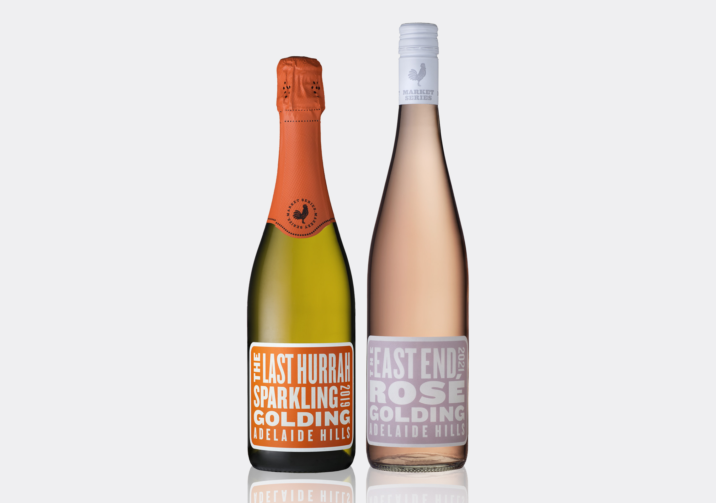
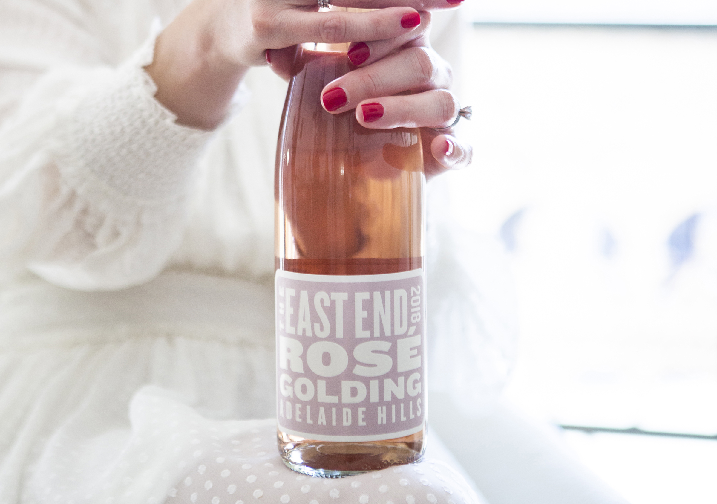
The labels for the Handcart Shiraz, the Last Hurrah Sparkling and the East End Rosé each feature an original typographic composition inspired by the early market posters and stallholder branding in Adelaide’s original East End Markets. The concept for the wine packaging celebrates the early market trading days of family patriarch Greg Golding whose agricultural background informed much of the viticultural expertise employed in their premium vineyards. The overstated varietal branding conveys the quirky, uncomplicated nature of the wines.
The labels have been instrumental in communicating a sense of the Golding’s family values which are integral to the brand and their commitment to winemaking that expresses a sense of place and connection to the land.
