Max Services
2015-2021
Can-do capability
Defining the value in the business and seizing the opportunity to reshape an industry through brand.

Karatta Wines
Brand identity
2016
Wildflowers Range brand
Progressive design for a premium wine brand profiling endangered flora of the South East coastal hinterland.
Premium range brand for Karatta Wines.
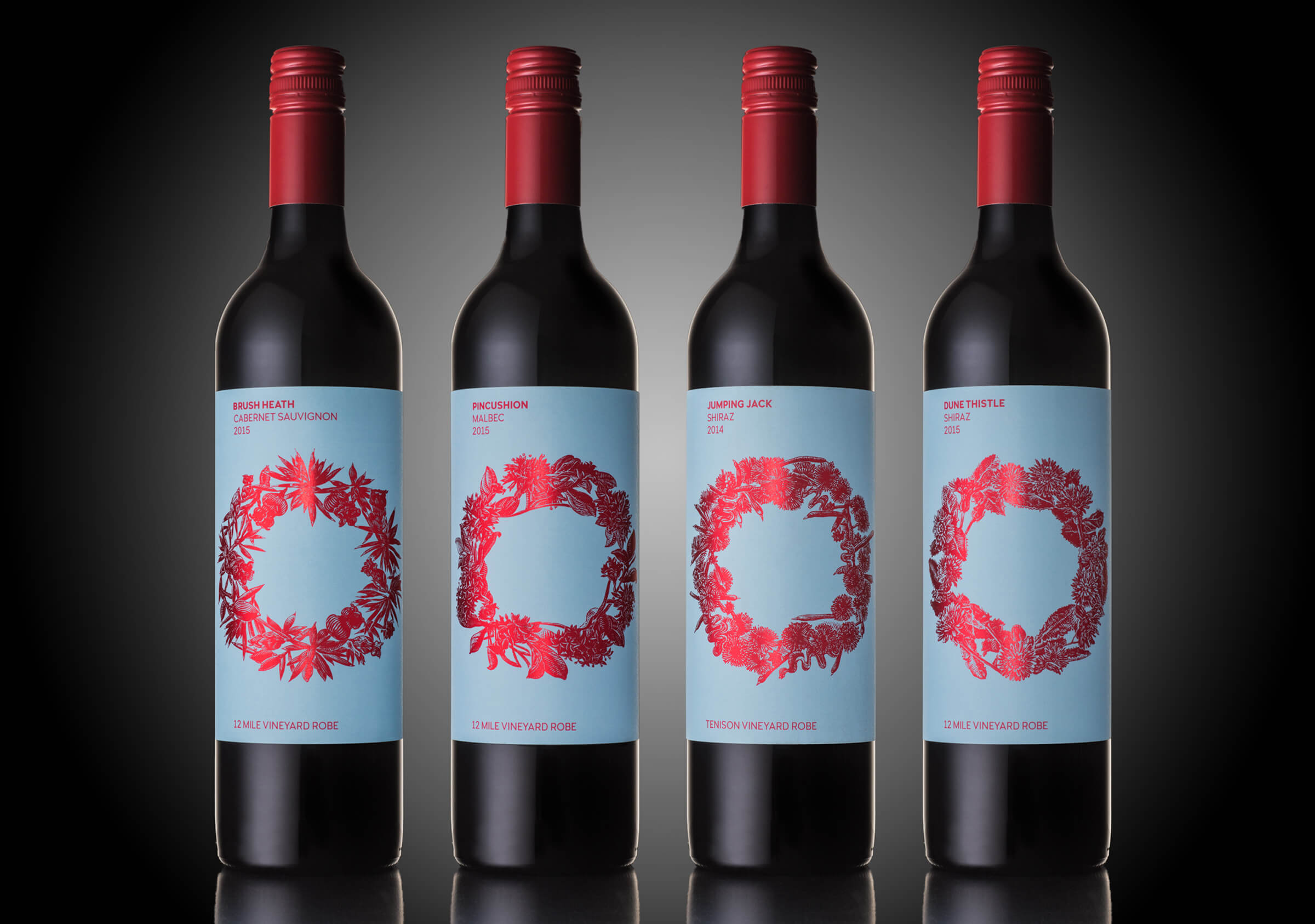
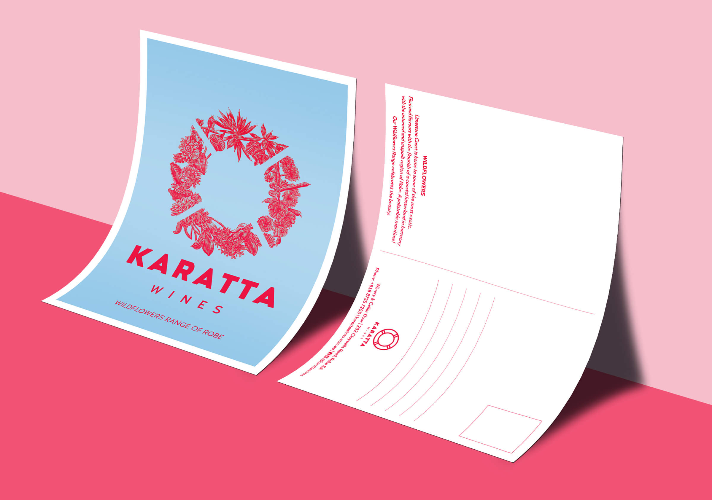
Following closely behind the launch of the Karatta brand we were tasked to deliver the range branding for the flagship Karatta Wildflowers range. Typically a premium brand will lean towards the understated aesthetic to convey a position of refinement, sophistication and restraint and while these labels do that in parts it had to do so much more. The brand for Karatta had the clear objective of rekindling loyalties and winning new hearts. To do this requires high levels of visibility and a package that was evocative and memorable.
Our minds turned early in the process to the amazing coastal hinterland – this wild and windswept coastline of the Robe region and the Karatta vineyards in behind it is situated in some of the most beautiful environments. The flora throughout this area also is very special with a number of rare and endangered species. And this was the genesis behind the Wildflowers Range. To capture and promote this fragile environment.
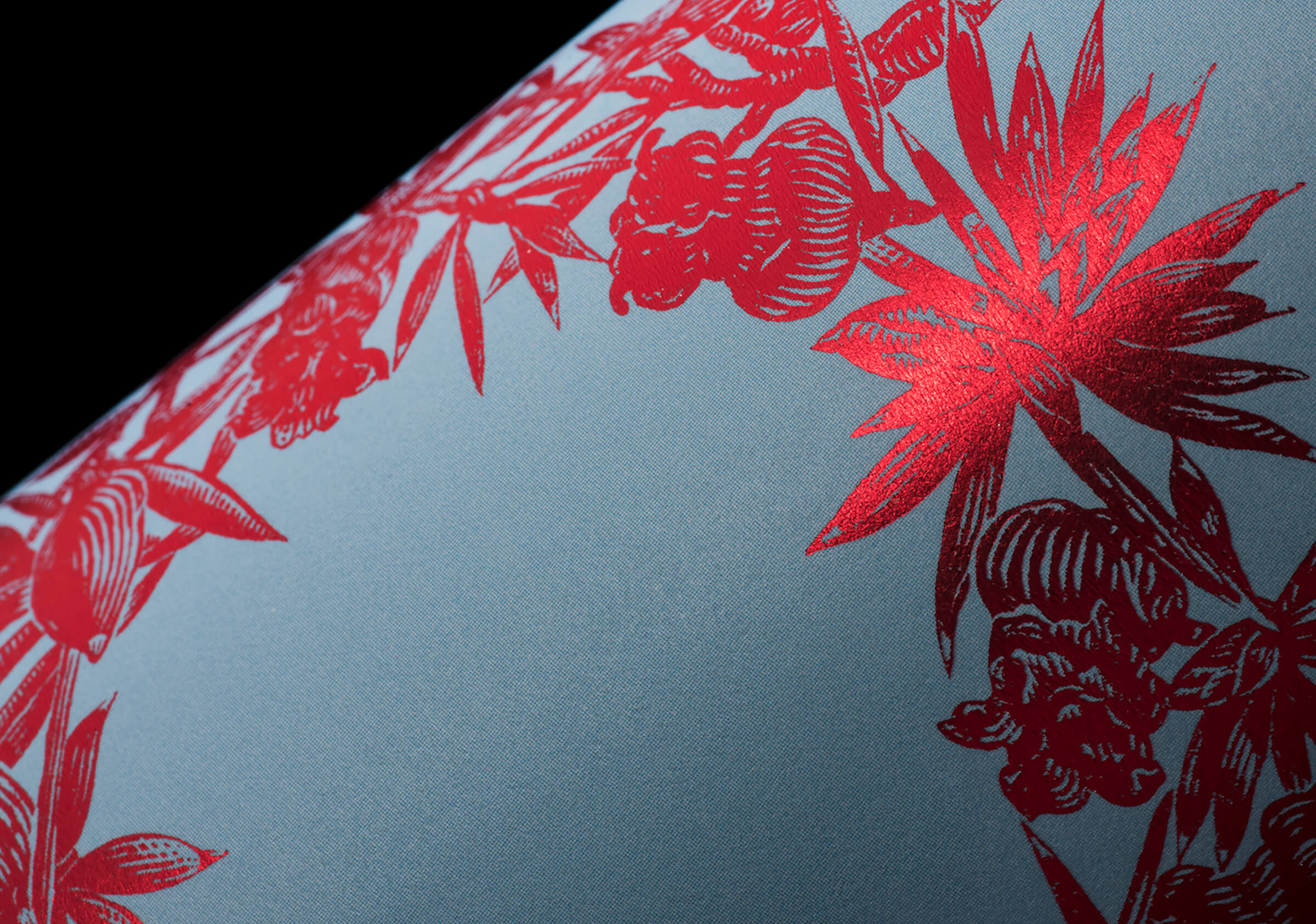
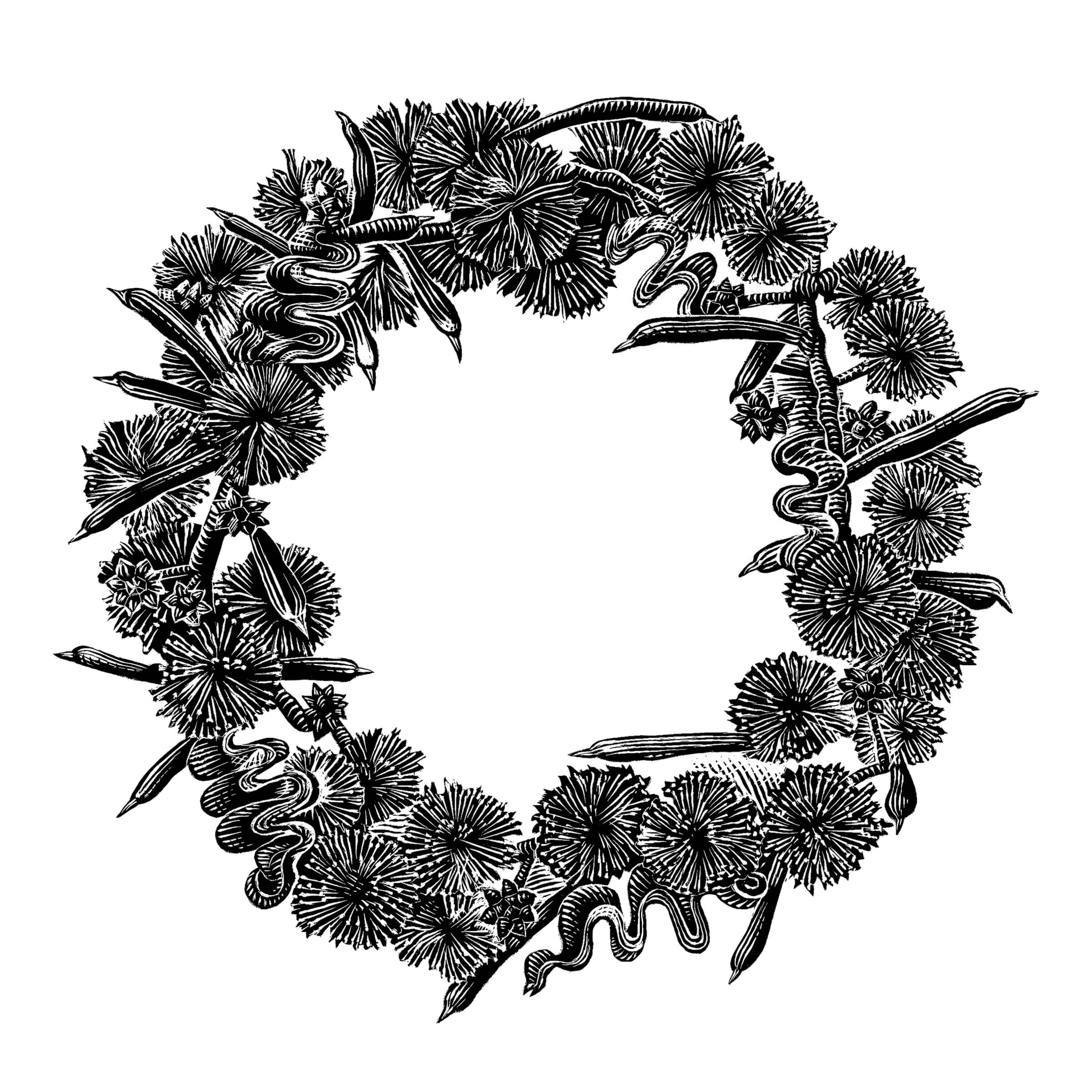
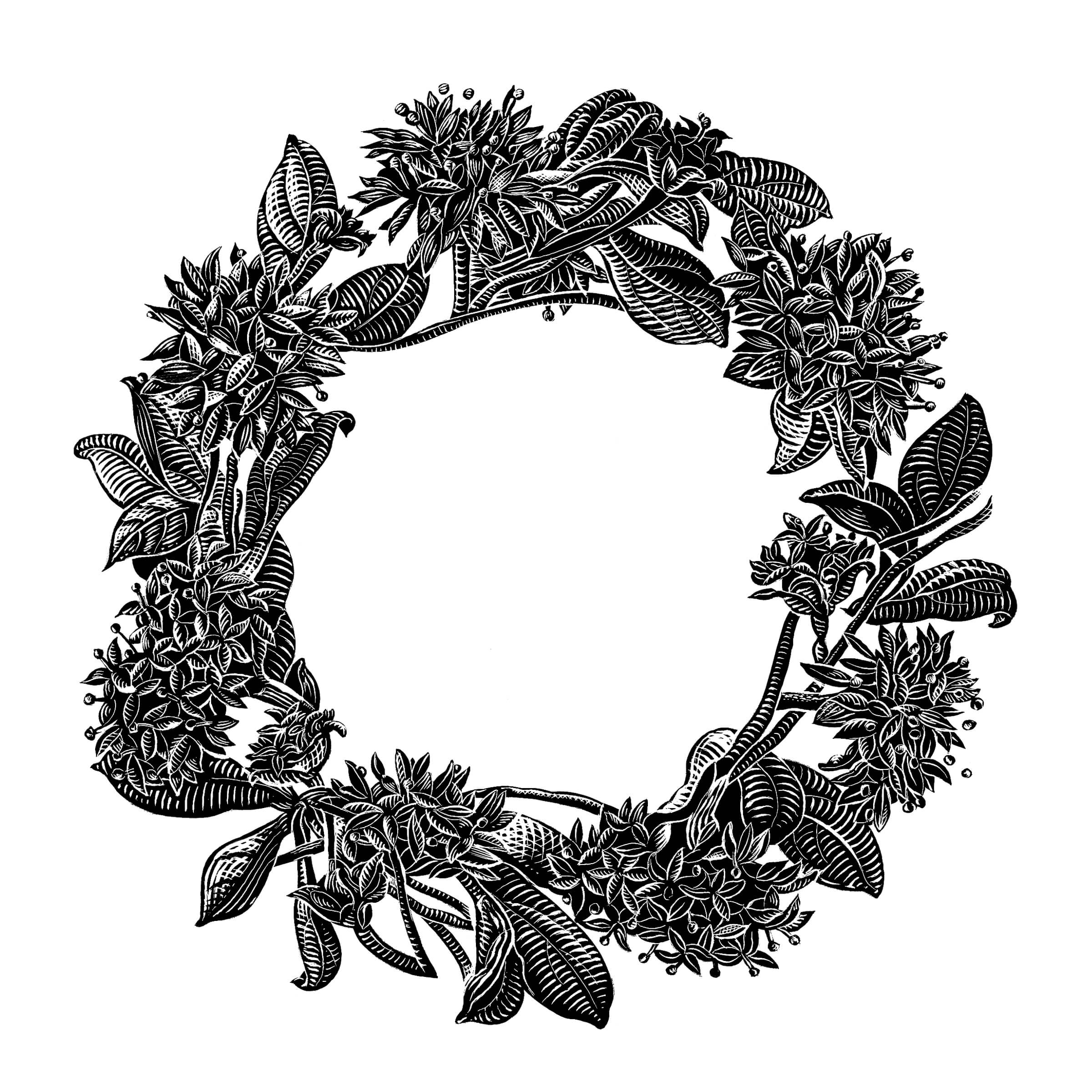
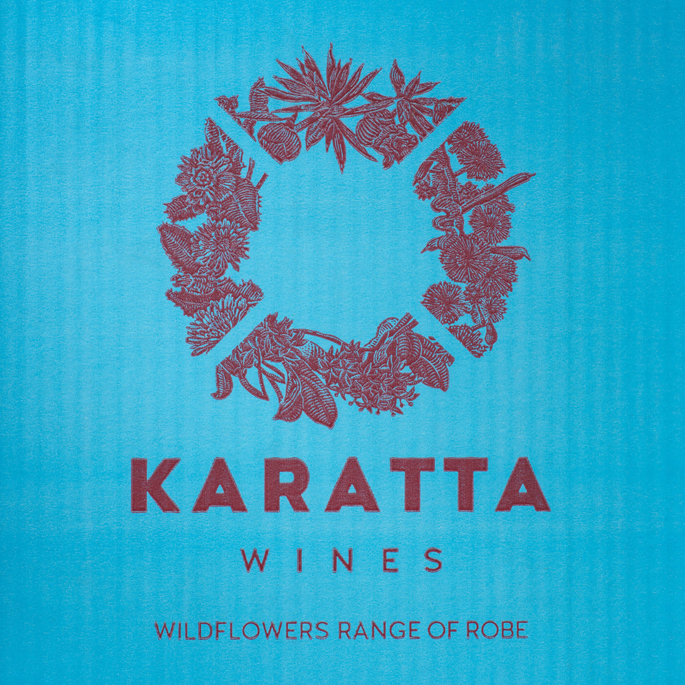
Our simple conceptual approach aimed to honour the elegance of the wines by crafting a wreath like shape from a range of flowers reflecting the form of the life buoy icon of the Karatta brand identity. To bring the sophistication and authenticity we required we sought the involvement of master illustrator Anthony Chiappin to create the series of original scraperboard works that would then be reproduced in a bright red metallic foil set against a matte label finish. Every stroke of these illustrations is painstakingly crafted by hand working through a series of developmental sketches bringing more and more detail into focus through many hours to the finished works.
The result of these labels is a powerful visual that reflected the quality of the product and the commitment of the owners to reignite a brand. As a testament to the power of these works within a week or two of their release the winery began receiving requests from restaurants and other outlets to stock their product. When queried all stated that it was the sheer beauty of the labels (as well as the quality wine) that had captured their interest. Noted too was the fact the product would be valued by their clientele and would reflect positively on their venue. Distributors local and national came on board too. Where previously they had noted a ‘lack of anything to sell’ – meaning no tangible story and therefore no relevance to audience – there was now a clear link to land, environment, region and people.
