University of Adelaide
Brand identity / Information design
2016
East meets West
Creating a new face for Traditional Chinese Medicine.
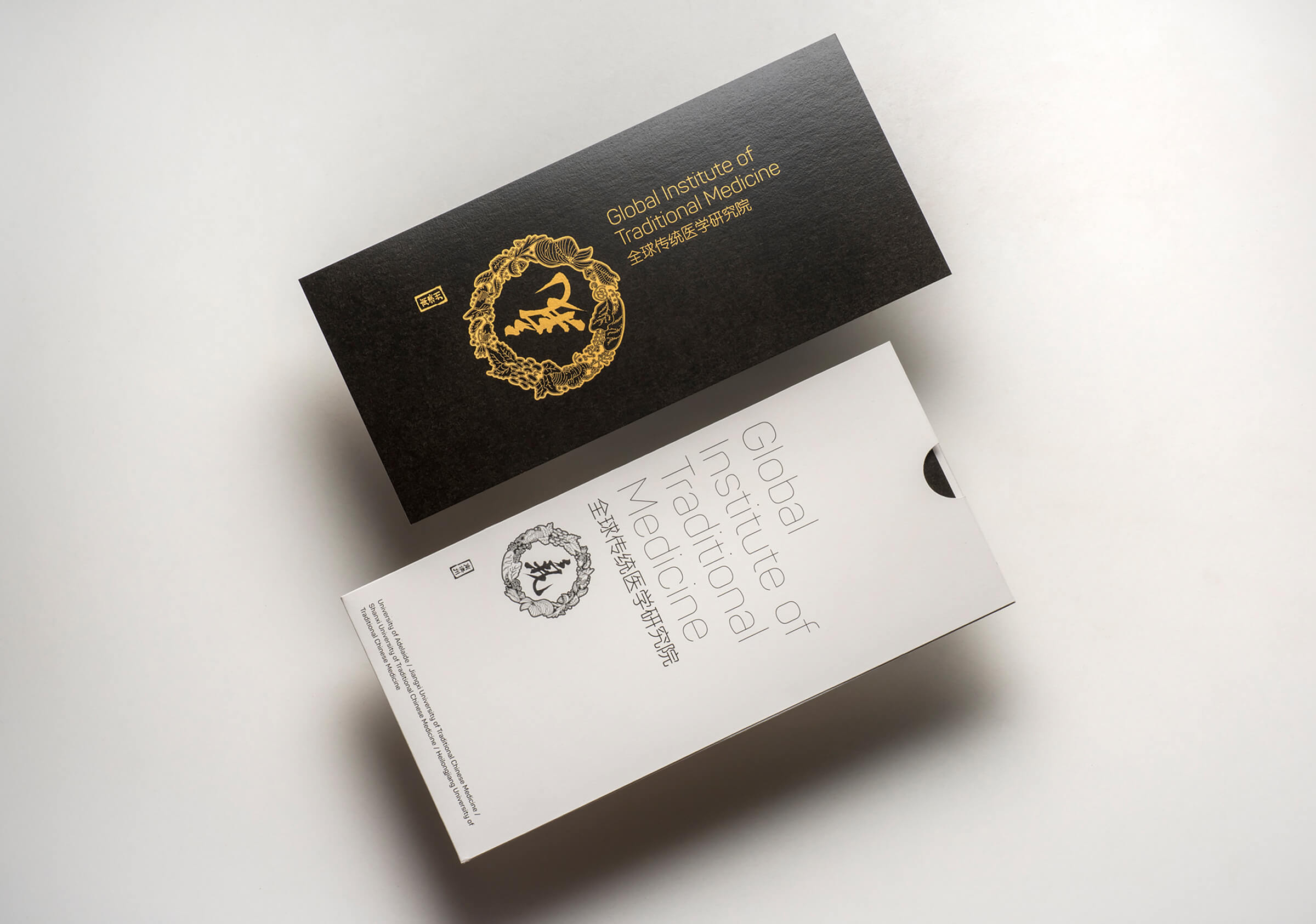
Brand identity for a joint venture project between Adelaide University and the Global Institute for Traditional Medicine.
We understood the requirements for this project very clearly from the outset: we were tasked to capture the essence of a millennia old tradition, resolve a progressive visual framework that would form a brand identity and ensure compliance, coherence and accessibility across English and Chinese culture. In a bold research venture the Adelaide University in partnership with the GITM was setting out to explore and map the molecular function that forms the basis of this traditional medicine.
Collaboration and consultation was key to the development and success of this branding project: working closely and seamlessly with the Adelaide University representative, their joint venture partner in China and in partnership with a Chinese culture and language professional in our network with a research specialisation in the interpretation and use of cross cultural imagery and symbolism.
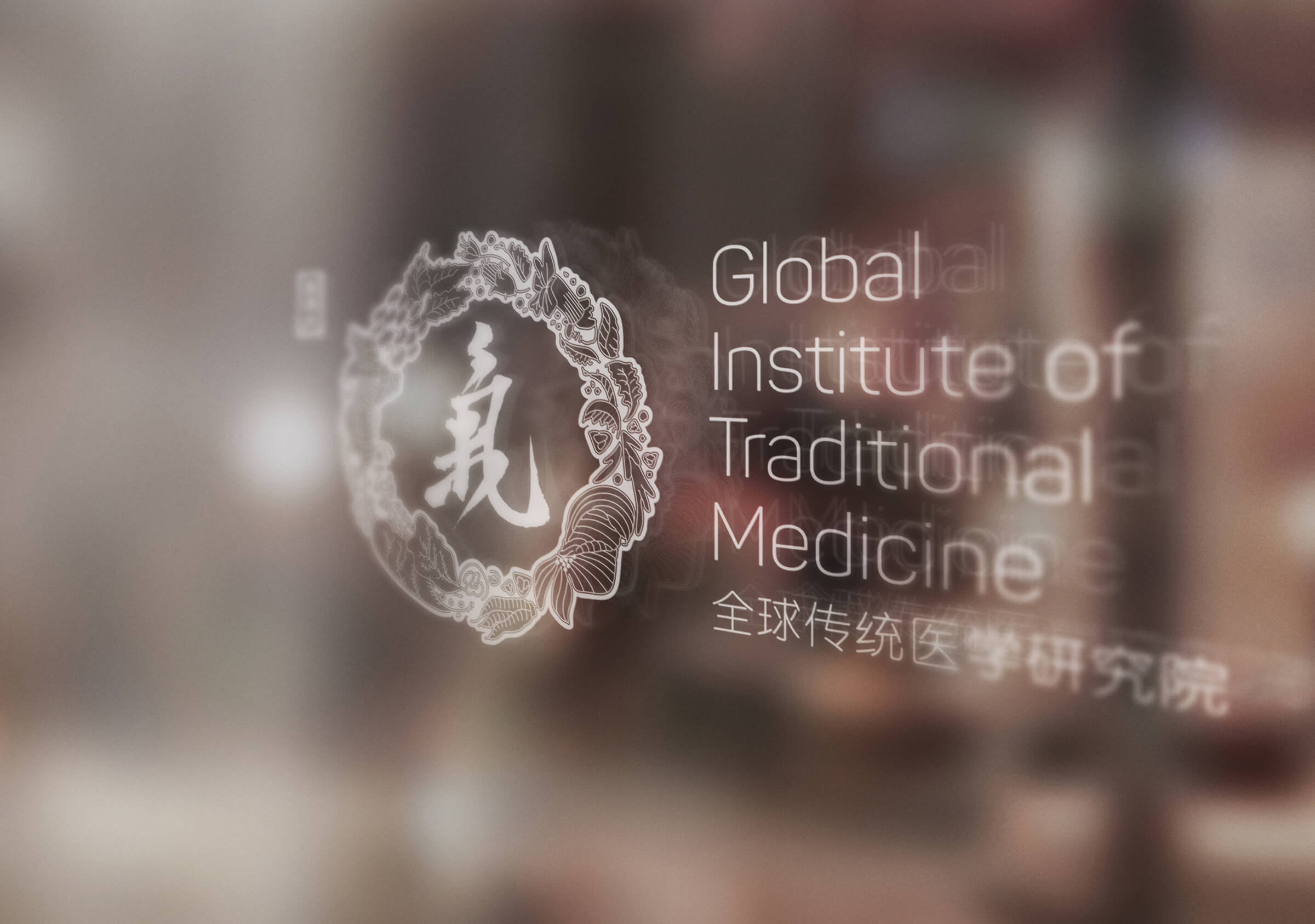
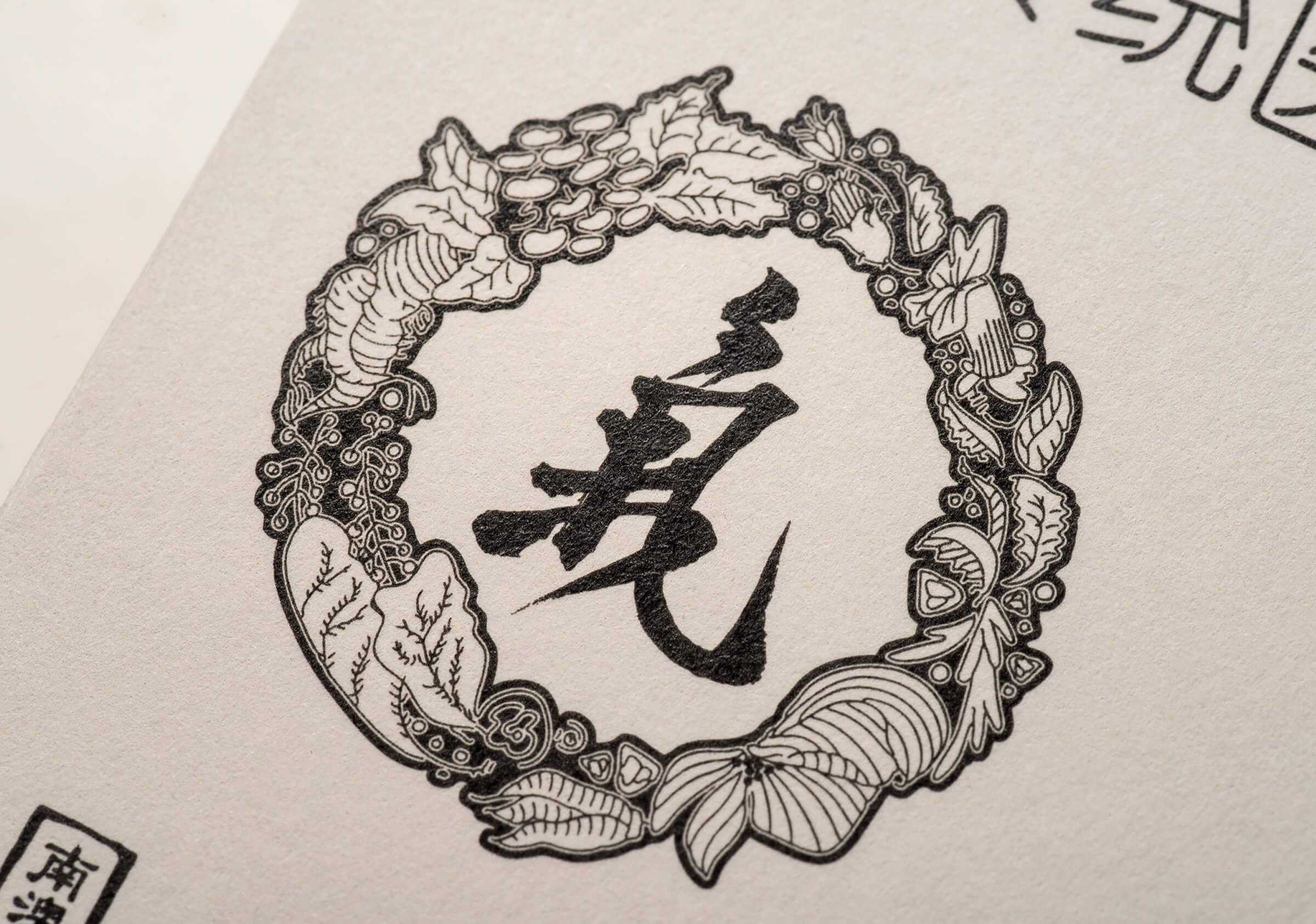
Given Traditional Chinese Medicine utilises a vast array of herbs, plants and substances we developed an in depth understanding that enabled us to see that the tradition relied upon a core set of principles that were symbolised by a small group of plants. Central to these principles was the concept of Qi (ch’i) – the animating principle that inhabits and illuminates all life.
This base set of information that was resolved in discussion and consensus with the research group enabled us to resolve a position where we would represent the tradition through a set of core principles and from this we could then translate into a more condensed form that successfully symbolised this ancient tradition.
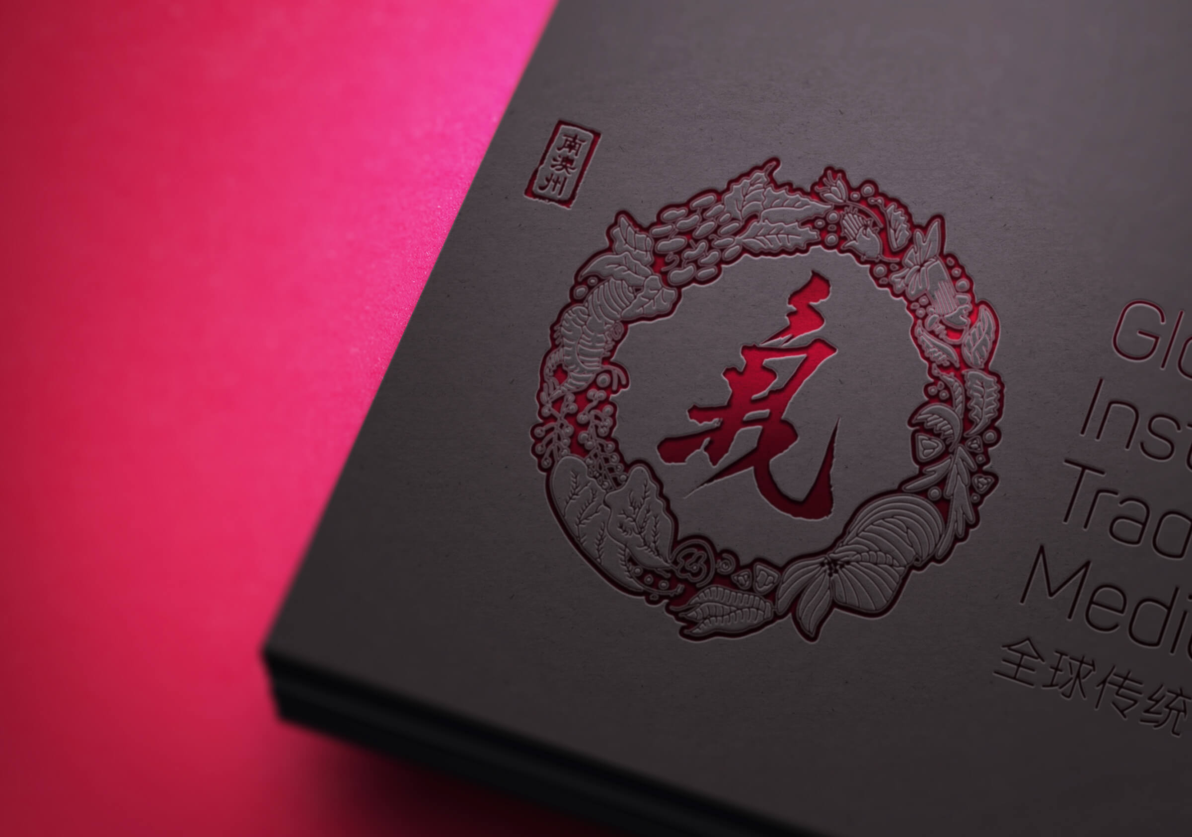
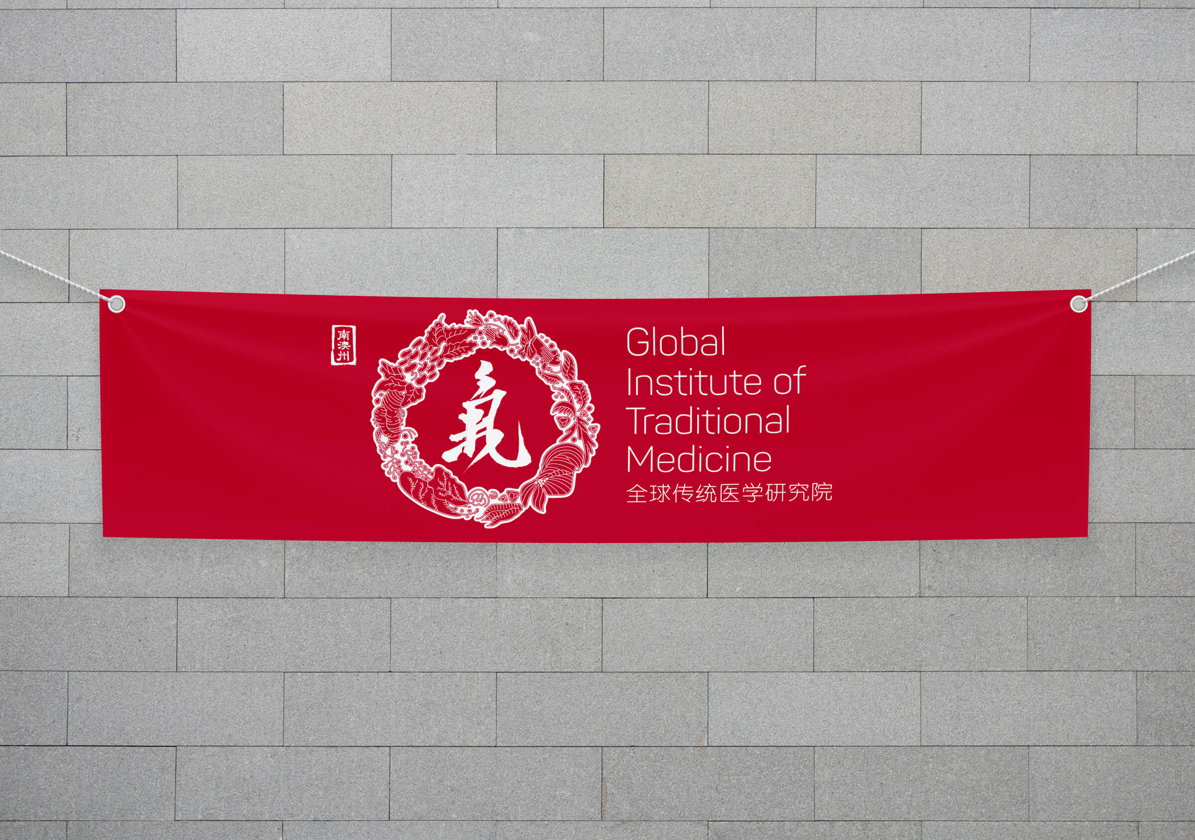
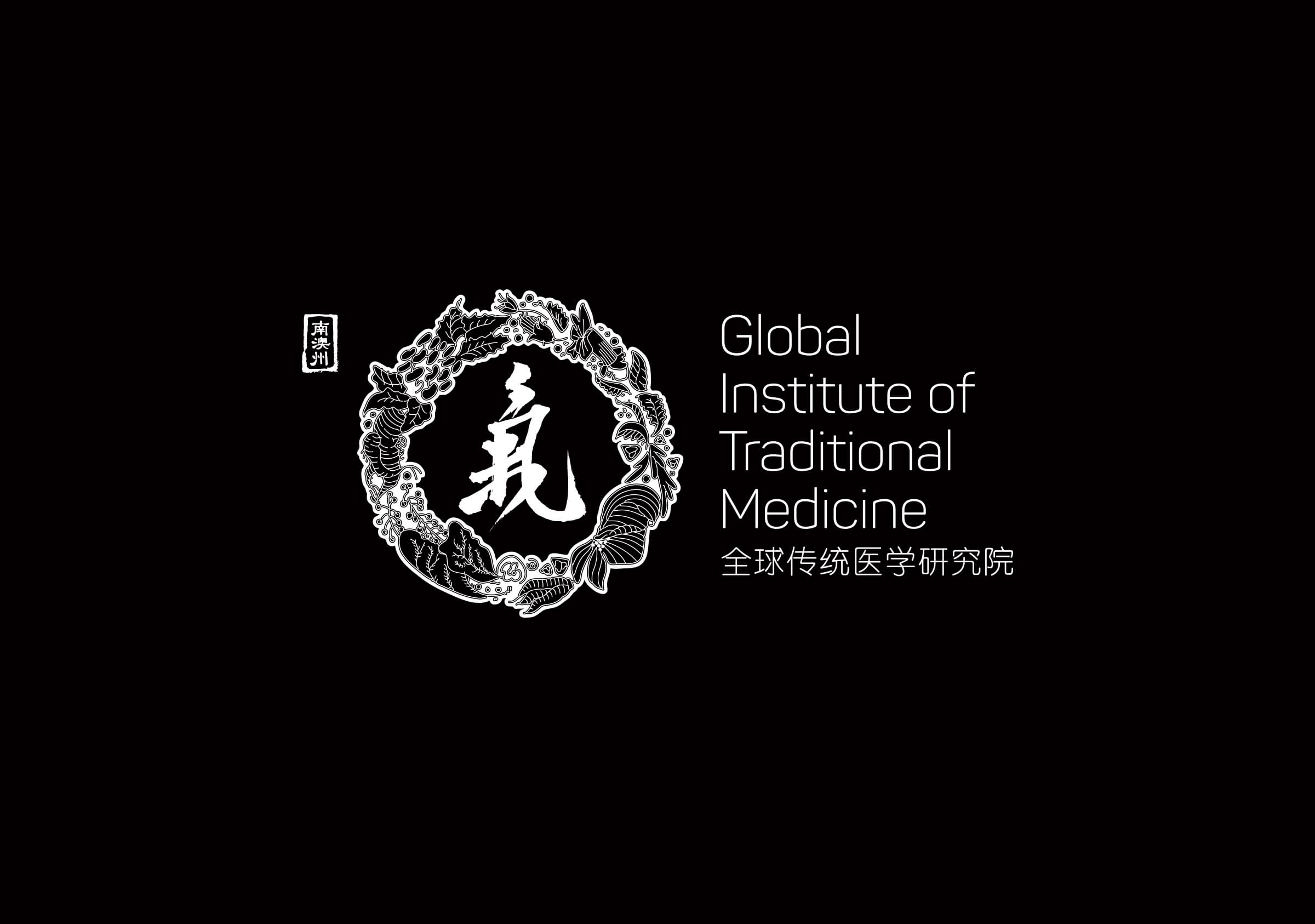
The resultant mark neatly packages these vital components within a circular plant-based form acknowledging the central role of qi represented by the ancient Chinese character for this element. The form of this character went through many iterations ranging from the progressive and abstract to the very conventional and historic. The resultant brush script presented a contrast to the highly stylised plant elements but also proved a very compelling and essential link to the ancient origins of the form and to Chinese culture.
As is often the case when designing brand across cultures our perceptions are embedded in western culture and we are thereby limited in what we may perceive of the nuances and finer meaning embedded in another language and culture. Our trust in this instance is placed in our professional partners and the client.
The collaborative and consultative approach that typified this project proved highly valuable in generating consensus and trust early leading to a shared communication position. This outcome resulted in a very successful brand identity representing the tradition and the spirit of a cross-cultural joint venture celebrated by both cultures.