
Max Services
2015-2021
Can-do capability
Defining the value in the business and seizing the opportunity to reshape an industry through brand.
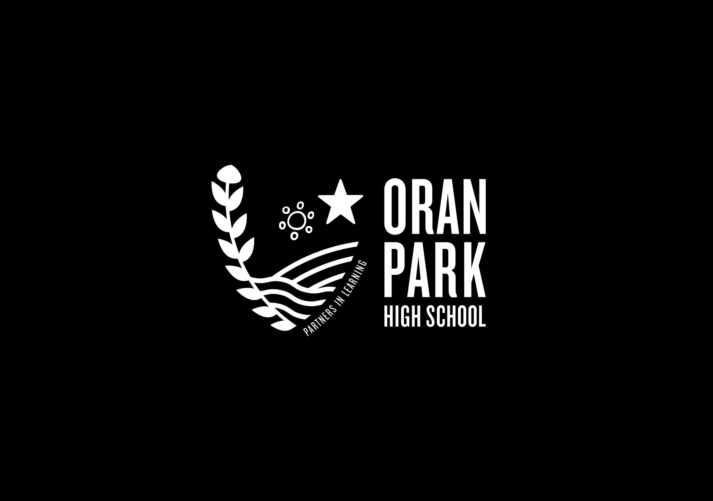
Oran Park High School
Brand identity
2019
Partners in Learning
A racing history and Indigenous culture is brought together.
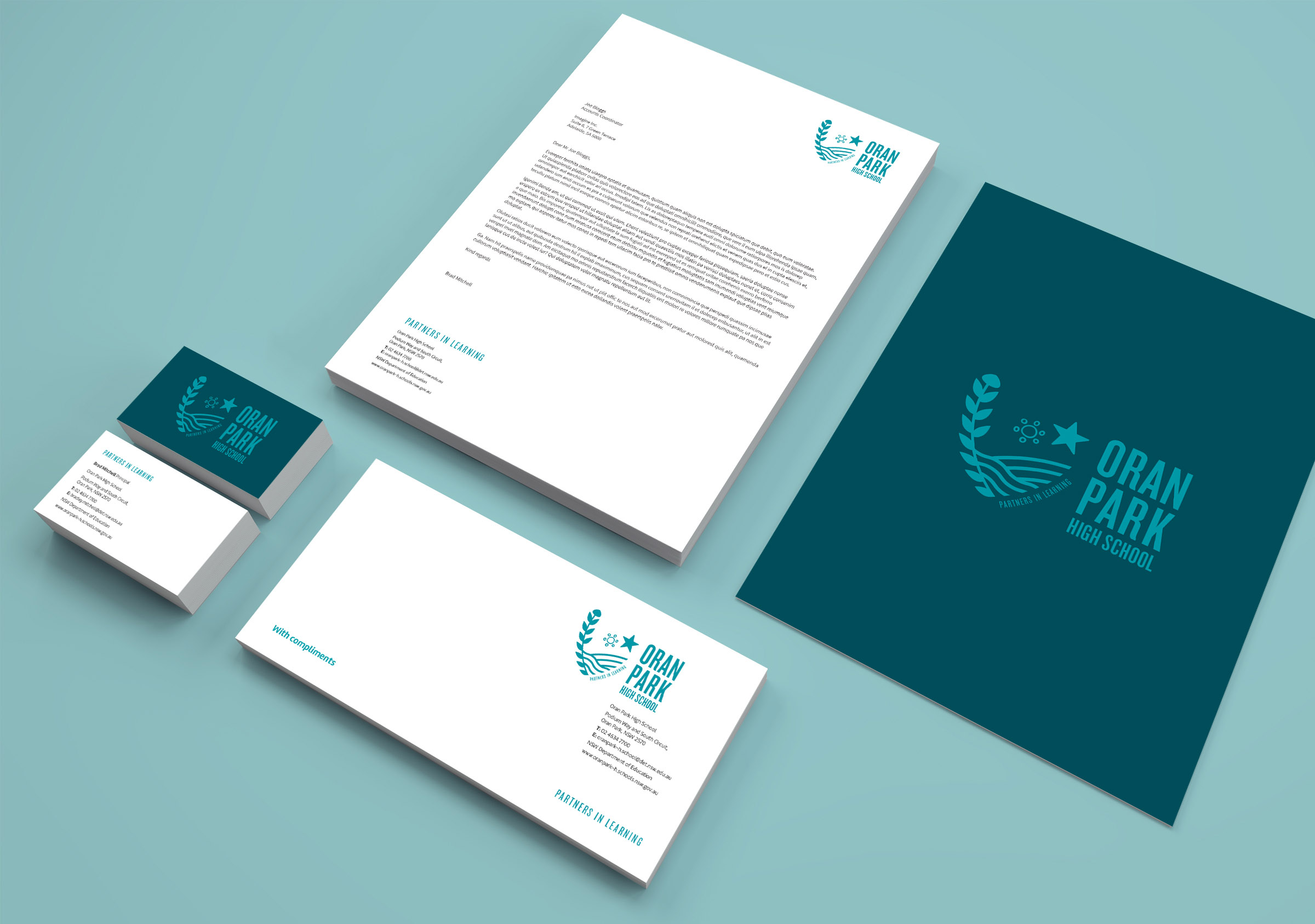
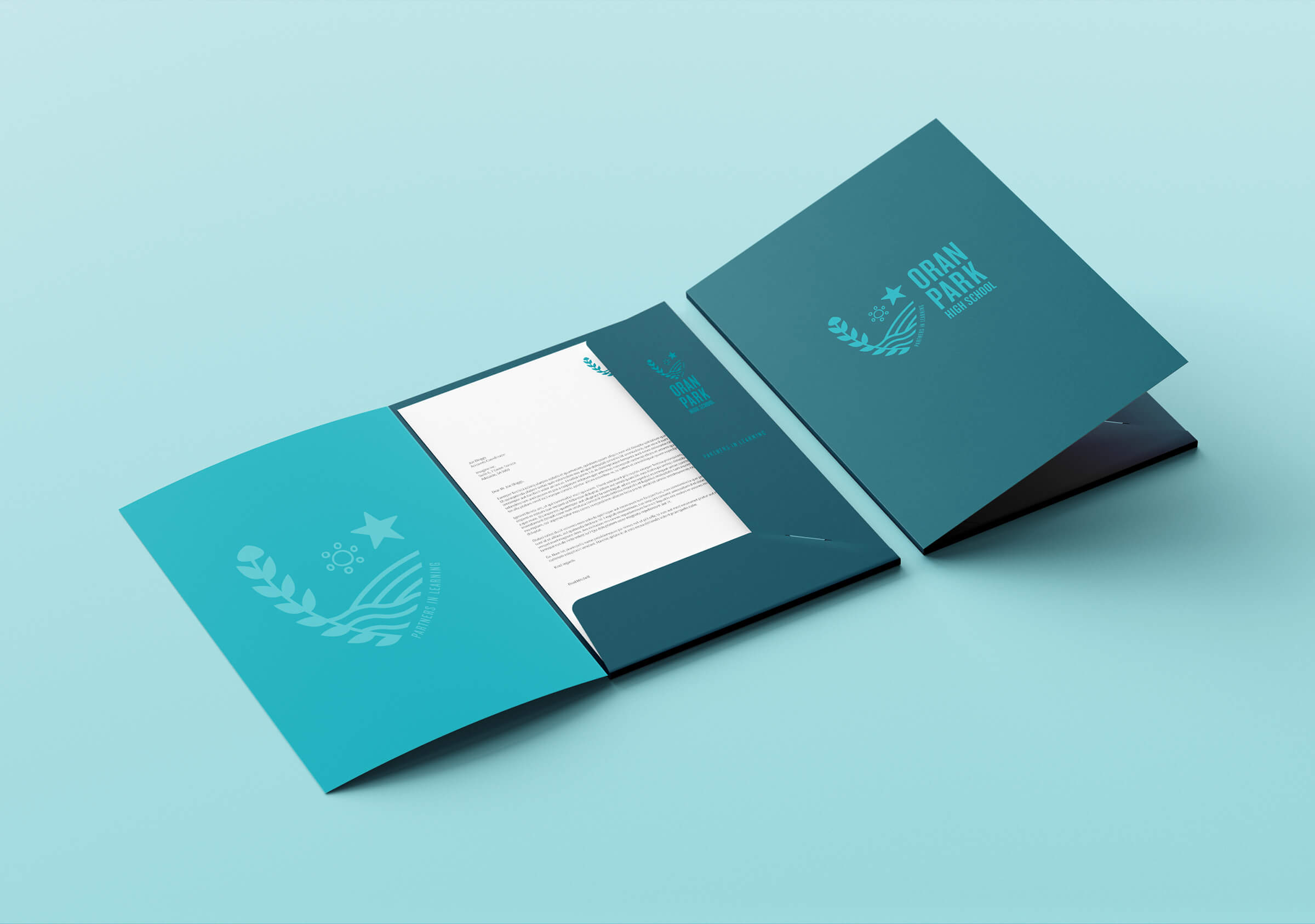
Brand identity, naming strategy, stationery and communication collateral for Oran Park High School, New South Wales.
The creation of a brand identity for a new school is a critical moment in time with the potential to convey important ideas to a new community prior to and following its commissioning. It would aim to embody the aspirations, desires and expectations of its stakeholders: its students, parents, staff and community and to serve as a coherent reflection of the character and values of the school embodied by its Principal and their team. It would project a range of characteristics and values that communicate outwardly to the community and inwardly to the students and staff. It would function as a ‘constant’ throughout the development, progress and evolution of the school and will come to be a symbol of the School’s achievements – a source of pride and a link to the history as it is recorded. The brand identity would also define a space and a set of expectations that the school would fulfill over time and should work tirelessly to support the realisation of its highest purpose.
The development of the brand identity for Oran Park High School was the result of close collaboration with Principal Bradley Mitchell and his project team of parents and community representatives. We were fortunate also to be able to draw upon core principles established through the Principal’s working sessions with external education consultants that reflected their values and progressive pedagogy. Over a period of weeks we also participated in an iterative process of providing frameworks for discussions that grew in depth with a working group established by the Principal. This enabled us as a collective to propose, discuss and test a range of principles and ideas that eventually formed a very clear and detailed brief for the brand identity. The benefit in this collective and collaborative approach is that it builds broad trust, wider ownership of ideas, promotes connection and personal investment and creates greater value for the school through the dissemination and integration of ideas represented by the brand.
In the course of Preliminary Design we identified a set of priority narratives responding to the Aboriginal and Western history of the site, the important connections with Indigenous culture, the aspirations of its community and students and the features of the immediate environment and landscape including its flora and fauna endemic to the region. In responding to Indigenous narratives the impetus for this came not only from the school Principal and his personal connections to the Indigenous community but also more broadly from NSW Education Department – who have mandated Indigenous inclusion and representation within new schools projects. These broad narratives were translated into a suite of icons and symbols and crafted into a range of visual identities. Where traditional Indigenous symbols were used we sought and gained approval for their use from the Indigenous community through the Principal prior to development of the brand.
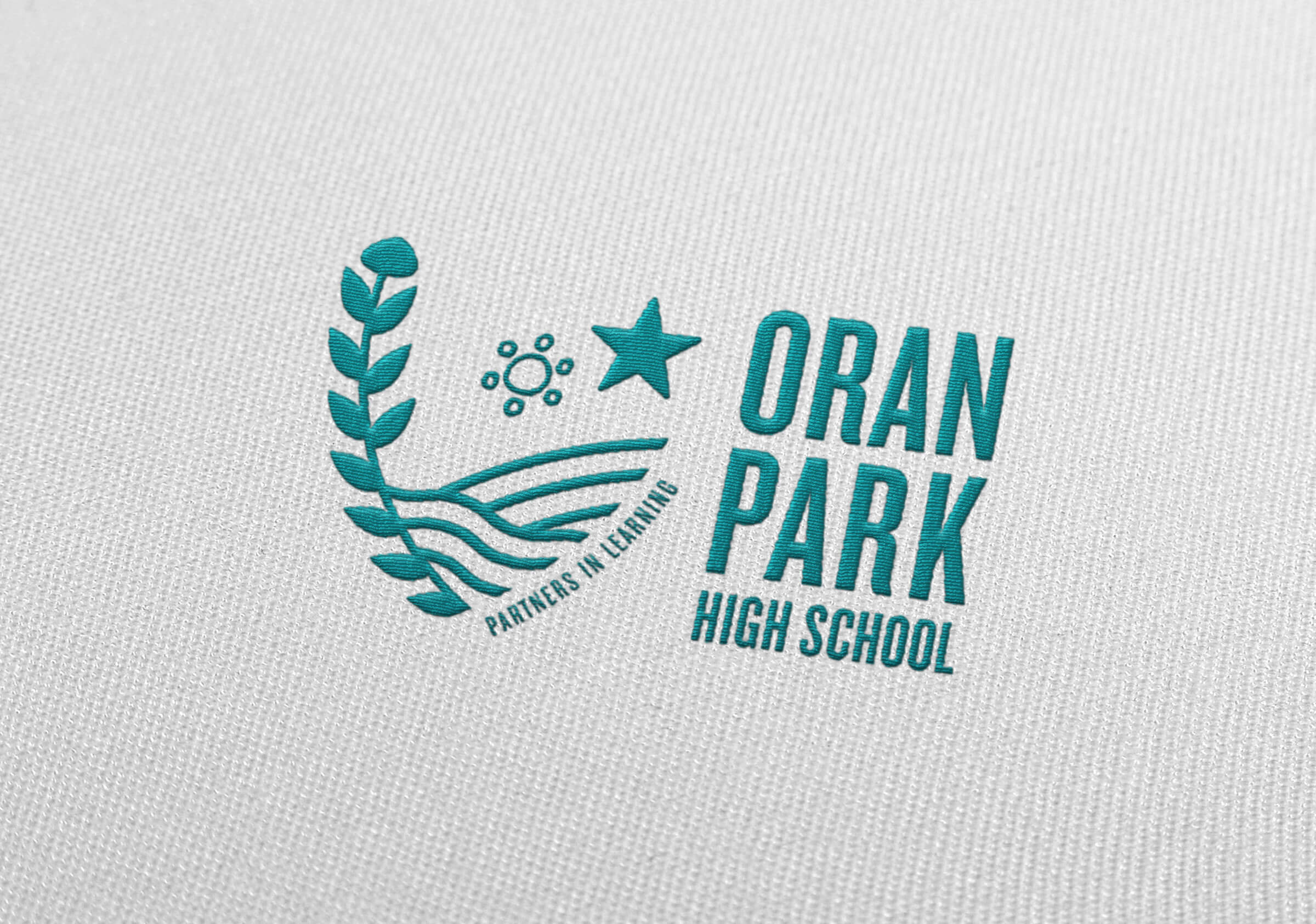
What emerged from this process was a range of distinctive prototype identities, supported by background research into educational branding, that was tabled with the project team for critical review and comment. An important consideration in this stage of the design process is to establish clearly the positioning for the school; in its pedagogy, character and disposition, does it conform to a conservative or progressive ideology and how might the brand ensure parity with this. So the prototype marks express a range of positions as well as a range of narratives. The group’s unanimous response was for a mark that combined simple visual devices combined in a highly progressive form. The star as a central element combines Indigenous and western symbolism and reflects the aspirations for the school and students. The mark also makes subtle reference to the racing history through the wreath form but cleverly uses a warratah floral element. This was included initially as it is the state floral emblem but we learned (excitedly) from subsequent review by local Indigenous groups that importantly it is the totem flower for the local Dharawal language group.
The distinctive, modern character of the typographic elements have two functions: they are intended to support the progressive positioning for the school but also subtly reference the racing history of Oran Park – widely known and regarded in national and international racing circles. The dramatically condensed type face draws on the style used for the numbers featured on racing cars.
An important aspect of a new brand is the crafting of a simple and distinctive qualifying statement or tagline. These words are typically difficult to resolve as they have to embody and communicate so much. Their function is to qualify and provide a supporting context for the visual identity. The words we resolved – Partners in Learning – reflects the clear mandate of the Principal and speaks of a strong collaborative spirit where consultation and collaboration is valued. It references also the tagline for the adjacent Oran Park Public School – Love of learning – and the intended collaborative learning environment of the two schools.
When we think of a school identity we think of the badge on the uniform, the school entry sign and other incidental places. What we don’t see so obviously is how it effects us and what it communicates to us over time. For a new school – without a history – how it begins this journey and the narratives, character and disposition that is communicated at its beginning is profoundly important. The success of this brand lies not only in its very contemporary rendering of a highly relevant and compelling narrative but in the broad collaboration and collective response guided by the Principal. The brand is the manifestation of the shared values, the ideals and the aspirations of its team and community.




You may also like:
Perumal Pedavoli Architects: Oran Park
Branded environments
St Mary’s College
Brand identity