Max Services
2015-2021
Can-do capability
Defining the value in the business and seizing the opportunity to reshape an industry through brand.
MAX Academy
Brand identity
2021
Experience + exposure = skilling futures
A response to a critical shortage of skilled workers in the specialist lifting industry.
Brand identity, naming strategy, brand working session, stationery and communication collateral for MAX Academy.
MAX Academy was born in response to an ongoing critical shortage of skilled workers for the specialist lifting in the heavy industry and mining sector in the Upper Spencer Gulf region. Early studies by MAX Services, the parent company, revealed that no other RTO nationally was delivering the training required to skill workers for this field nor in a better position to do it. Discussions with relevant Government bodies revealed tremendous support and the necessary backing. MAX was also in a position to satisfy the two most important requirements sought by prospective trainees and their future employers: exposure and experience. As a further endorsement MAX is an industry leader, has an enviable track record, a grounded approach to business cemented in local community values and a reputation that speaks of safety, teamwork and quality.
The work before brand was initiated through a series of informal discussions with the management team to gauge the scope and extent of work and to understand the relevant position in an already saturated market. Our early survey of the market followed by a competitor analysis revealed the majority of other training organisations were less about training and more about certification. In line with this their value propositions underpinning the business were premised on a queue and stamp approach whereby having satisfied standard regulatory requirements they were certified to endorse applicants through basic training.
This background highlighted and contrasted two key value drivers for Max Academy that would distinguish it in the field nationally. Two key groups of applicants were identified: young school leavers wanting to enter the industry and older workers looking to reskill. Both groups are looking to skill their futures and not just get a ticket. For both groups the provision of exposure and experience would all but guarantee them entry into the MAX Services company and enable them to be prioritised in the broader industry.
The brand identity developed for the company utilises three distinct elements: The robust MAX logotype of the parent brand – to enable the reputation to be harnessed, the 5 pointed star – representing the aspirations of its target audience and shooting for the stars, and the shield/crest form – which references the traditions of academic institutions and academies. The shield in this form has a dual meaning within the lifting industry symbolising safety – a priority above all else. As a whole the brand speaks of confidence, strength, trust and integrity.
The success of the MAX Academy brand identity is in its ability to open up a conversation and speak directly to its audience and to provide substantial distinction in an undifferentiated market.
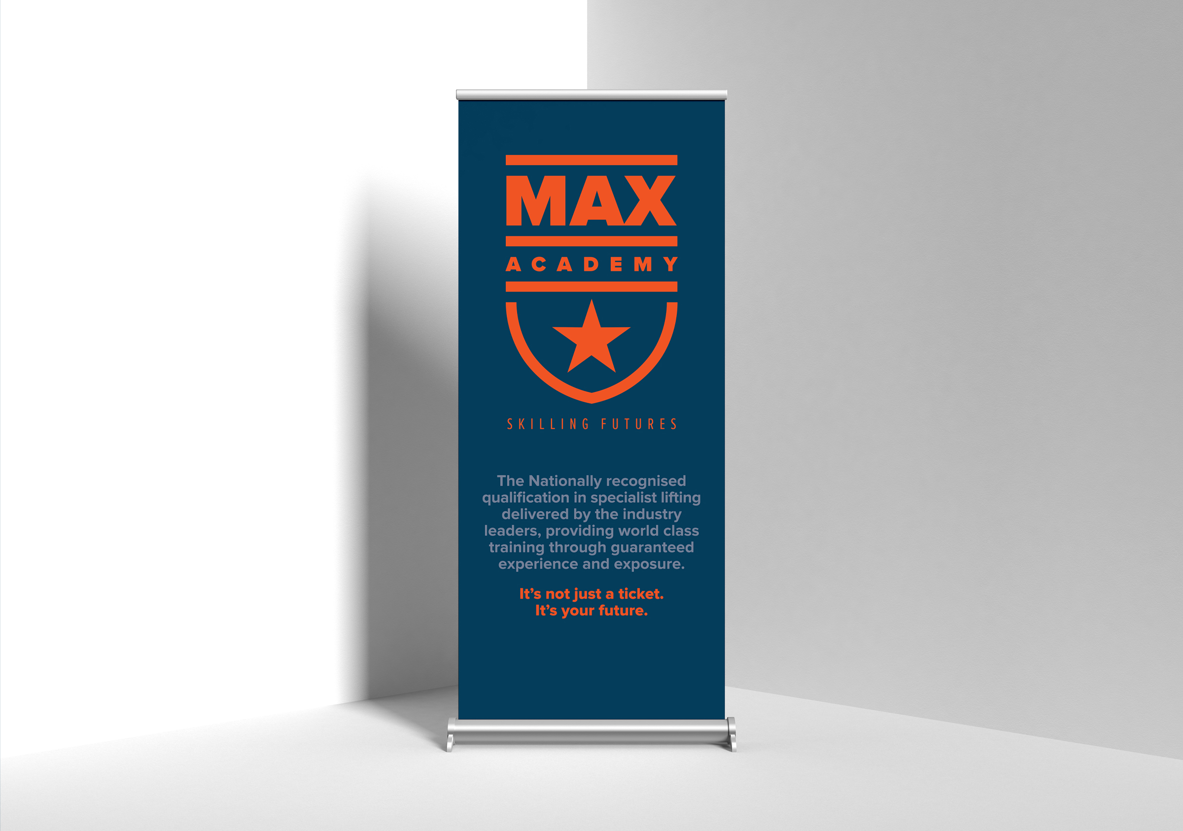
MAX Academy – It’s not just a ticket, It’s your future.
