Max Services
2015-2021
Can-do capability
Defining the value in the business and seizing the opportunity to reshape an industry through brand.
Kinetik Consulting
Brand identity
2021
Moving forward
A progressive brand centered upon keeping things moving.
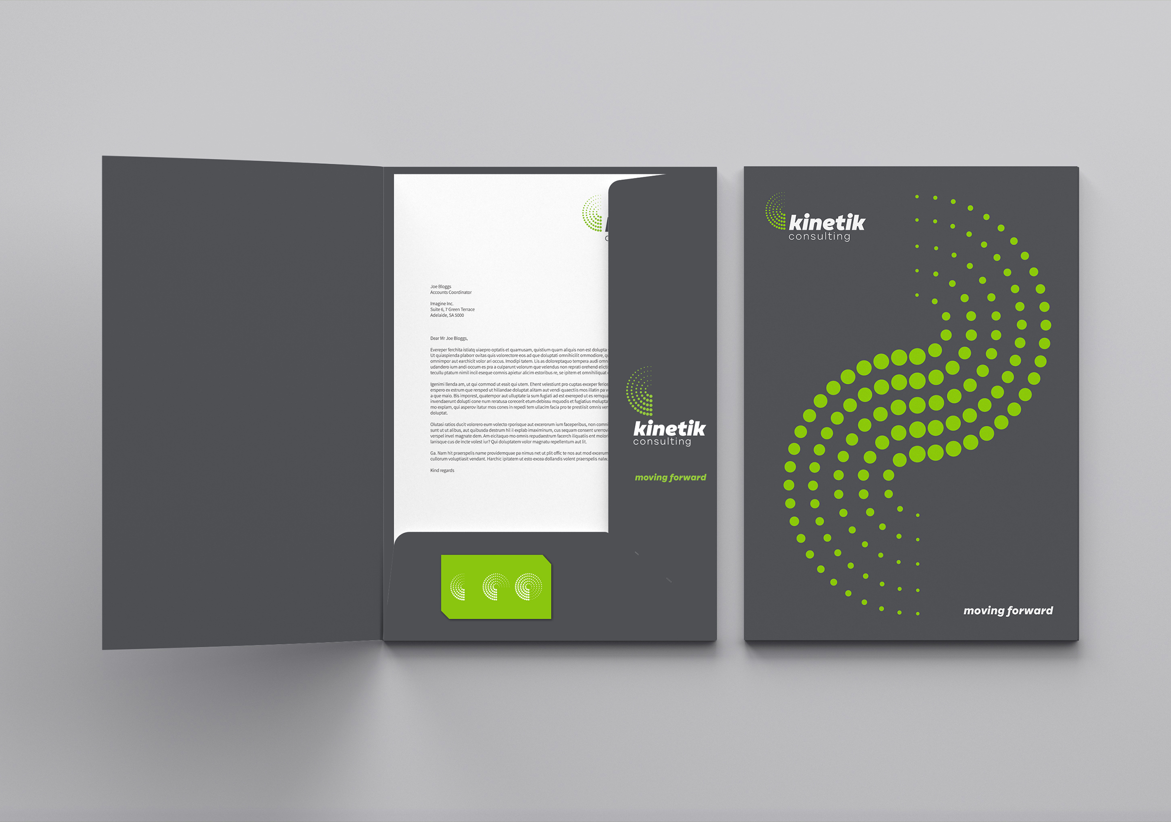
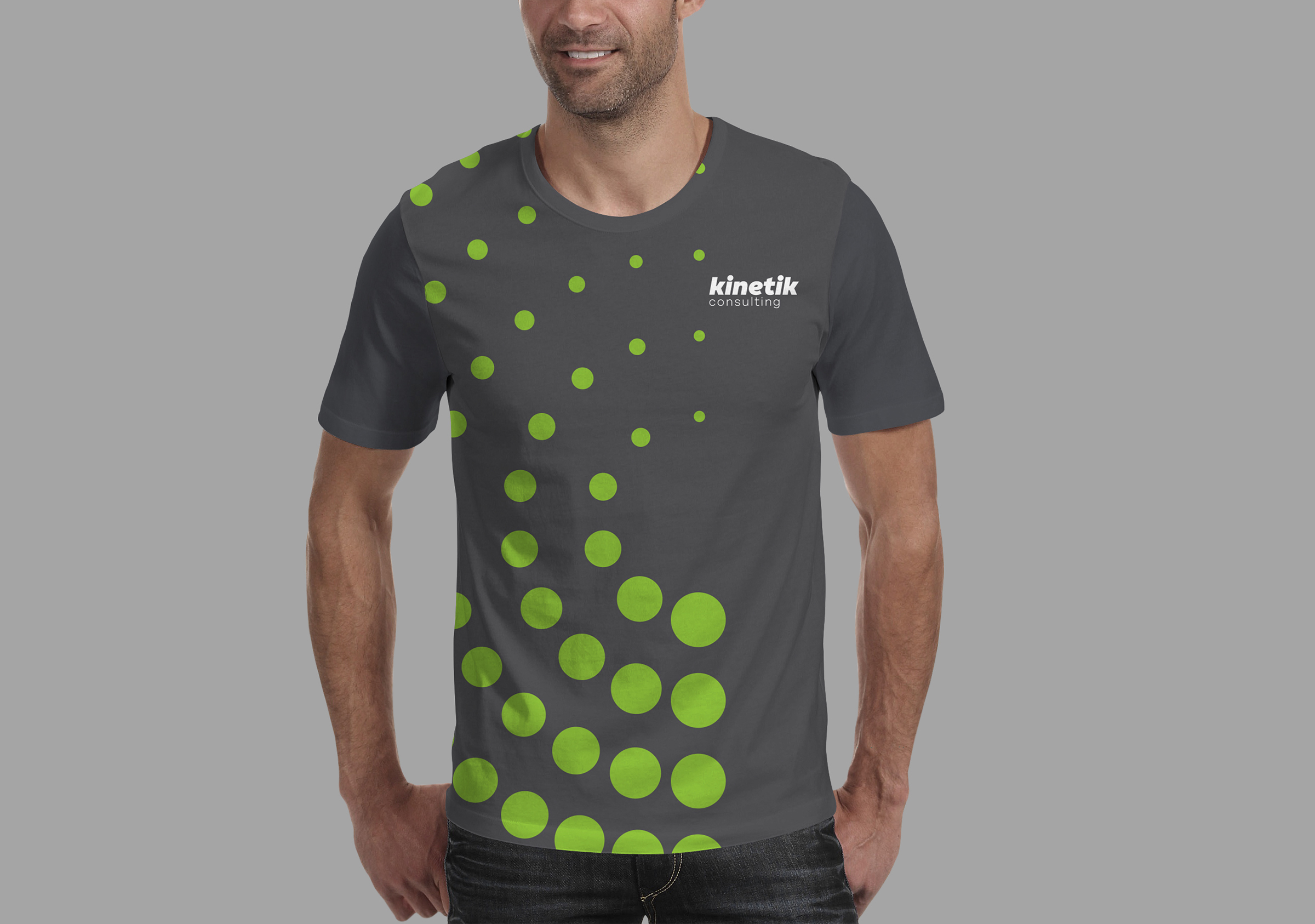
Brand identity, naming strategy, brand working session, stationery and communication collateral for Kinetik Consulting.
Kinetik Consulting is a newly established South Australian company providingquality inspections, consulting and mechanical services.
In the development of the brand, we were primarily led by the capable, dynamic and grounded nature of the director, Brett Woolford. In particular, it was important to capture the practical approach and underlying value proposition which is centred upon keeping things moving: the equipment and the project. When the equipment used by the business is operational it means everything is moving forward it means there’s no down time. Down time is a significant cost to businesses operating in the heavy industry and mining sector. These underlying principles of the value proposition led to the concept of kinetic energy, which incorporates the attributes of progression, movement and motion.
The name Kintetik Consulting was derived from this idea, supporting the core values and communicating the precision, robustness and confidence of the brand.
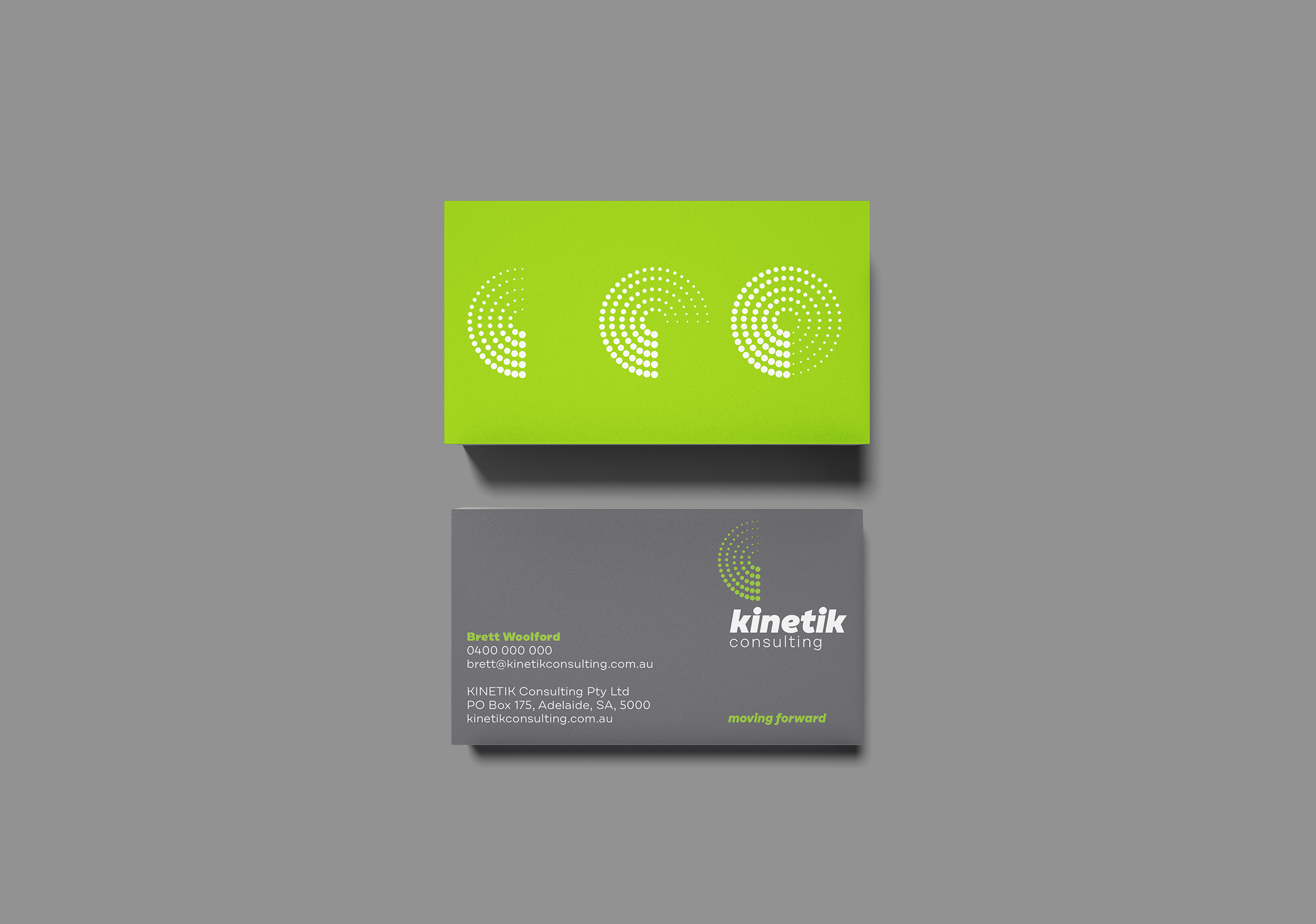
Our early visual studies for the brand mark focused on kinetic energy and resulted in an elegant graphic comprising three forms distinct forms articulating three stages of movement. We linked these to the three service offerings of the business: inspections, consulting and mechanical engineering.
This graphic was developed into a simplified form grouping the circles in a stage of motion and the full graduation (fully operational) became the centerpiece of the brand mark.
The tagline moving forward communicates the central value proposition and the brand promise – to provide services that ensure their clients equipment will remain moving and an enduring commitment to progressing forward.
The typography supporting the brand mark adopts a robust character synonymous with heavy industry whilst presenting a friendly face to the business. Through the plain speaking character of the font and its lower case rendering it conveys confidence and assurance as well as an openness and transparency that belies honesty and trust. The smooth, rounded letterforms were purposefully selected to compliment the logomark and the italicised style further depicts energetic motion.
The success of this brand identity lies in its ability to speak clearly about the things most important to the market in a language that establishes confidence and earns trust.
