Max Services
2015-2021
Can-do capability
Defining the value in the business and seizing the opportunity to reshape an industry through brand.
Just People
Brand identity
2021
People. culture. performance.
Defining the importance of the individual role in the team, creation of culture and the business performance.
Brand identity, naming strategy, brand working session, stationery and communication collateral for Just People.
Company founder Lou Sapio is a self described personologist. Located in the crowded people services industry he has one main focus: just people. Where most HR companies are concerned with policies and procedures, the primary intent of Just People is to provide the tools and services to create a healthier, calmer, team driven and more productive workplace.
Our work before brand began with a number of intensive definition sessions working iteratively to deeply understand the current operational environment and the underlying value proposition for the business. Two key drivers emerged from these discussions: an increased need for businesses to work with and manage their people and a lack of resources and expertise by business managers and owners in this space. The value proposition responded to these two drivers: providing the tools and services that result in individuals feeling better supported and more secure so they can reach their full potential, stronger workplace culture and individuals that are better aligned with the strategic goals of the organisation increasing individual and business performance.
Our task included development of a naming strategy that would clearly convey business value and work to differentiate the business in a saturated, complex and often confused market. The name just people announces the singular focus for the business and works to define the importance of the individual role in the team, creation of culture and the business performance. The crux of this being that everything depends on the person. If the person doesn’t thrive the culture fails and the business fails. Grow the person. Grow the culture. Grow the business.
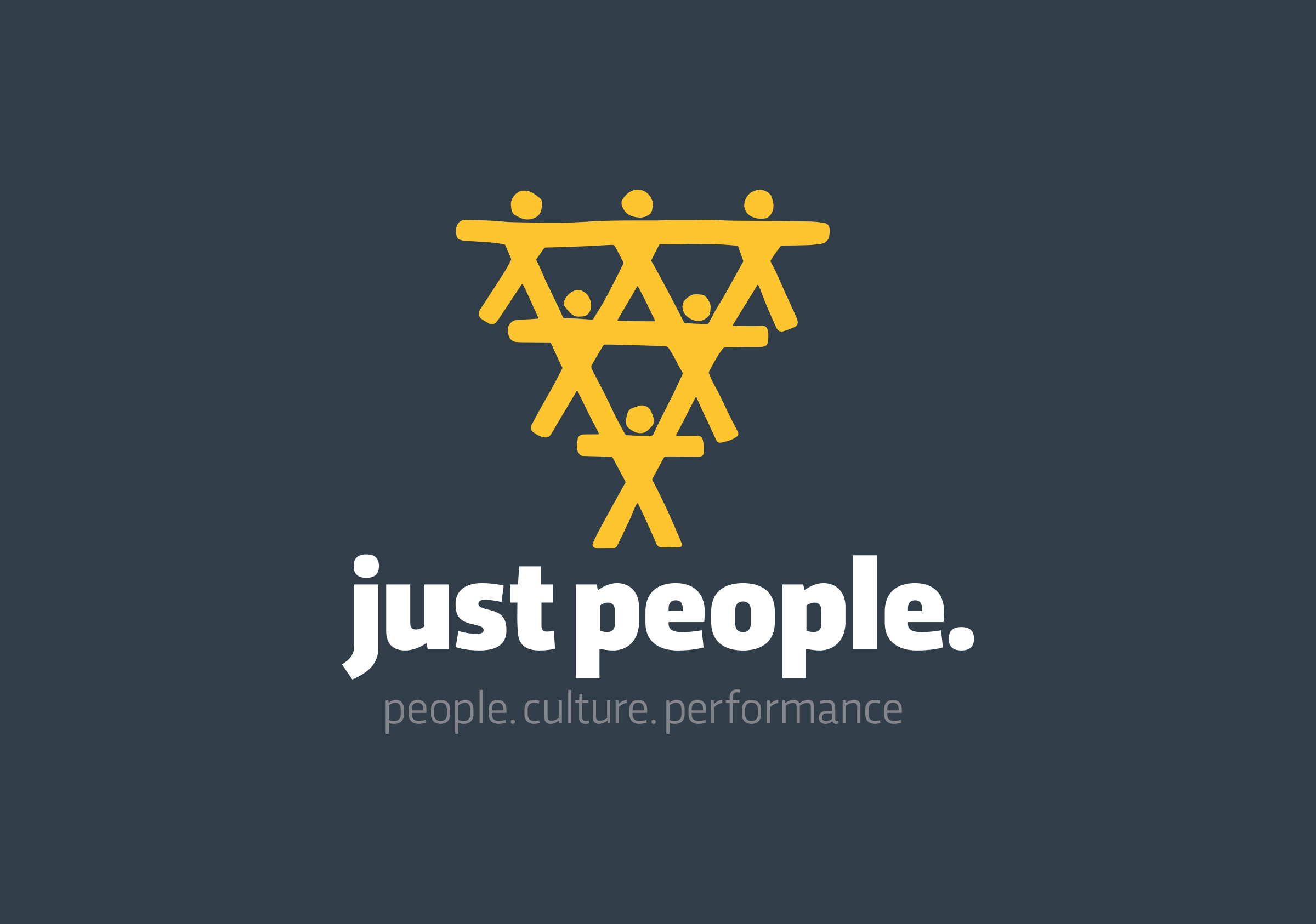
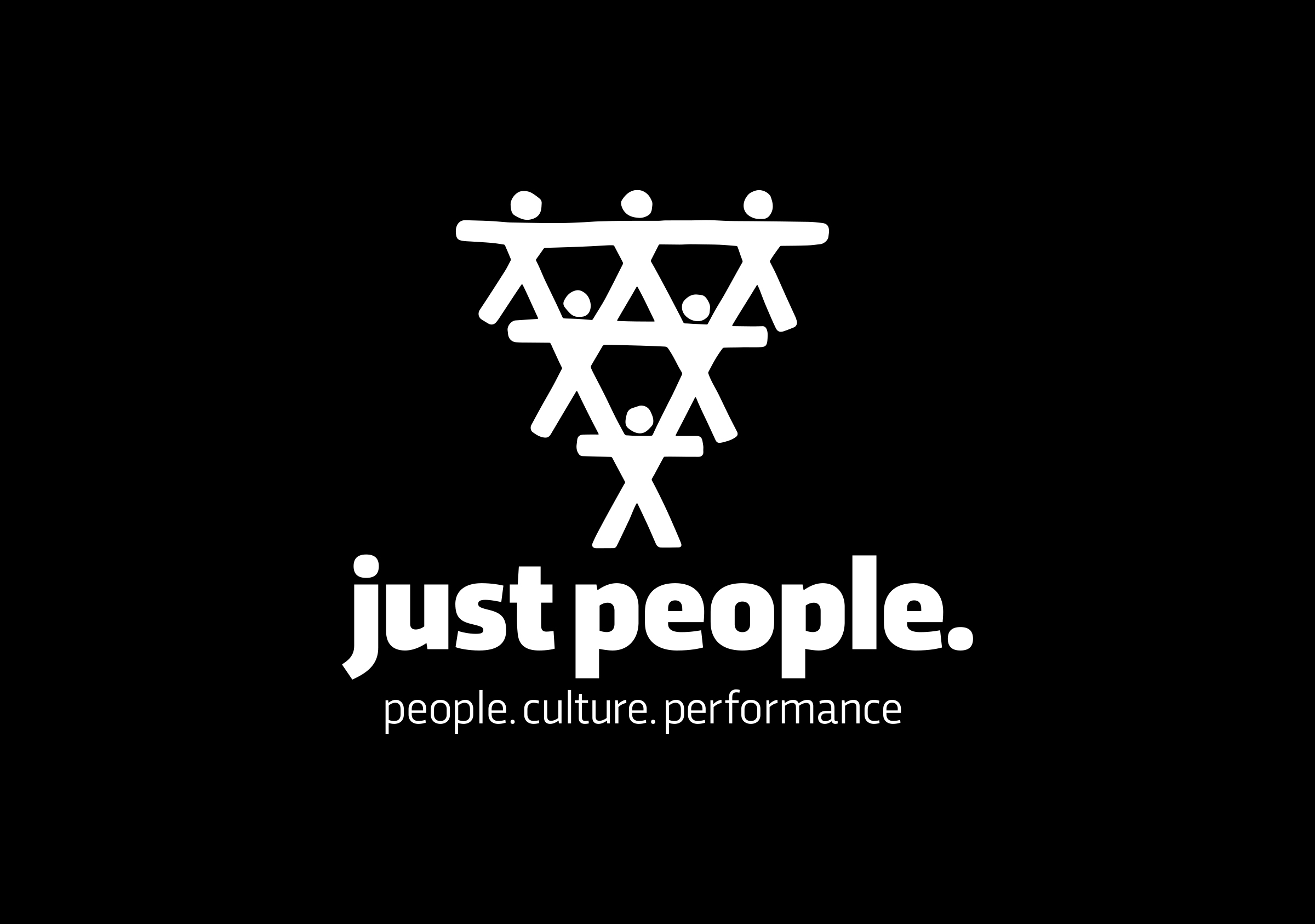
The concept for the mark aims to work hard against established stereotypes operating in the people industry where the focus is largely on the team and culture. The desire was to flip the conventional visualisation which typically portrays a bottom heavy pyramid where a team of people supports the individual. In contrast to this the just people mark presents the importance of the individual to the team whereby if the individual is supported what they can achieve is grown exponentially. Support the individual, support the team, which supports the business.
Following an exhaustive series of studies working with a talented young illustrator we deliberately selected a hand-drawn style that displays the humanist qualities of the brand (the personal), displays a host of individuals through a clever interlocking pattern (the team) and reinforces the focus on the individual and their unique character (the culture).
Supporting the brand mark the logotype utilises a bold typographic style that conveys openness and honesty. The sans serif font presents as robust and plain speaking, set in all lowercase giving an approachable, friendly & non confrontational character.
Due to the nature of the brand, it was especially important to take into consideration the psychology of the colours which further communicate the objectives of the brand. The chosen yellow possesses qualities of uplifting, hopeful, happy, and thoughtful nature, whilst the contrasting gray conveys balance, practicality, calmness and strength.
The success of this mark lies in its ability to clearly distinguish the business in a saturated and confused market and to present complex work through a simple and singular narrative.
