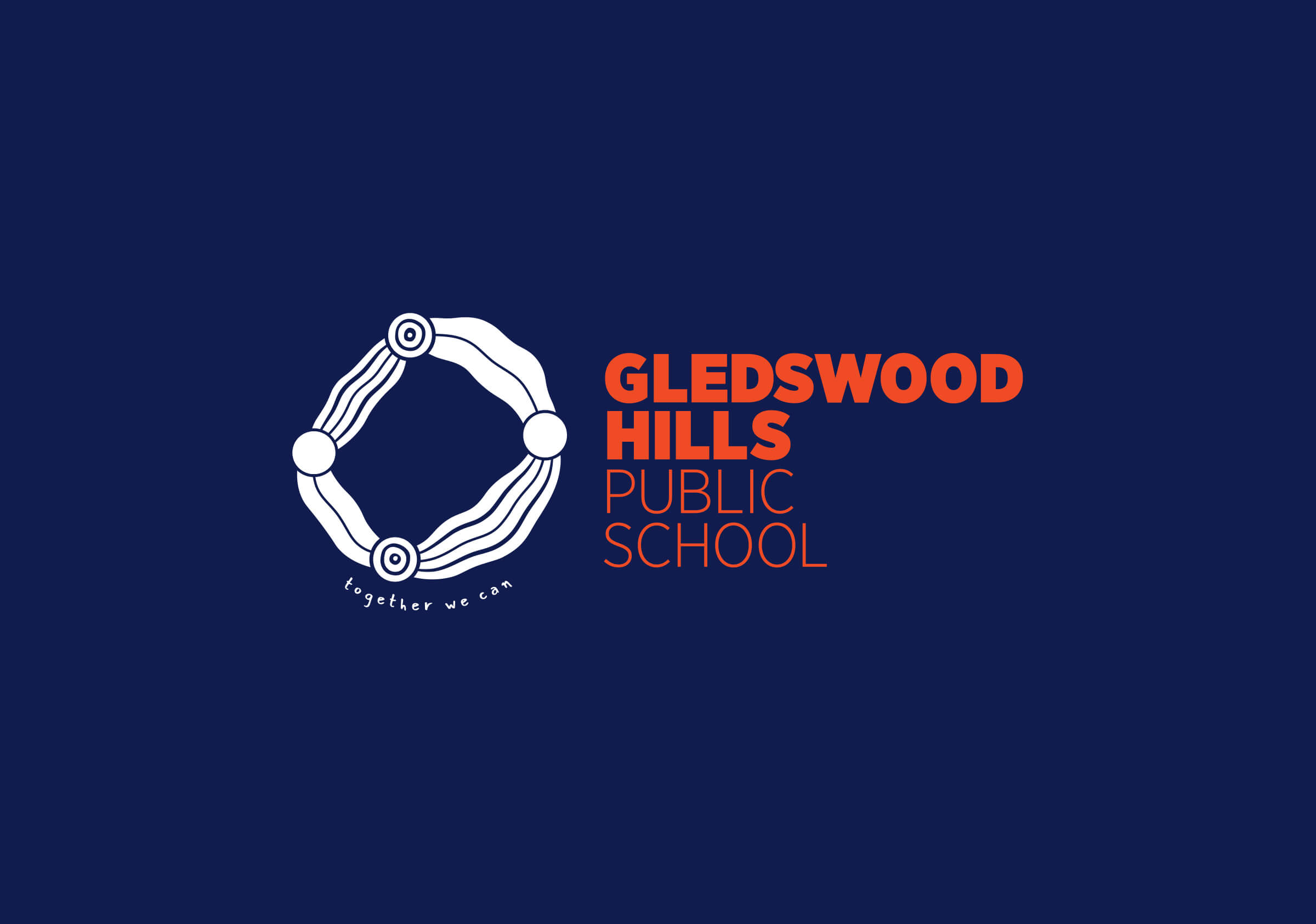
Gledswood Hills Public School
Brand identity
2019
Together we can
A cooperative spirit empowering students and community.
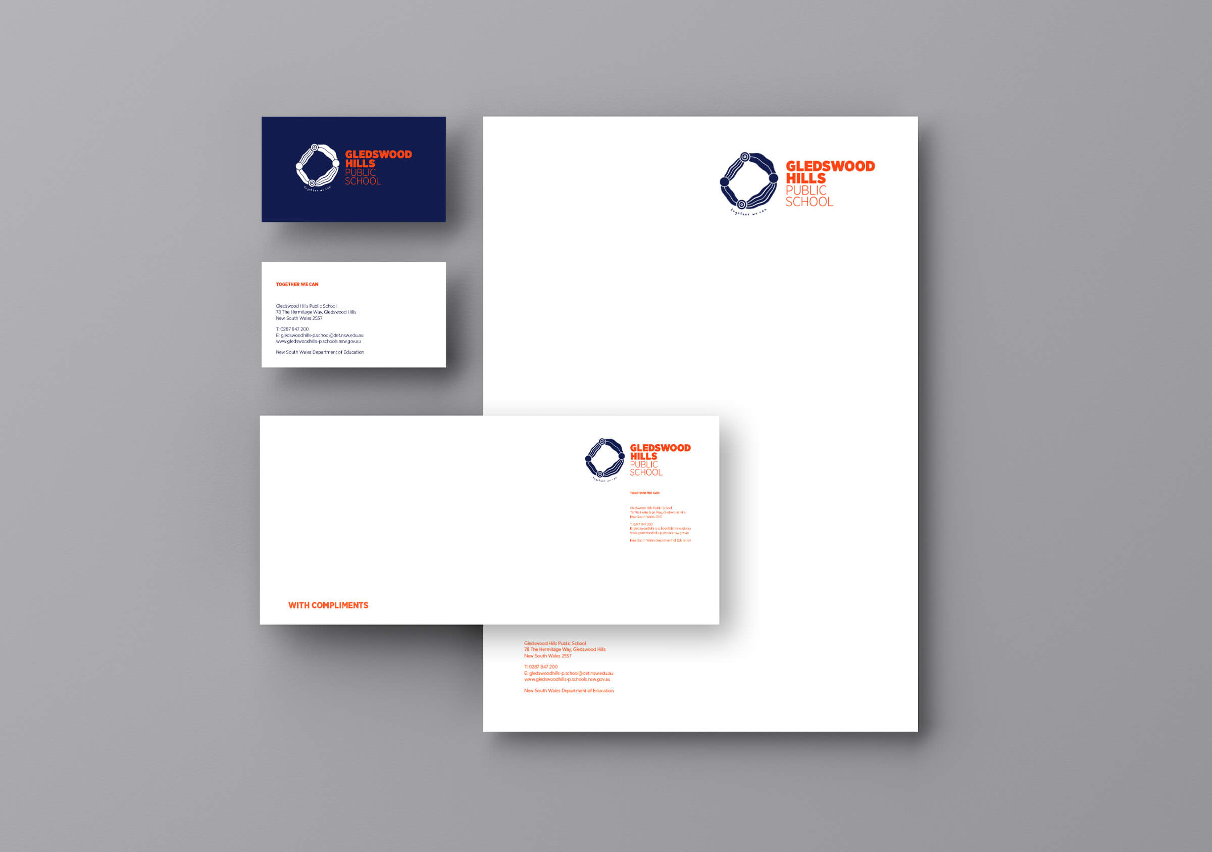
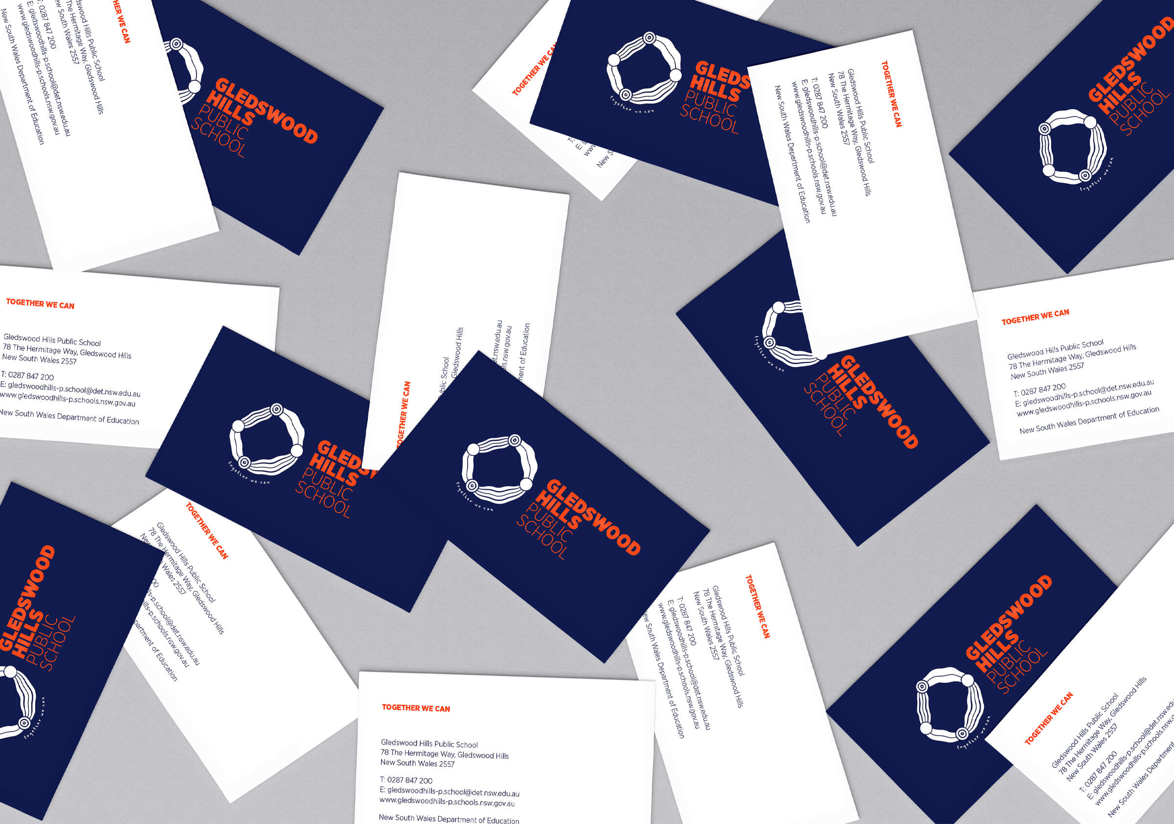
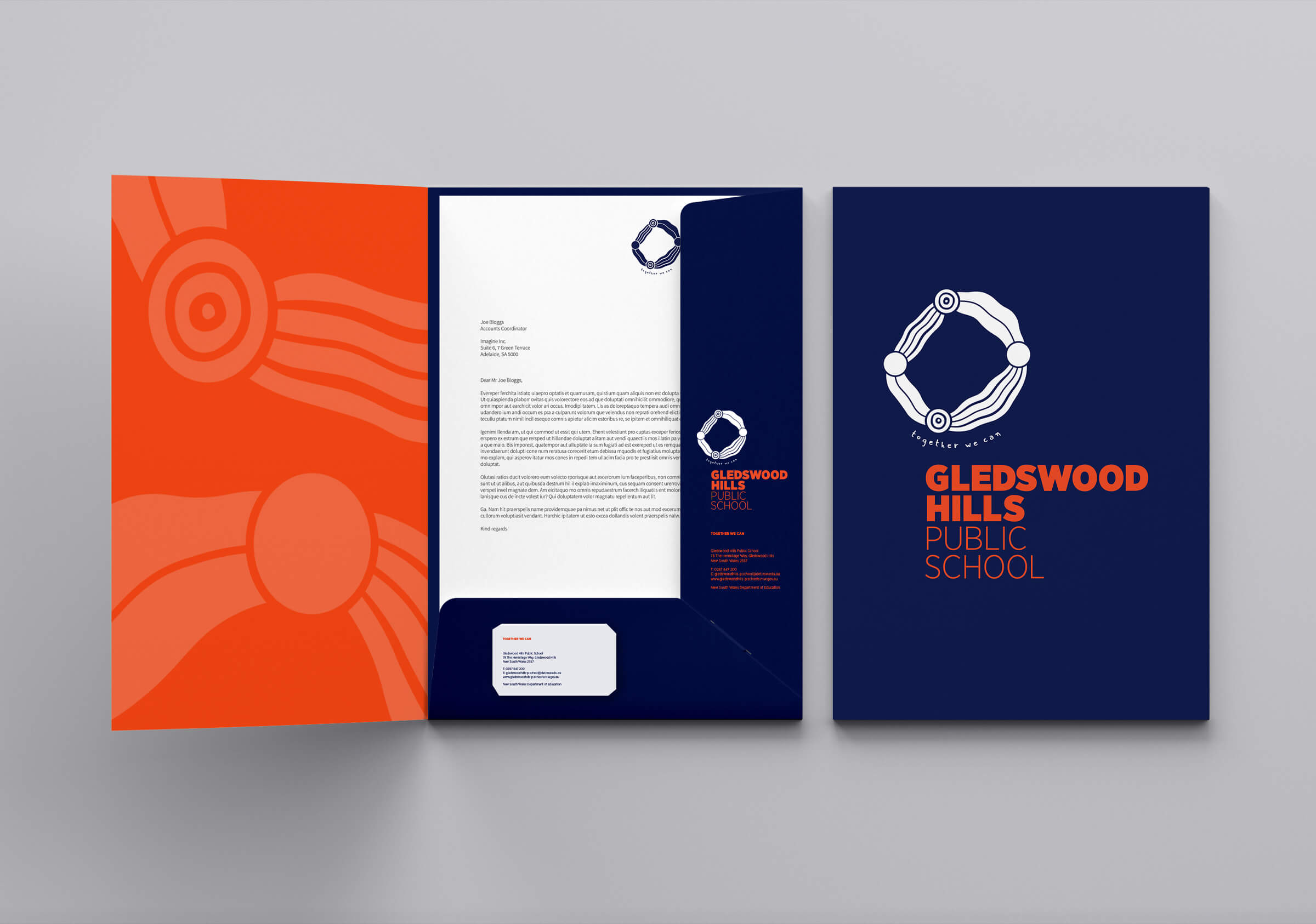
Brand identity, naming strategy and stationery for Gledswood Hills Public School, New South Wales.
Brands at their heart are about stories. The most powerful stories are those that have deep, shared relevance as they can communicate the greatest value. A brand identity built on these will be powerful, evocative, compelling and through relevance will remain timeless. Building a great brand identity for a school starts with these shared stories or narratives. But in spite of living in the digital age with access to limitless information, defining a narrative remains one of the greatest challenges for schools or any business.
Our work with Gledswood Hills started with the work on a narrative. It began with a round table team working session where we led the group through a series of lenses to define and to capture their most important information – the perspectives, insights and values of the principal, their team and the community. This set of information creates a broad contextual resource and a set of narratives that guides us in the development of the creation of a brand identity. A brand has a function and a role – its singular task is to define a heart for the school built around a compelling narrative reflecting the values and principals of the team. This narrative will go on to inspire and guide its development over the ensuing years and to unite the wide range of views and perspectives within the broader faculty.
The insights gained from our working session defined a progressive position and character for the school built around the principles of cooperation. This principle emerged broadly in response to: the challenges and expectations of a new community in its establishment and also in response to the learning / living environment of children and the challenges presented by technology and faltering social cohesion. In particular the anxiety shared by parents and students surrounding the contemporary educational vision of future focused schools. It was evident from our discussion with the team, and wider educational inquiries, that this aspirational focus has actually shifted attention away from more fundamental principals held by the Gledswood team of building learning foundations established on trust and the fostering of flexible learning dispositions in children.
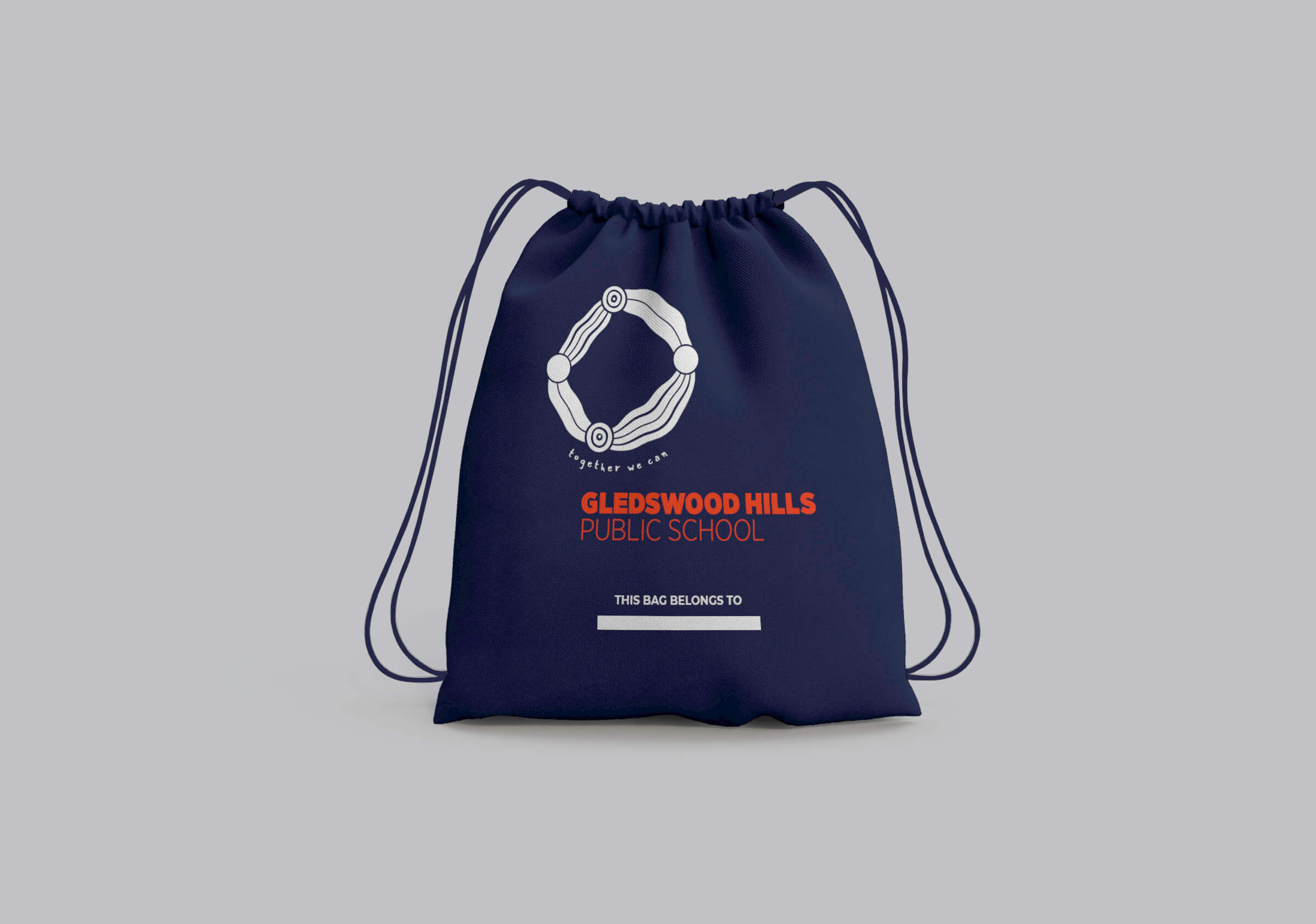
The strength and importance of the narrative focused on cooperation led us to develop an abstract and organic mark that unambiguously championed this principle.
Working together cooperatively implies the coming together – not of the same but of varying and differing beliefs: cultural perspectives, pedagogical differences, racial differences etc. The symbol embodies this through four dots loosely representative of people (or places and philosophical positions) with arms outstretched linking with and connecting to others.
The broad visual style of dots and lines aims also to draw upon accepted Indigenous graphic language and symbols – the arms flow like rivers between places and thereby represent the exchange of information. The abstract and organic nature of the form responded to a clear directive from the principal who wanted a mark that embodied obvious human qualities and characteristics and to contrast the precise language typical of more corporate school brands.
The typographic elements for the school name aim to contrast the organic character of the mark and offer a clear and honest rendering of the name. The tagline responds to the mark and its organic style. Its hand-drawn forms and lower case typography aims to convey an ease, honesty and the personal.
An important aspect of a new brand is the crafting of a simple and distinctive qualifying statement or tagline. These words are typically difficult to resolve as they have to embody and communicate so much. Their function is to qualify and provide a supporting context for the visual identity. The words we resolved – Working Together – reflects the clear mandate of the Principal and speaks of a strong spirit of cooperation where differences are accommodated and a unified position is created.
The best brands operate on a simple, compelling message and through this connect deeply with their audience. The success of this brand identity is in its response to the clear and unambiguous pedagogical position of the Principal, Lisa Whitfield – that working together is powerful and enabling – and its ability to champion this message as a foundation for a new school brand. One that will work hard to unite differing perspectives and support the team and the school to achieve great things.