Max Services
2015-2021
Can-do capability
Defining the value in the business and seizing the opportunity to reshape an industry through brand.

San W Gallery Shanghai
Brand identity / Information design
2015
Nature / Nurture
Capturing a curatorial theme and establishing brand language for a new Shanghai gallery.
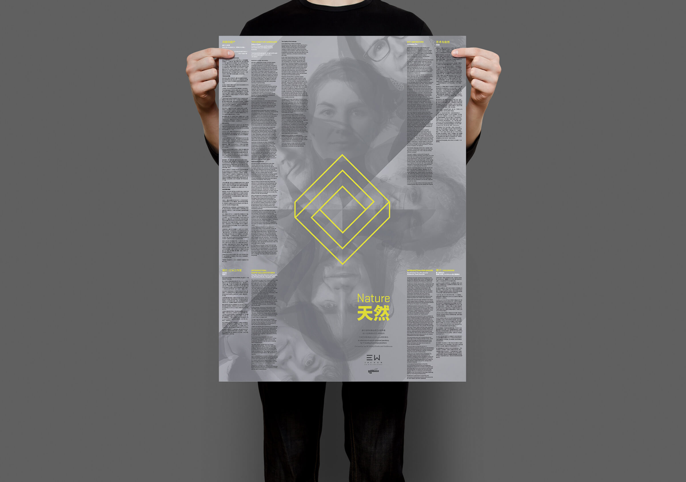
Creation of a dual language curatorial theme and poster design for exhibition profiling the work of leading South Australian artists.
A singular piece of communication design has the potential to establish a market position and language. And so it was with the design of an exhibition poster for the new San W Gallery in Shanghai, China.
We were approached well into the organisation of the exhibition to design a catalogue profiling the work of 15 leading South Australian artists and makers invited to show their work in Shanghai – an initiative and joint venture of San W Gallery with Guildhouse. The initial challenge before embarking on the design exercise was to resolve a curatorial theme that would make sense of a disparate group of jewellers with a diverse range of work. The role of curator typically serves to bring a coherent voice to a body of work that presents a greater meaning through a larger narrative. This narrative will in turn generate a broader understanding that may serve some artistic or cultural purpose. It must also accommodate the nuanced voice and aspirations of the individual artists that are typically hand picked – curated.
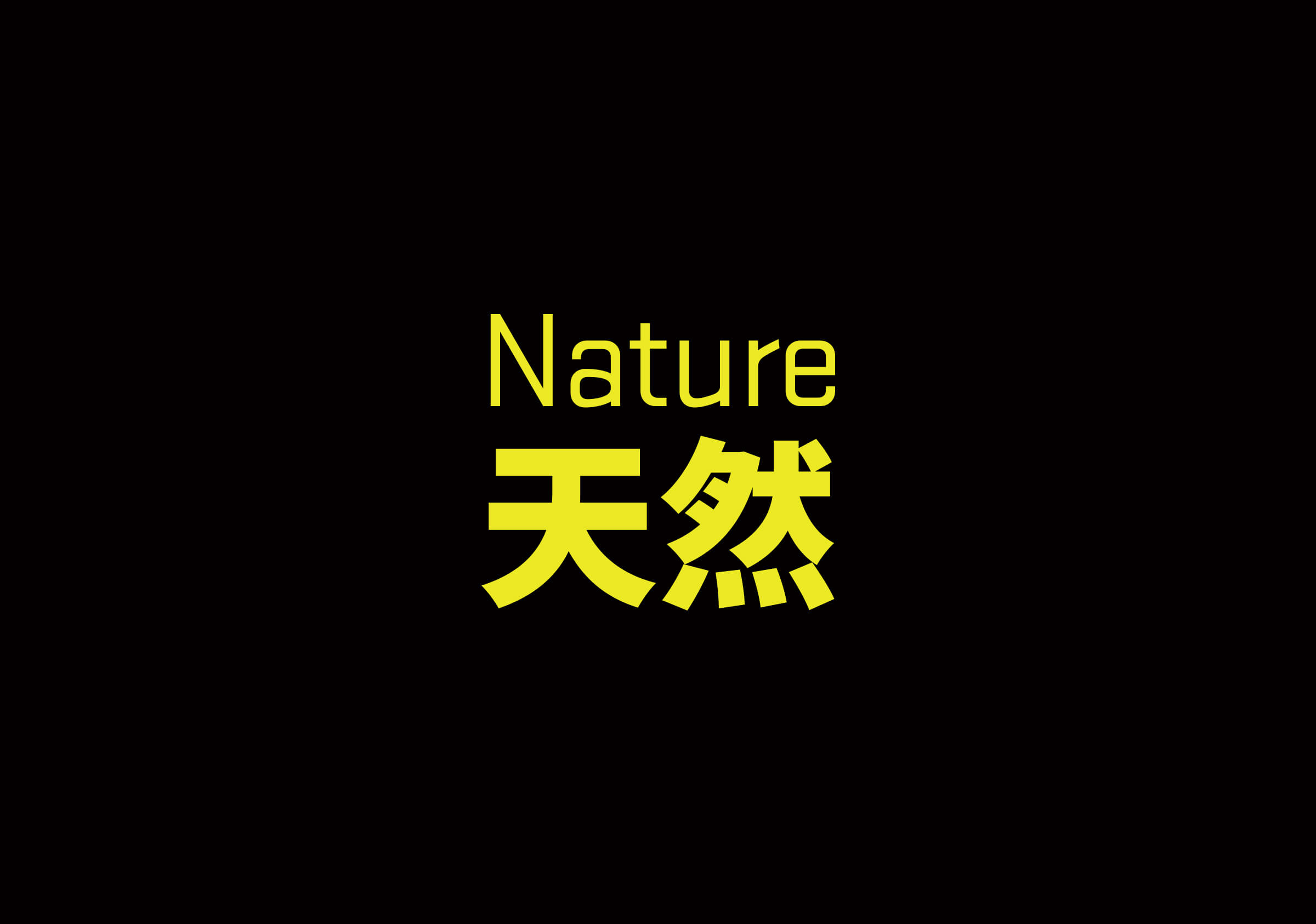
The compressed timing and opportunity to export South Australian talent meant that no thematic approach existed and a body of work that lacked a broader narrative. Through a deeper analysis and observations of the artists involved and their work, guided by the director of Guildhouse we set out to craft an exhibition title that would bring coherence to the work. Settling on the dual meaning title: nature (environment) and nature (character) our challenge was to first ensure the words and their dual meaning would maintain the same cultural relevance in Chinese and secondly to locate the relevant translation in Mandarin. Consultation with a range of Chinese culture and language professionals in our network proved highly valuable and resulted in a very successful, nuanced dual-language, dual-meaning exhibition title.
The design of the catalogue aimed to capitalise on the opportunity for this inaugural exhibition for San W Gallery to clearly define a market position – establishing itself as a confident, contemporary gallery with an international sensibility. In line with this, and early in the design process, we realised the necessity to shift away from the conventional language and packaging of gallery information in the form of the catalogue. Whilst this form is ubiquitous it speaks of routines and communication formula that the gallery sought to move away from.
Packaging 15 artists, their body or work, their artist statements and commissioned essays profiling the work and type and translating into Mandarin and English presented significant challenges on the poster form. Working closely with the selected South Australian printer we worked relentlessly through numerous prototypes that failed successively for various reasons. Whilst we had a minimum and mandatory amount of content to include this presented challenges in how to present it. Our goals were to preference the artists and their profiles, showcase their work, support this with their artist statements and contextualise through the academic papers. We were clear in our vision of a: two sided, folded, A1 poster that would read like a catalogue when folded, maintain right reading when unfolded – with text the same way up on both sides on all panels. This task proved to be greatly problematic to the extent that we maintained a conventional catalogue design in parallel to the poster design right up to the point a few days prior to the delivery deadline where we were confident that we could print the poster.
The bold geometric form of the nature/nature icon combined with the striking contrasts of the dark greys and bright yellow, along with its unconventional form, generated an unmistakable contemporary aesthetic and ensured this poster was a great success for the gallery and for the artists profiled in the exhibition.


You may also like:
Global Institute of Traditional Medicine
Identity
New Taipei City Library
Identity