Metric Consulting Engineers
Brand identity
2019
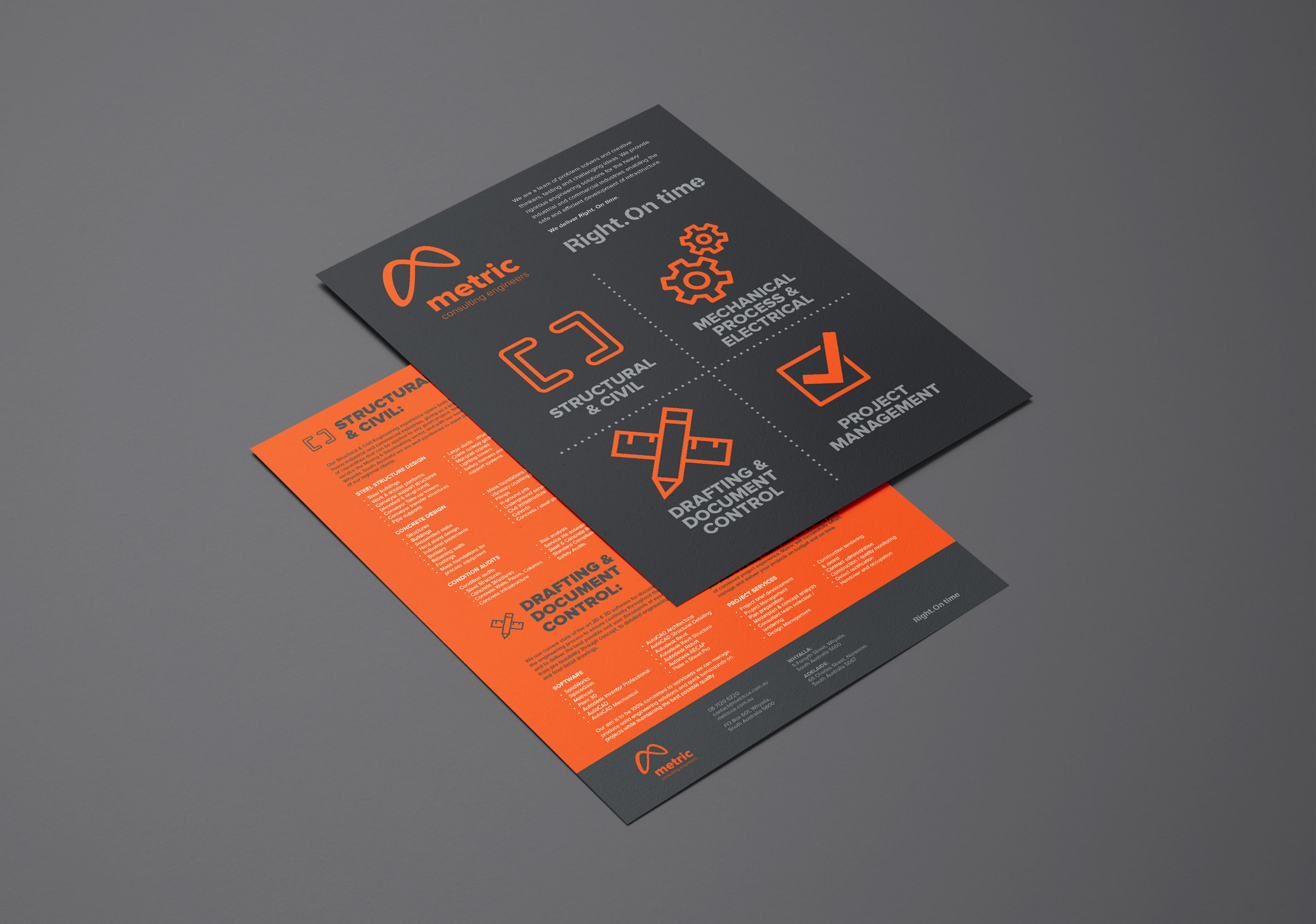
Right. On time
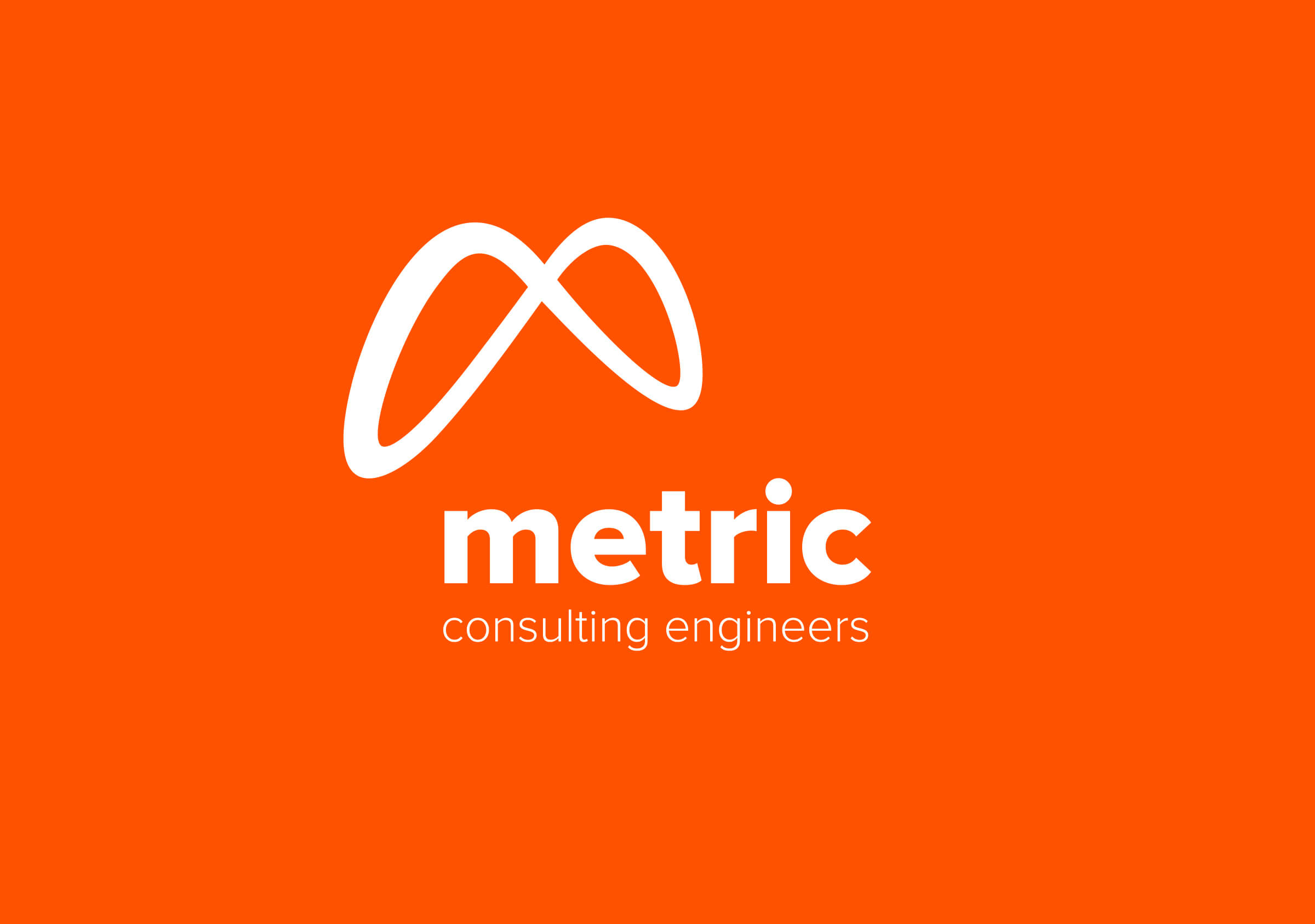
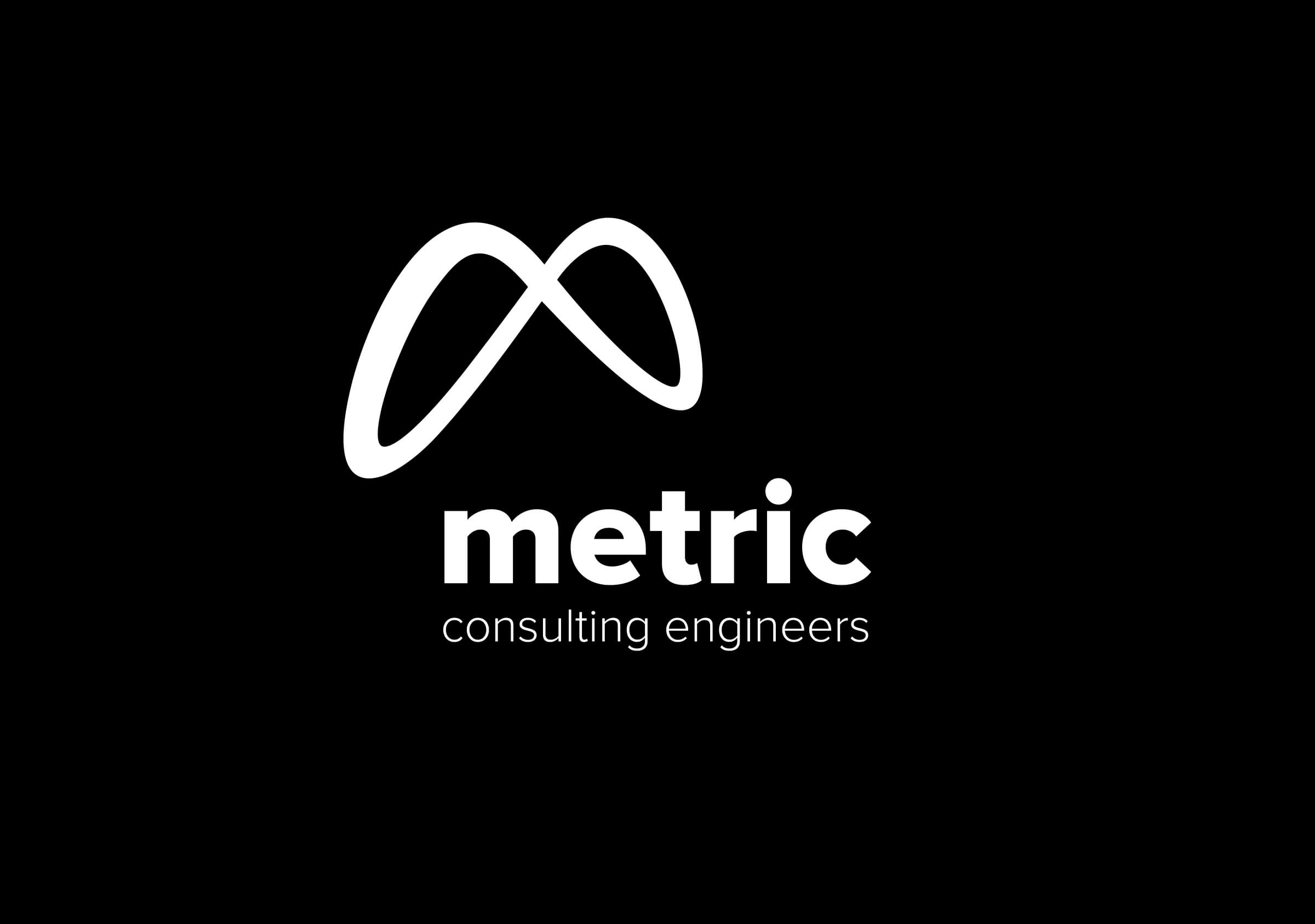
A mobius form with a weightlessness that defies physical principles and challenges engineering conventions.
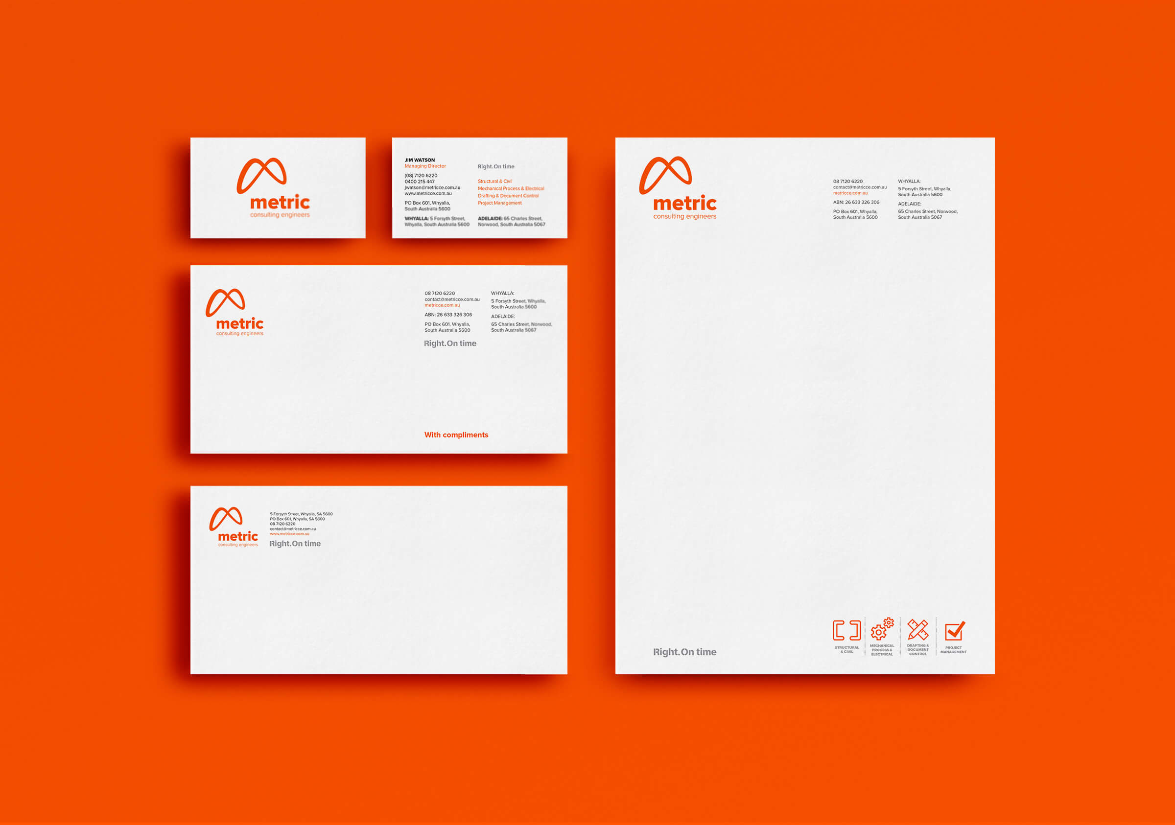
Brand identity, naming strategy, brand working session, stationery and communication collateral for Metric – Consulting Engineers.
The benefits of brand are seen mostly in their outward projection – providing definition and distinction for a business operating within a competitive and often saturated market. But their value internally is often overlooked. In our work before brand for all clients we aim to capture, define and communicate the value created by the business. This value – the tangible benefit that it provides for its market – lies at the heart of all transactions a business makes and should form the basis of their story. For clients this story telling that defines value is difficult. It requires the collection, analysis and synthesis of a range of information that for all intents appears undifferentiated to the client.
Through our Brand Profiling workshop we led the Metric team through a series of discreet lenses over the course of a day generating a set of qualified information affording perspectives on audience, industry trends, strategic imperatives and a deeper reflection on team values. This resulted in a range of insights that were distilled into a compelling narrative that then formed the basis for a communication strategy.
But it seems the real value to the business owner came from other channels. On starting our work the existing logo had been through a number of subtle evolutions. The logo was functional and certainly acceptable by the engineering industry standards but something was missing that had been difficult to pin down. Over the previous years the business owner held a vision that was never quite expressed or captured by the logos.
The way we frame this is that the value, capability and positioning of the business was not adequately communicated or reflected in the brand. And this is important. For the business owner, on seeing the new brand was an ecstatic moment where for the first time, the brand spoke easily of the visions, aspirations and capability that he had maintained since its inception.
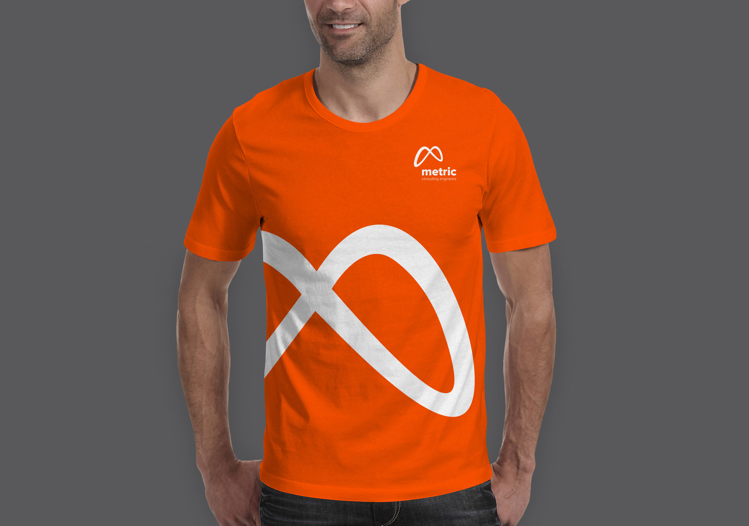
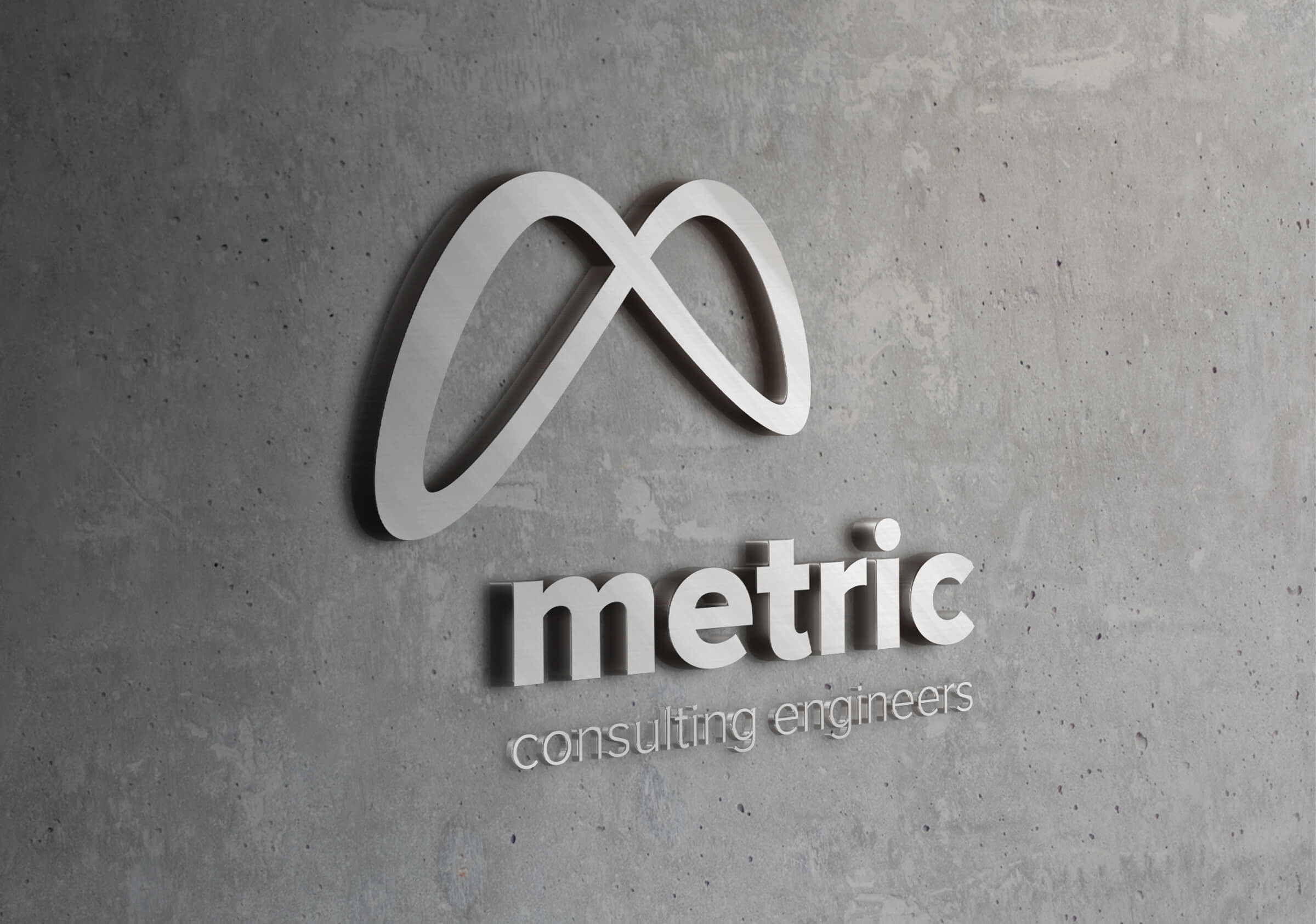
The resolved mark was derived primarily on an abstract representation of the letter M but its significance is greater. Within the context of engineering this floating, mobius form has a weightlessness that defies physical principles and therefore challenges engineering conventions built on strict laws of physics. Its movement, traced in a three dimensional space by the form suggests an ongoing and perpetual evolution. It embodies also the principle of a closed loop – where the details of an engineering response are resolved completely and purposefully with nothing left to chance.
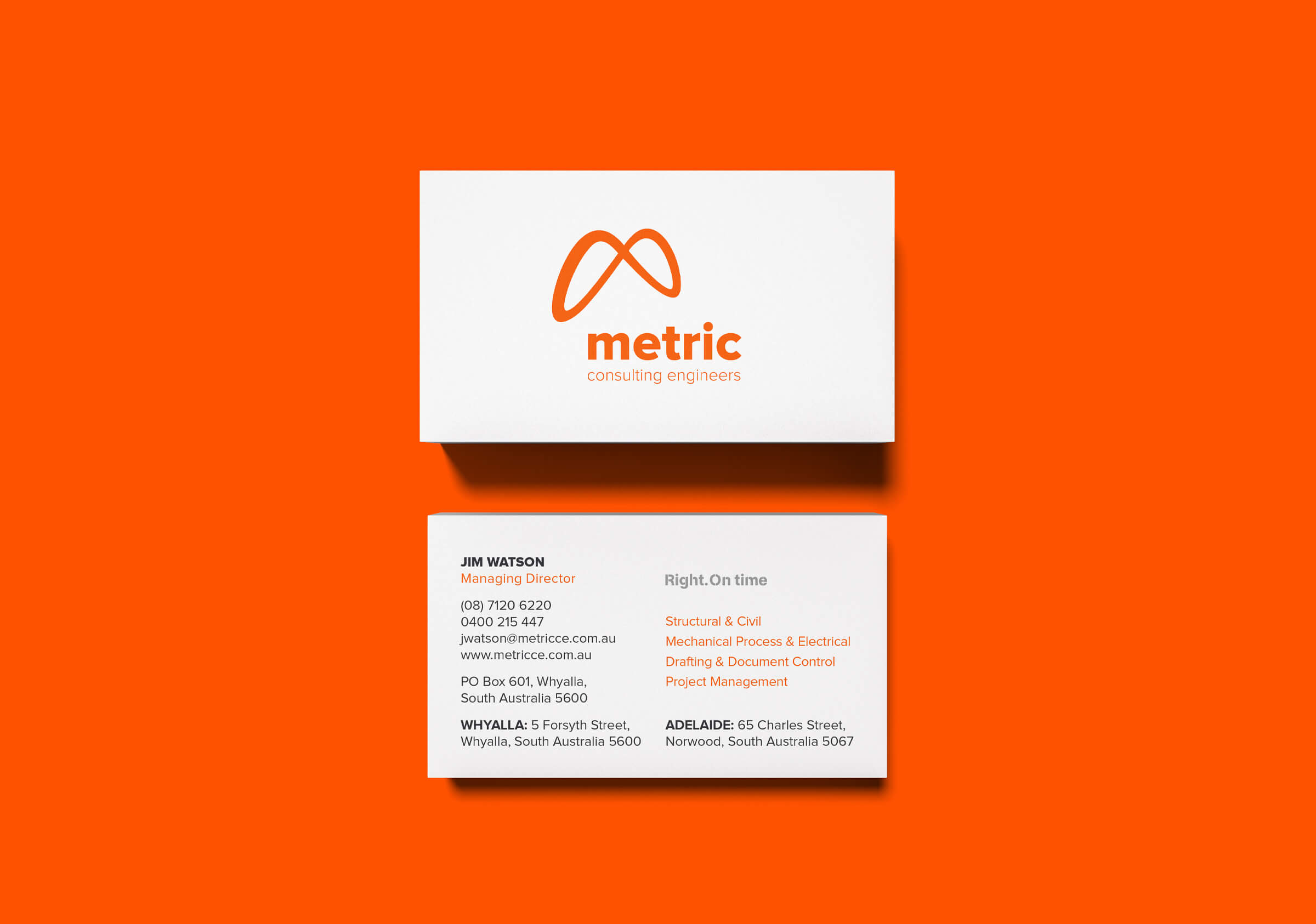
Following the generation of a detailed information set we were able to form a compelling narrative and tier one value proposition centered on the deep expectations and mandatory requirements of a typical engineering client. The tagline: RIGHT. ON TIME reflects a mindset and way of being, a personal and professional disposition that speaks of being highly attuned to detail, a granular vision and an enduring commitment to the exhaustive resolution of an engineering problem. And within this operational environment of heavy industry, projects and solutions are time critical with significant cost implications. Being right, and on-time is paramount.
The typography supporting the brand mark is robust but also personal. Through the plain speaking character of the font and its lower case rendering it importantly conveys a certainty as well as an openness and transparency that belies honesty and trust. This subtle differentiation from other more prominent brands avoids the heavy hand of a larger corporate entity and the obvious masculine responses typical of many competing industry brands.
The success of this new brand lies not jut in the distinction afforded within a very conservative and conventional industry and in its ability to convey an understanding of the value generated by this business and expected by its clients – but in capturing and communicating the aspirations and vision of its leader and the team. Fueling the belief and the commitment to great engineering solutions. Right. On time.