Barramurra Public School
Brand identity
2020
Learning Together
Uniting three distinct narratives of primary importance to the school and community.
Brand identity, naming strategy and stationery for Barramurra Public School, New South Wales.
School brands have a broad function that aims to embody the aspirations, desires and expectations of its stakeholders: the students, parents and community as a whole. The brand should project these values and characteristics and over time, become a symbol of the school’s achievements and a source of pride for the community.
Throughout the BrandProfiling working session, we were able to work with the team from Barramurra Public School to develop a compelling narrative and identify these values ensuring that the brand communicates and reflects the heart of the school. This narrative will go on to inspire and guide its development over the ensuing years and to unite the wide range of views and perspectives within the broader faculty.
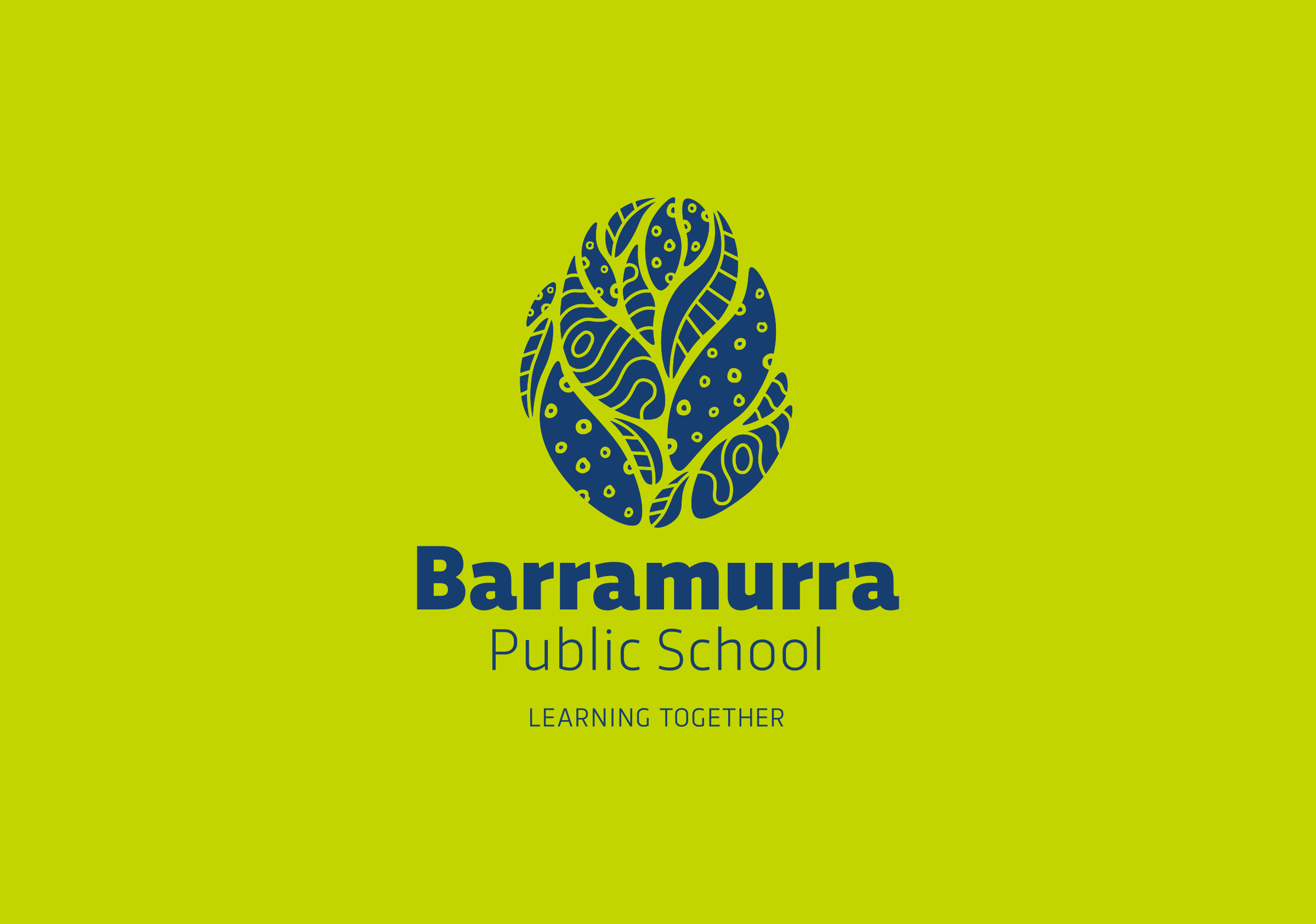
The insights gained from our working session defined a progressive position and character that responds to the core pedagogy of the school: the notion of seeds of growth – where a seed (small, powerful ideas) contains the potential for growth (the individual and education of the whole person). In this way, it links to the cycles of nature and the environment. This led us to develop an abstract and organic mark that incorporates a range of iconography that both literally and metaphorically celebrates the development of the student and the connection to nature. The concept of growth – a person learning and growing within the school and acknowledging the surrounding environment.
The symbols used; a seed, water, grass and leaves each represent the natural environment connecting to the cycle of nature and the process of growth. An abstract representation of the seed form draws directly from the flora of the region and represents growth and the potential of the student. The overall form is comprised of abstract leaves, symbolising endurance and productivity. The leaves and grass represent the many species endemic to the region, an important link to the Indigenous heritage of the area. Water, symbolising life and flow has relevance to a range of local water sources within the Upper Nepean water catchment coursing throughout the site, bringing life to the surrounding elements.
The abstract and organic nature of the form contrasts the conservative language typical of more corporate school brands and instead embodies human qualities and characteristics.
On consideration of the visual language and tone used for school branding it is useful to consider the age of the audience and to adjust the character and tone to suit. The choice of font, the typography, the forms of the brand marks and the colour schemes work to reflect and support this positioning.
The typographic elements support the language and tone by combining the bold, rounded letterforms of the school name, inspiring joy and playful characteristics with the more structured, academic style of the tagline.
An important aspect of a new brand is the crafting of a simple and distinctive qualifying statement or tagline. Their function is to qualify and provide a supporting context for the visual identity. A range of taglines were tabled that were generated through community involvement undertaken by the principal. They were drawn in response to the central themes and ideas identified as important to the school, community and pedagogy. The resolved words – Learning Together – captures the importance of collaboration, trust and strong relationships between students, parents, school and community. It is open, inclusive and invites participation.