Max Services
2015-2021
Can-do capability
Defining the value in the business and seizing the opportunity to reshape an industry through brand.

Denham Court Public School
Brand identity
2020
Empowering Learners
A strong spirit of cooperation, belonging and support for the student as a whole.
Brand identity, naming strategy and stationery for Denham Court Public School, New South Wales.
A brand goes beyond the visual aspects of a logo or graphic element by operating as a vehicle that delivers a set of values and commitments to a wide community, building trust and connection on a deeper level.
The brand development for Denham Court Public School began with a working session, where the group was led through a series of lenses that identified the core values of the school and its community, identifying the evolution of communication in recent times, which has led to a greater connection with parents, students and teachers.
Open communication, trust and collaboration are central to the philosophy of the school, along with a strong desire to acknowledge the diverse cultures and Indigenous history of the surrounding environment. The school is committed to recognising and celebrating the whole child in a way that supports a sense of belonging for each student and member of the community.
The school site is located adjacent to the heritage listed canal of the Upper Nepean catchment and the loss of the original environment has led the school to reinstate endemic species and creating a sense of place through connection with early environment and Indigenous culture. A curious theme emerged around overlapping and the number three, with the origins of the school site acting as a meeting place between three Indigenous groups and the current area being on the boundaries of three local councils.
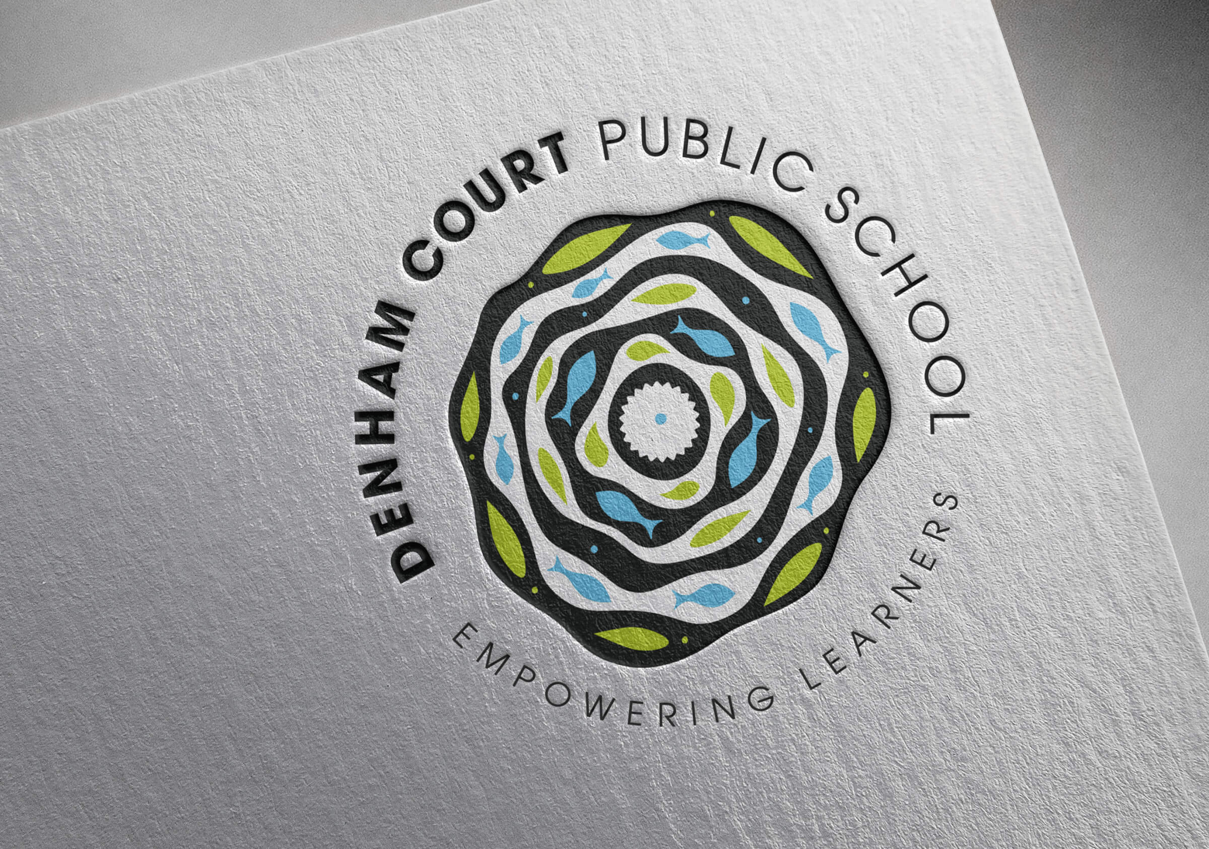
This theme of three continued in the development of the graphic, which aims to synthesise three key elements of the site: The Natural Environment, The Natural river system and the Indigenous history. Symbols of these three elements form an integrated whole with water being a primary element – the site is situated within a region rich in oral history and stories referencing the local waterways. At the centre of the image is the nut of the Swamp Oak which was an important food source for aboriginal people. The logomark, as a whole and complete form, represents the key narratives of collaboration, connection and celebration of the whole person.
The typographic elements for the school name aim to contrast the organic character of the mark and offer a bold, open rendering of the name. The tagline responds to the mark and its organic style. Displaying character and friendliness with rounded, bold typeforms.
An important aspect of a new brand is the crafting of a simple and distinctive qualifying statement or tagline. These words are typically difficult to resolve as they have to embody so much and form the foundation of the brand’s promise. Their function is to qualify and provide a supporting context for the visual identity. The resolved statement – Empowering Learners – reflects the clear mandate of the Principal and community and speaks of a strong spirit of cooperation, belonging and support for the student as a whole.
The success of this mark is its ability to unite three distinct narratives each of primary importance to the school and community which conveys the spirit of playfulness and cooperation.


